

PERSONAL STYLIST
CONSULTATIONS FROM
THE COMFORT OF
YOUR HOME.
PERSONAL STYLIST
CONSULTATIONS FROM
THE COMFORT OF
YOUR HOME.
PERSONAL STYLIST
CONSULTATIONS
FROM THE
COMFORT OF
YOUR HOME.
PERSONAL STYLIST
CONSULTATIONS
FROM THE
COMFORT OF
YOUR HOME.
PERSONAL SHOPPING CONSULTATIONS FOR MODEST FAITH BASED APPAREL FROM THE COMFORT OF YOUR HOME
PERSONAL SHOPPING CONSULTATIONS FOR MODEST
FAITH BASED APPAREL FROM THE COMFORT OF YOUR HOME
PERSONAL SHOPPING CONSULTATIONS FOR MODEST
FAITH BASED APPAREL FROM THE COMFORT OF YOUR HOME

PROBLEM
Identifying restaurants that satisfy flavor preferences & food allergy needs remains
a challenge, often leading to overlooked options and missed dining opportunities.
SOLUTION
Develop an innovative app that maps flavor profiles and tracks food allergies, enabling confident restaurant discovery.
MY ROLE
Conduct & synthesize research, and develop iterative solutions through user testing from low to high-fidelity prototypes.
RESEARCH PLAN —
SCHEDULE —
— PHASE 1 —
DISCOVERY
PLAN RESEARCH
1. Formulate Research Plan
2. Define User Audience
CONDUCT RESEARCH
1. Competitive Landscape
2. Secondary Research
RESEARCH
1. User Personas
2. Empathy Mapping
3. Mood Board
— PHASE 1 —
DESIGN R1
DESIGN INFORMATION ARCHITECTURE
1. User Flow Red Routes
DESIGN IN LOW FIDELITY
1. Computer Wireframes
2. Group Critique
3. Combine Concepts
DESIGN INFORMATION ARCHITECTURE
1. Refine Design & Incorporate
Prototype Functionality
— PHASE 3 —
VALIDATE R1
PREPARE TO TEST
1. Create Test Script
2. Identify & Book Test Users
CONDUCT TESTING
1. Conduct Remote Moderated
Usability Tests
SYNTHESIZE RESULTS
1. Create Usability Test Report
2. Address Any Critical Errors
3. Present Concept to Client
— PHASE 4 —
DESIGN R2
DESIGN IN HIGH FIDELITY
1. Refine Design Based On
Usability Test Findings,
Group and Client Feedback
— PHASE 5 —
VALIDATE R2
PREPARE TO TEST
1. Create Modified Test Script
2. Identify & Book Test Users
CONDUCT TESTING
1. Conduct Remote Moderated
Usability Tests
SYNTHESIZE RESULTS
1. Create Usability Test Report
2.Address Errors
3. Present Concept to Client
— PHASE 6 —
DESIGN R3
ITERATE IN HIGH FIDELITY
1. Refine Design Based On
Usability Test Findings,
Group and Client Feedback
2. Final Presentation to Client
3.Handoff Final Deliverables
to Client

• Faith-conscious women 25-50
• Prefer elegant/modest fashion
• Desire a curated shopping experience
• Alignment with their beliefs & style
USER AUDIENCE
PRELIMINARY RESEARCH —
COMPETITIVE LANDSCAPE / COMPARISON —
APPLICATION FEATURE
Category
Video Shopping Type
Human Element
Integration Level
Key Features
Pricing
Best For
Example Use Cases
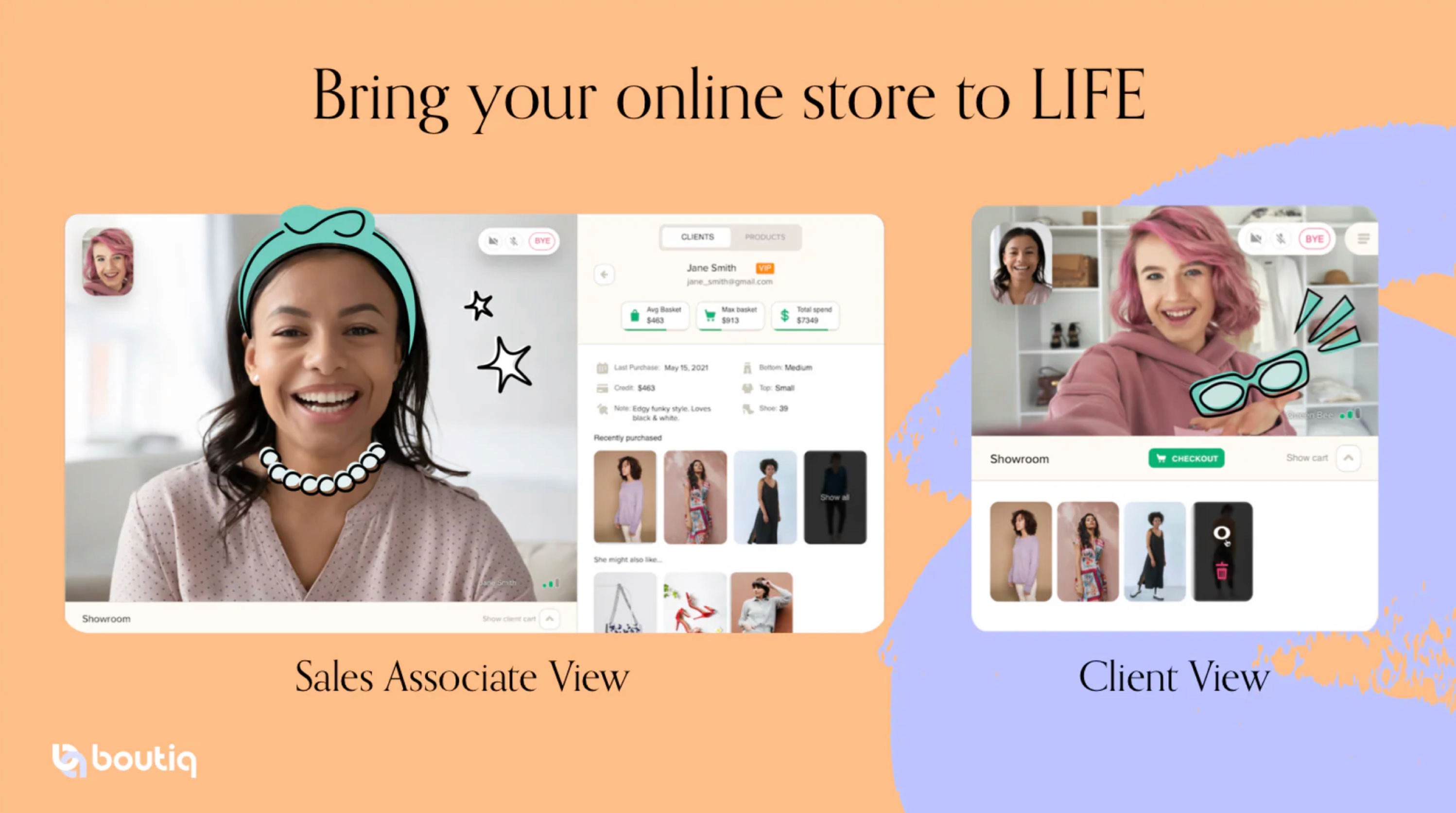
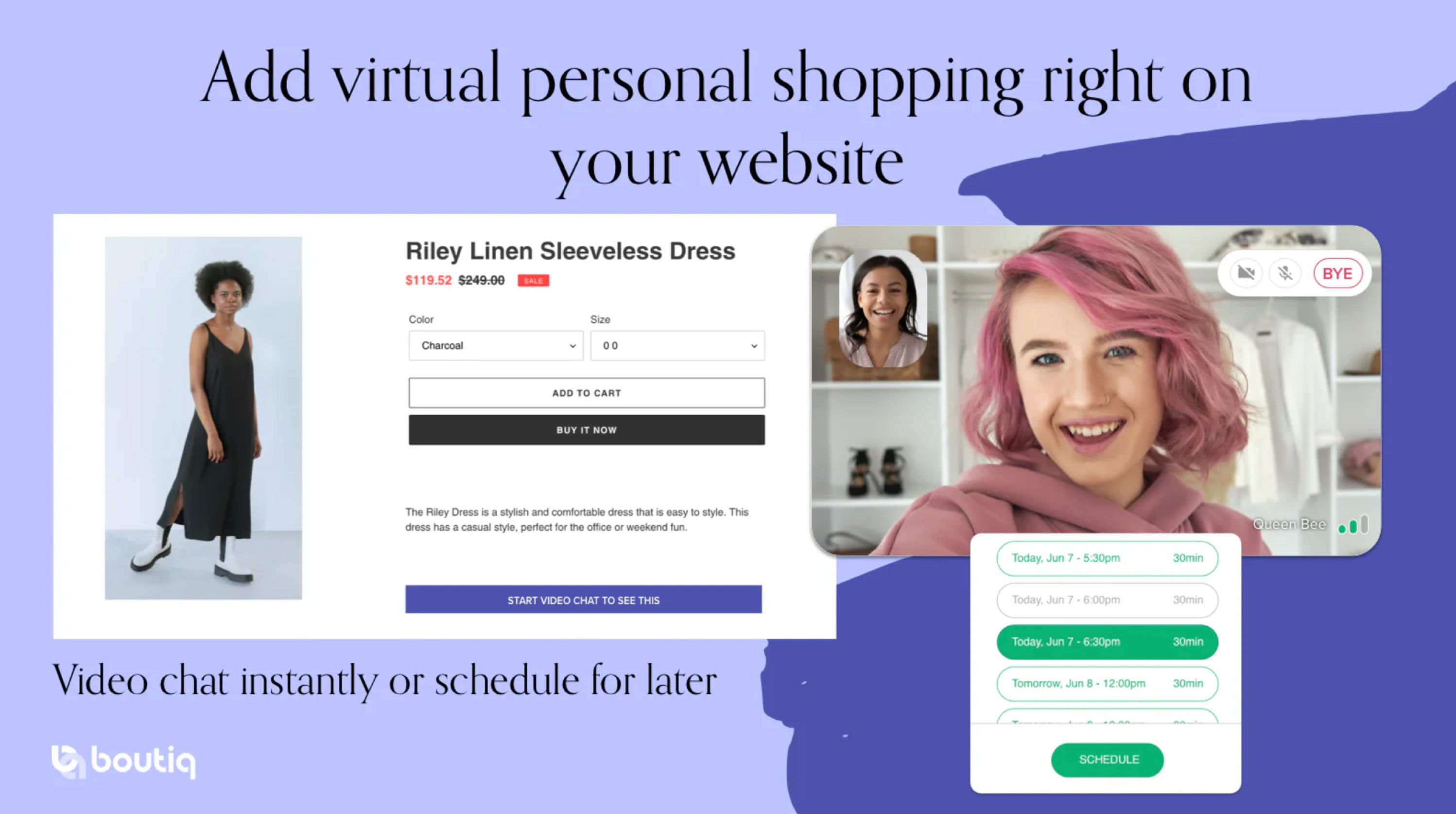
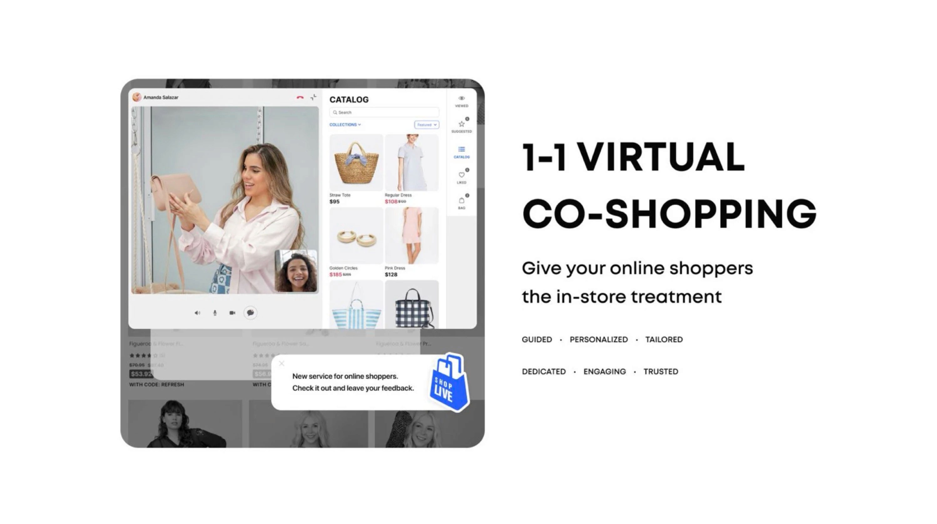
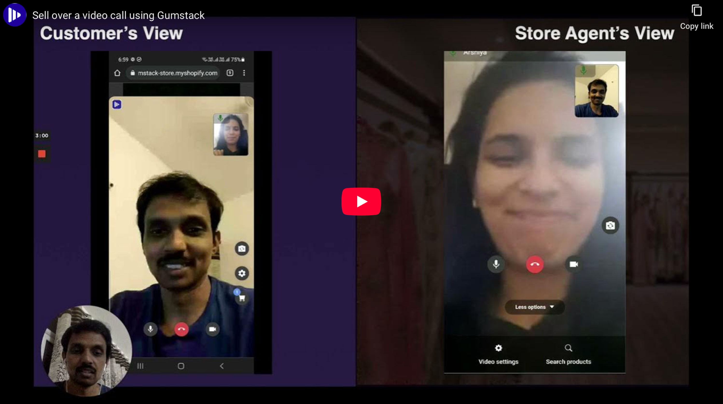
BOUTIQ PERSONAL VIDEO SHOPPING

Shopify App
1-to-1 personal video clienteling (instant or by appointment)
Yes - live video with real agents
Full Shopify sync (cart,
checkout, analytics)
Shoppable video, checkout sync, analytics, abandoned cart follow-up
From $90/month + usage fees
Sellers wanting personalized,
high-touch video shopping
Upselling fashion items via
live video sessionsAPPLICATION FEATURE
Category
Video Shopping Type
Human Element
Integration Level
Key Features
Pricing
Best For
Example Use Cases
BOUTIQ PERSONAL VIDEO SHOPPING

Shopify App
Autonomous or human-assisted
video commerceOptional (Al-driven or pre-recorded)
Shopify store embedded
videos and product display
Shoppable recorded/live
videos, product demos
Not listed, contact for pricing
Stores needing interactive shoppable
video without agents
DIY demonstrations or automated
product walkthroughs
APPLICATION FEATURE
Category
Video Shopping Type
Human Element
Integration Level
Key Features
Pricing
Best For
Example Use Cases
GUMSTACK

Service / Platform
1-to-1 live video shopping with brand
ambassadors
Yes - real brand ambassadors
providing shop support
Website integration with
shoppable video calls
Brand ambassador matching,
SAT/PS tracking, instant help
Custom packages
Brands offering expert-led
personal shopping experience
Appliance or complex product
consultations via video
APPLICATION FEATURE
Category
Video Shopping Type
Human Element
Integration Level
Key Features
Pricing
Best For
Example Use Cases
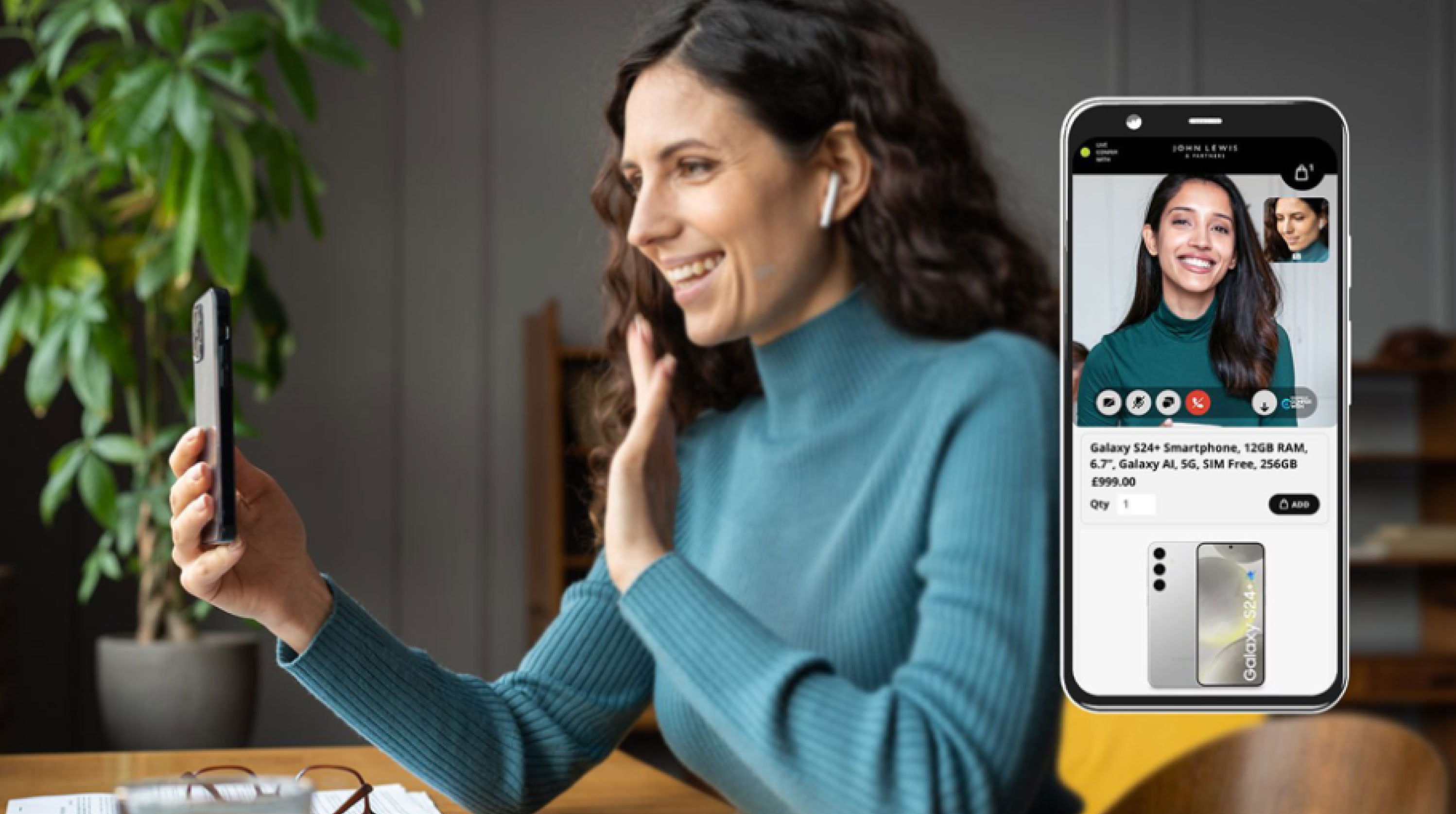
CONFERWITH

Service / Platform
Shoppable video, checkout sync,
analytics, abandoned cart follow-up
Yes - on-demand agent via video
Web/app integration for
live video calls
1-click video, mobile-first,
callback scheduling
Not listed, contact for pricing
Stores needing fast on-site video
customer support
Virtual store visits or real-time
visual assistance
COMPETITIVE LANDSCAPE / ANALYSIS —
Analyzing the competitive landscape I identified strengths & weakness of the other products currently or the market offering similar services. The primary feature of all products was the video chat feature, but each was paired with different complimentary features.
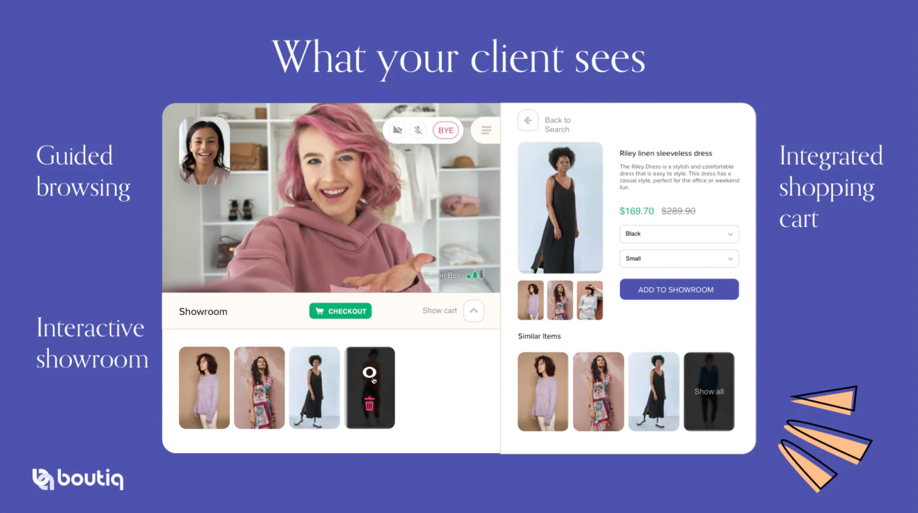
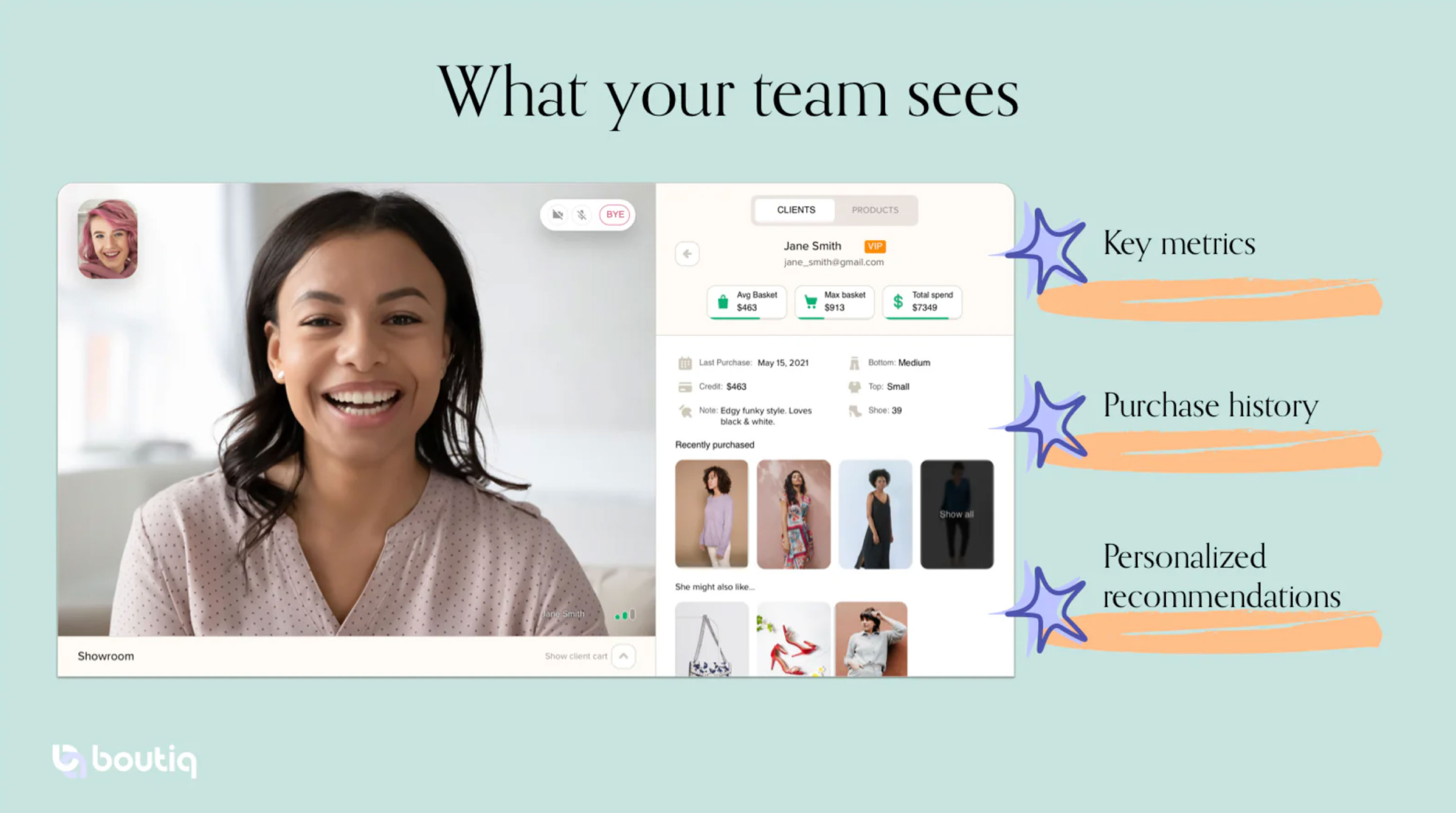
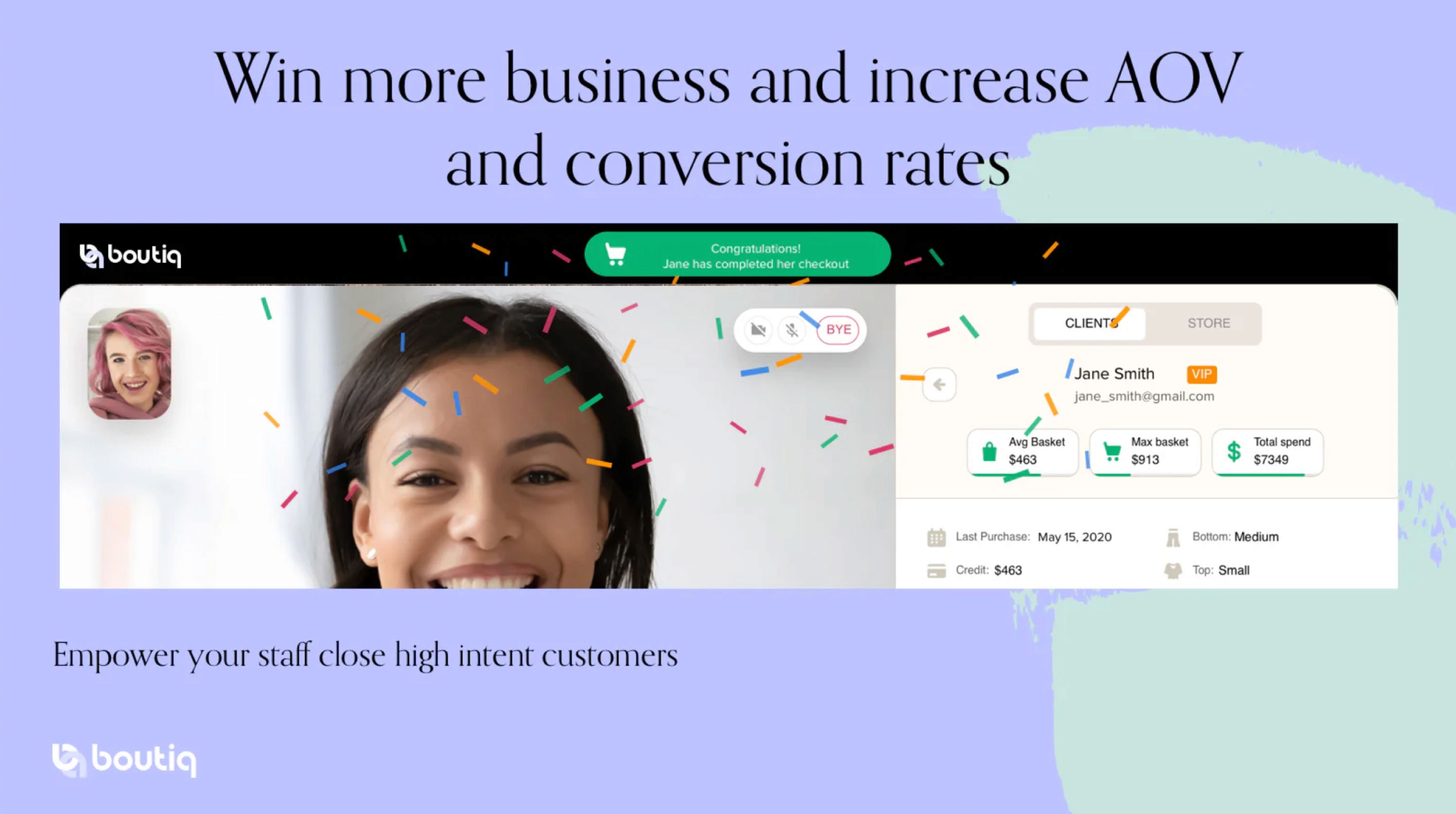
DECISION FATIGUE FROM TOO MANY CHOICES: Displays client video, purchase history, sizing, spending trends, style notes, and curated recommendation showroom.
CLIENT EXPERIENCE: Half-screen video with cart access, checkout, and showroom recommendations.
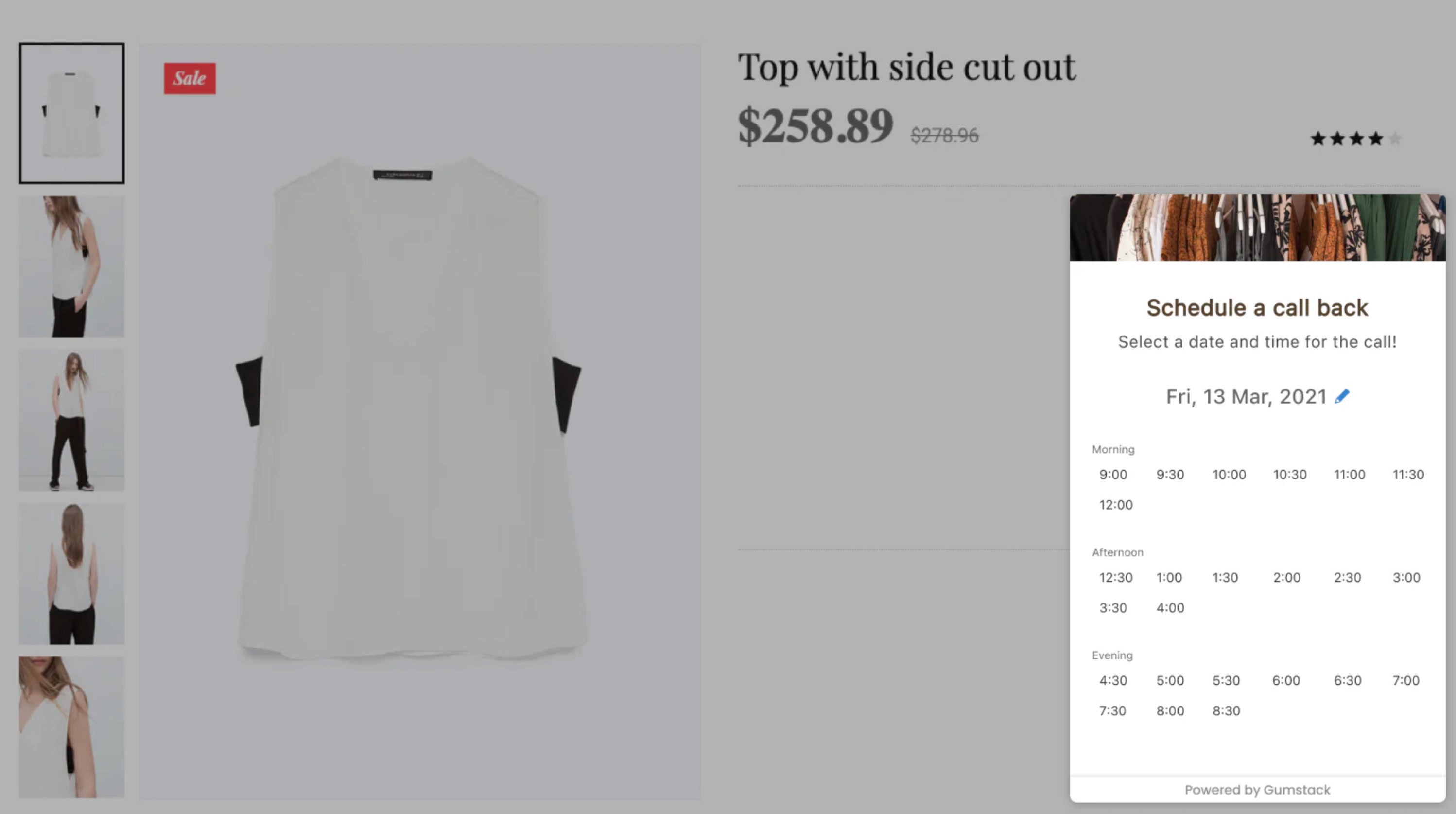
INSTANT OR SCHEDULED CALLS: Product pages include a "Start Video Chat To See This" CTA for immediate or scheduled consultations.
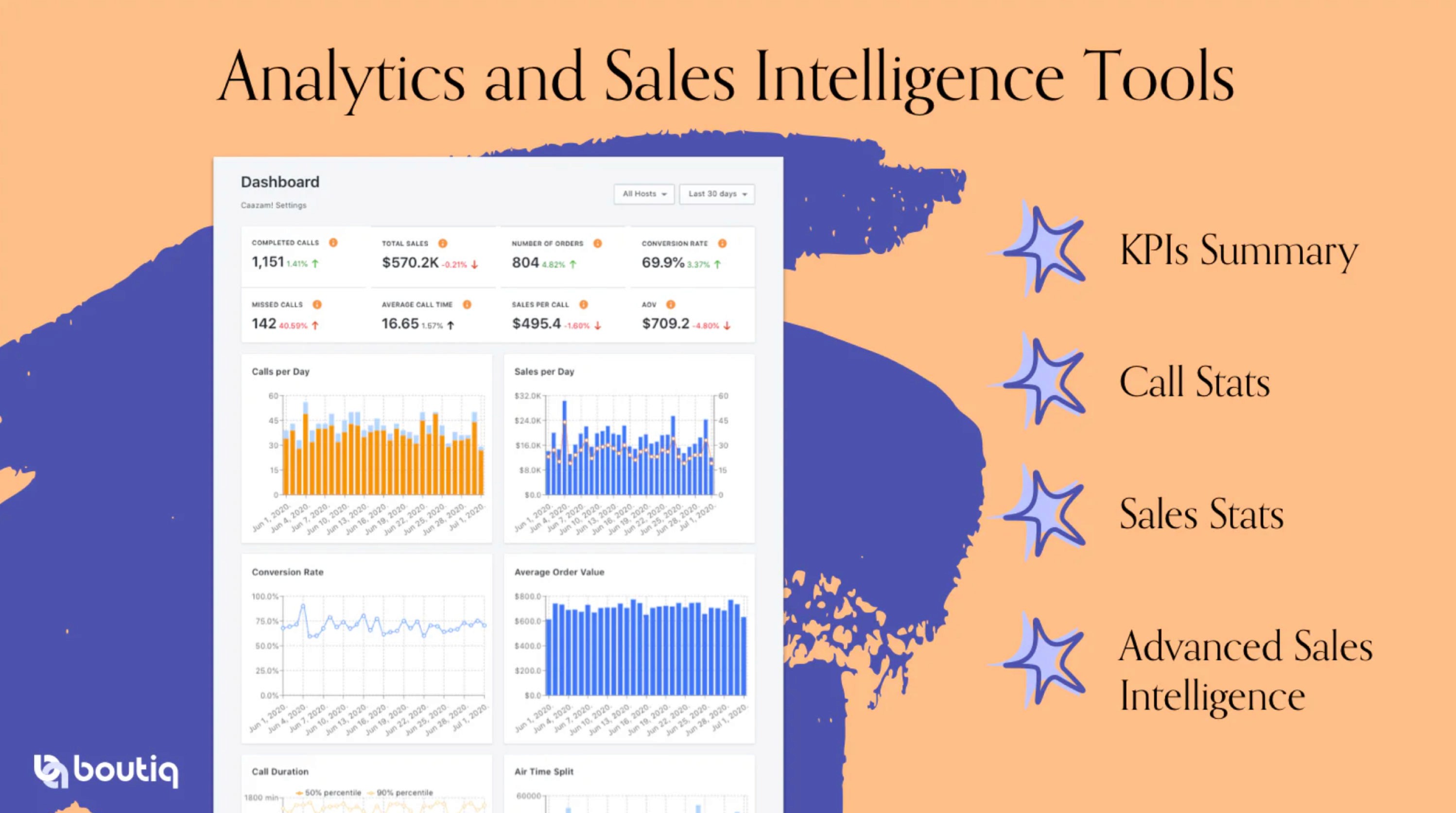
ANALYTICS & SALES INTELLIGENCE: Tracks calls, conversions, sales per call, AOV, and engagement metrics.
THIRD-PARTY INTEGRATIONS: Supports Klaviyo, Calendly, and Acuity for seamless workflow.
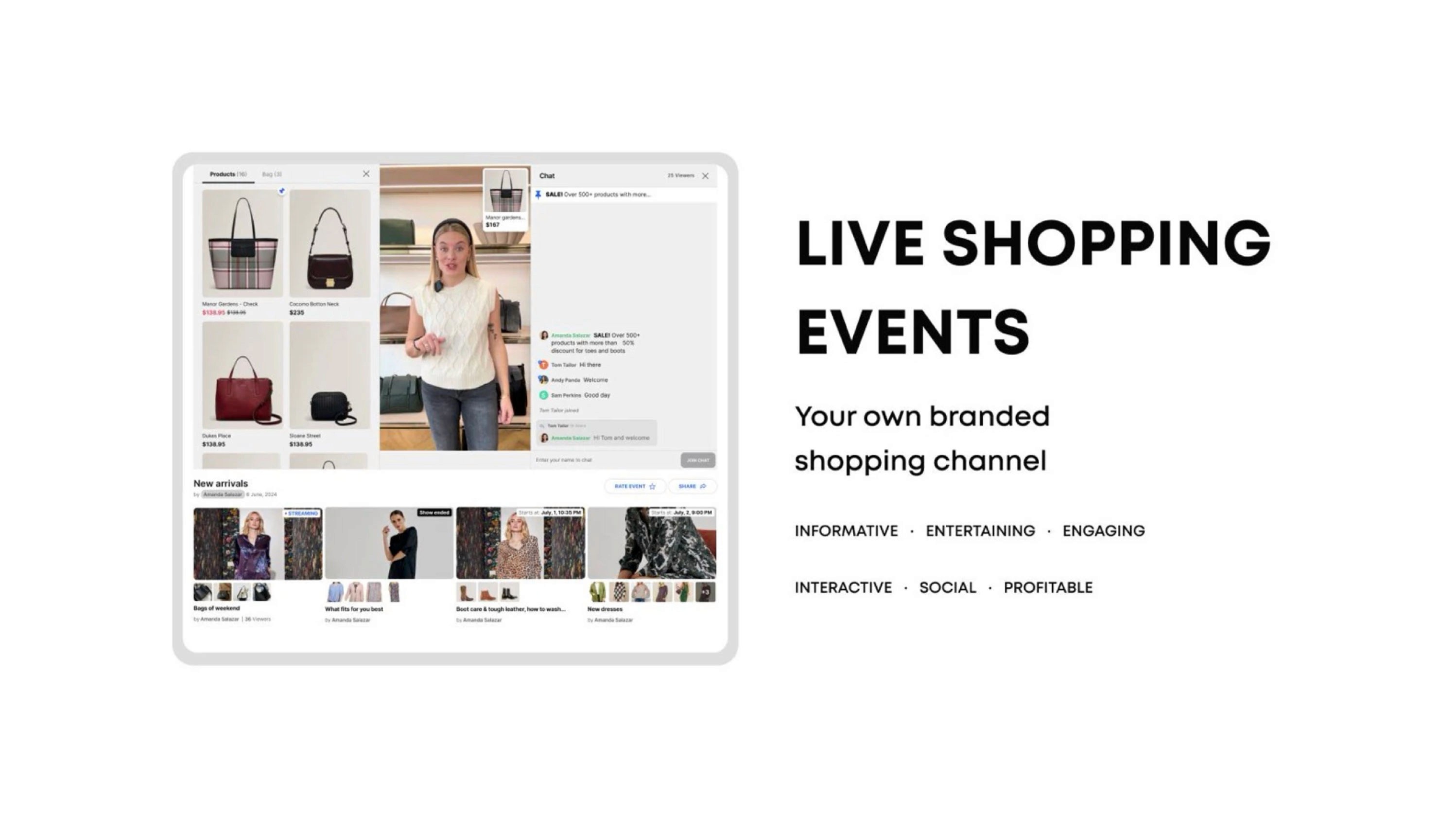
AI LIVE CHAT & VIDEO SHOPPING: Provides real-time product assistance and personalized recommendations.
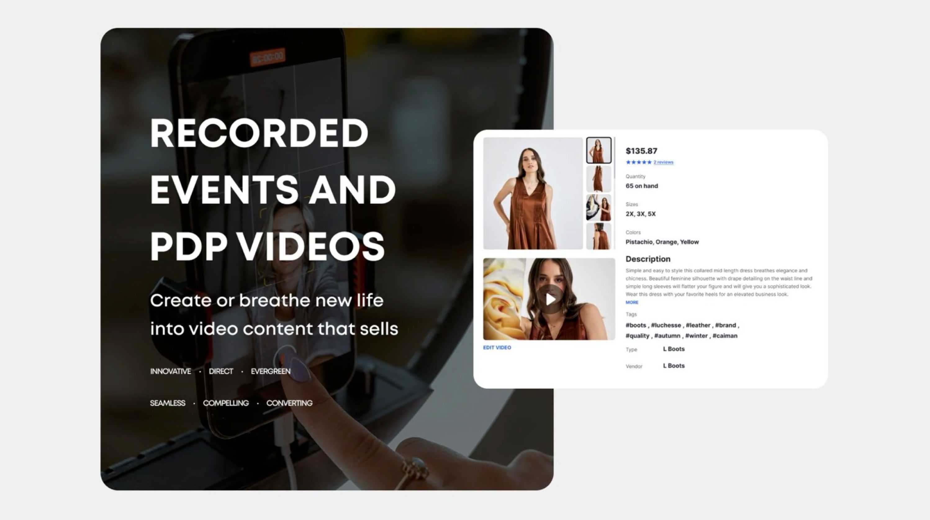
RECORDED & LIVE SHOPPING EVENTS: Group video sales, interactive product showcases, and PDP video integration.
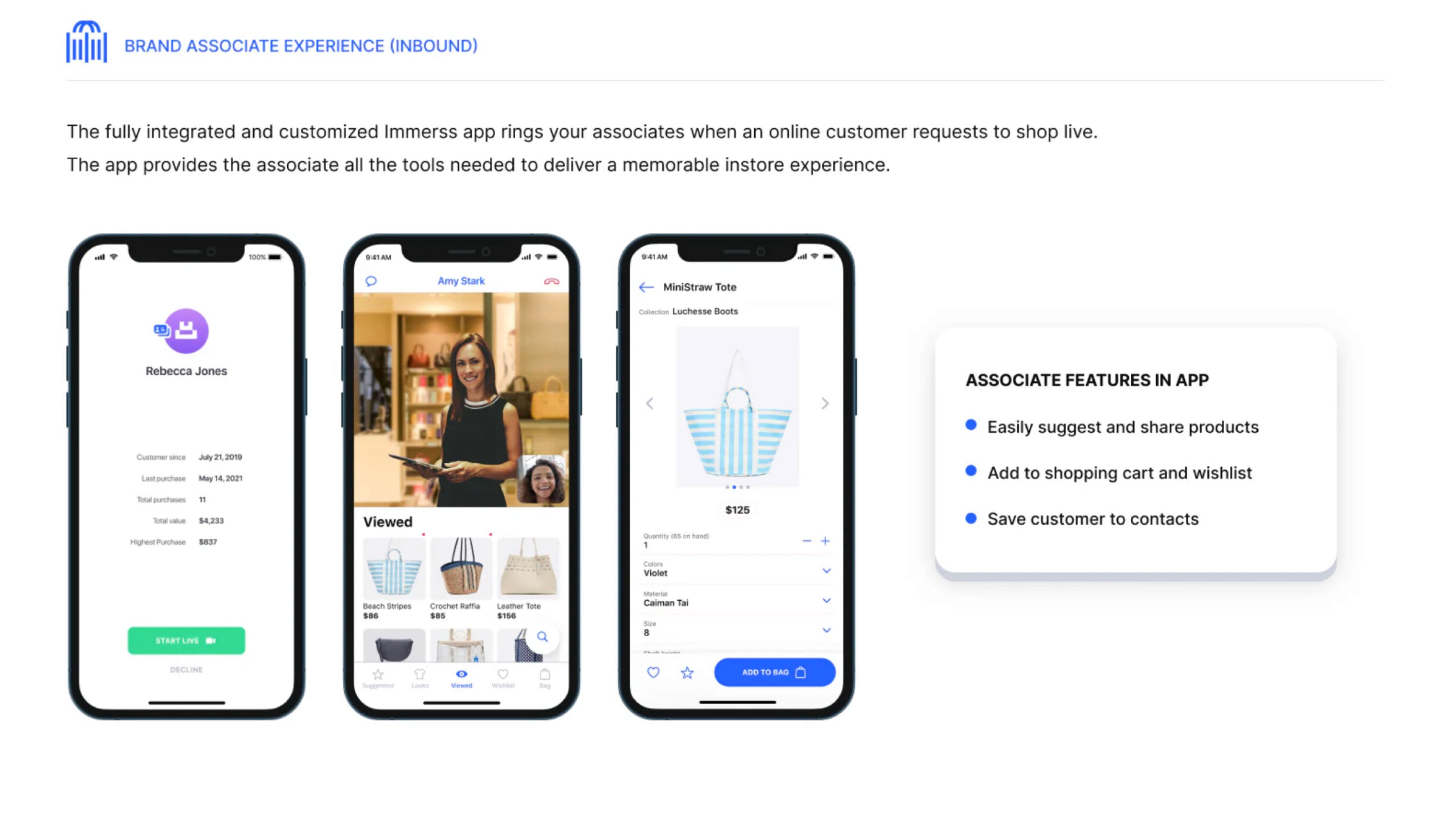
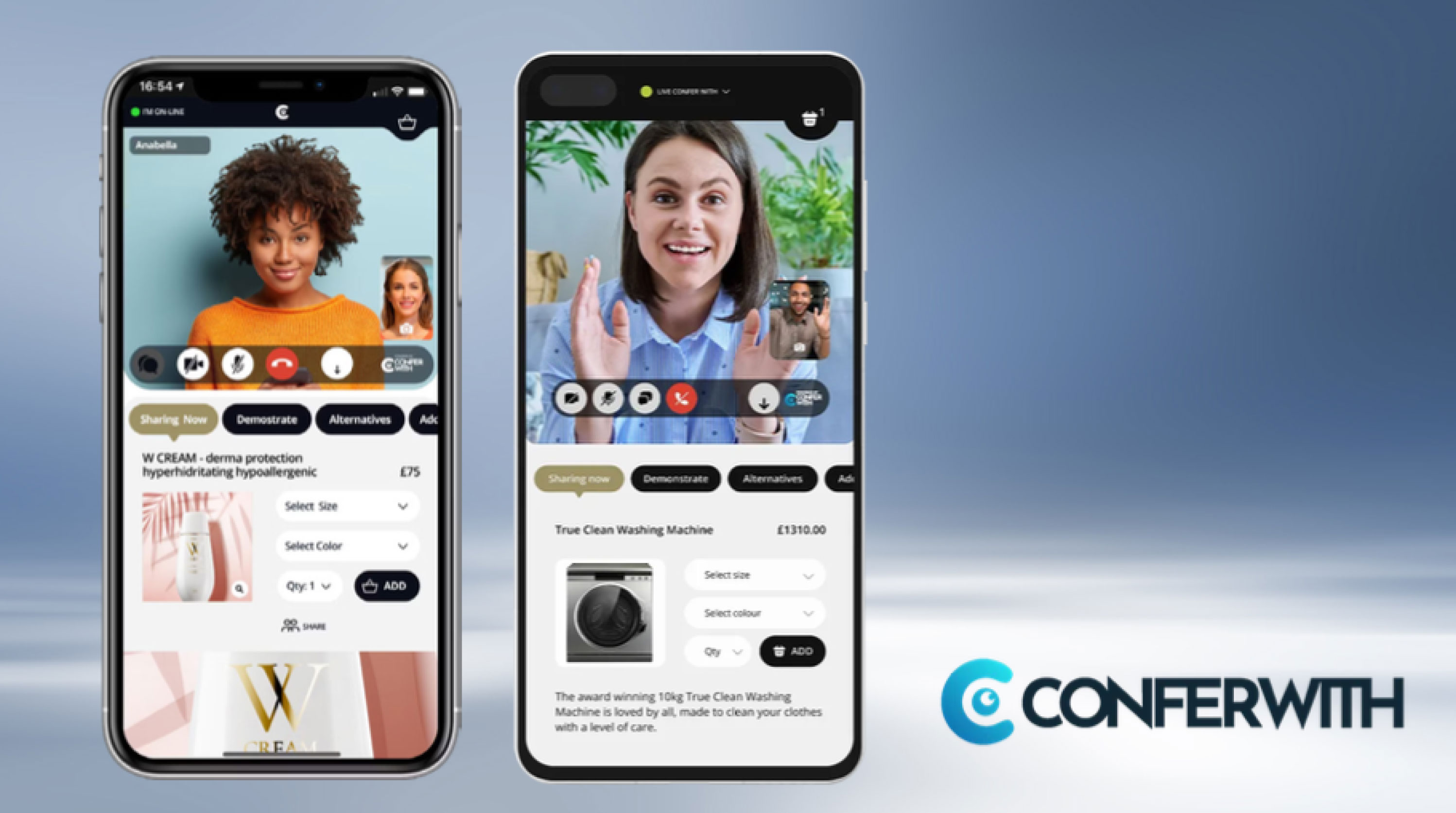
CLIENT EXPERIENCE: 60% VS screen area, product catalog browsing, and interactive tab navigation (Items Viewed, Suggested, Wishlist, Bag).
SALES ASSOCIATE DASHBOARD: Displays customer history, purchases, and engagement data with quick actions for live interactions.
PRODUCT DETAIL & EVENT PAGES: Carousel images, stock availability, material details, event thumbnails w/ reminders & sharing options.
SEAMLESS INTEGRATIONS: Connects with checkout systems, customer service tools (Gorgias, Zendesk, Olark, Intercom, Tidio, LiveChat).
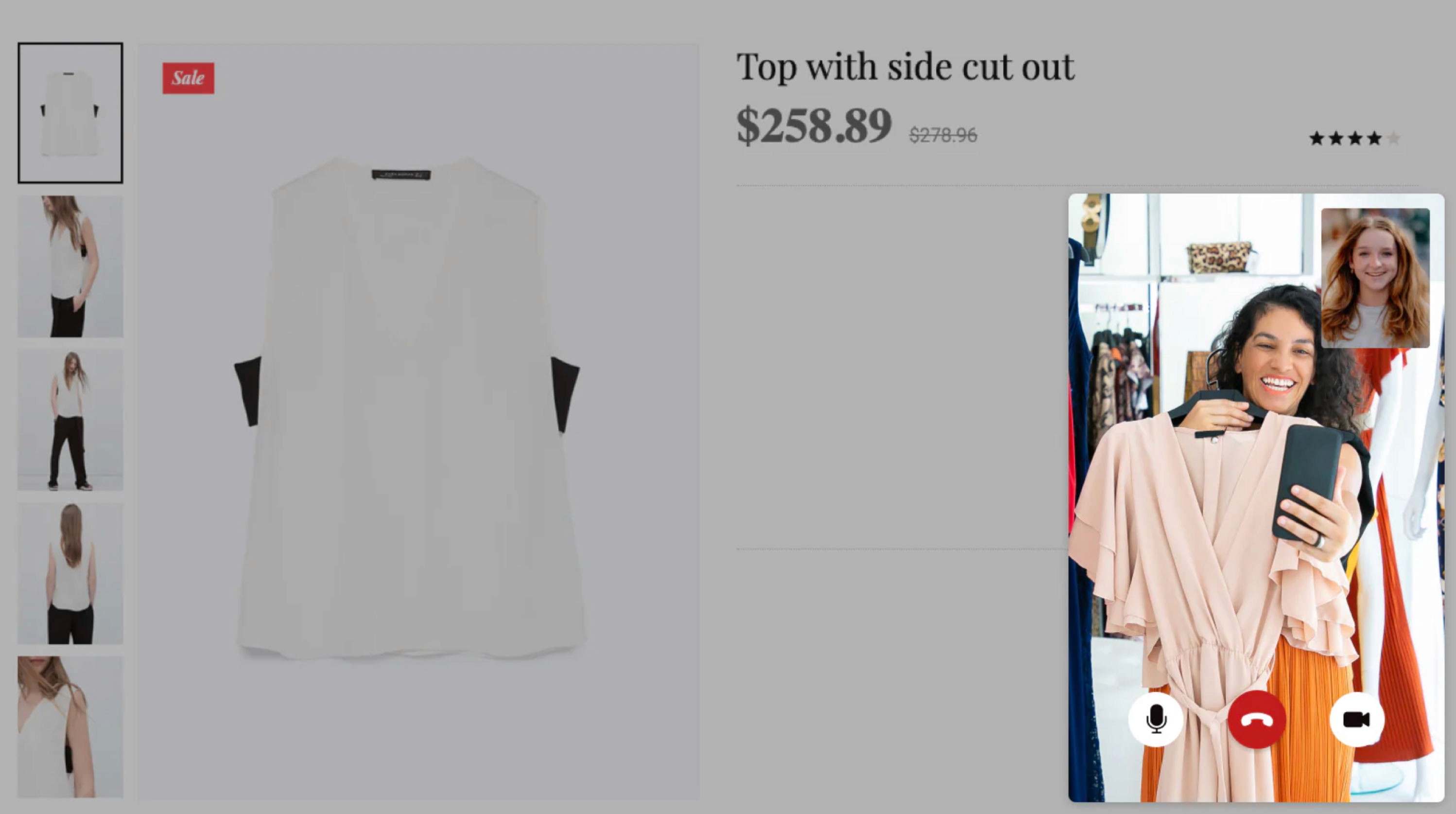
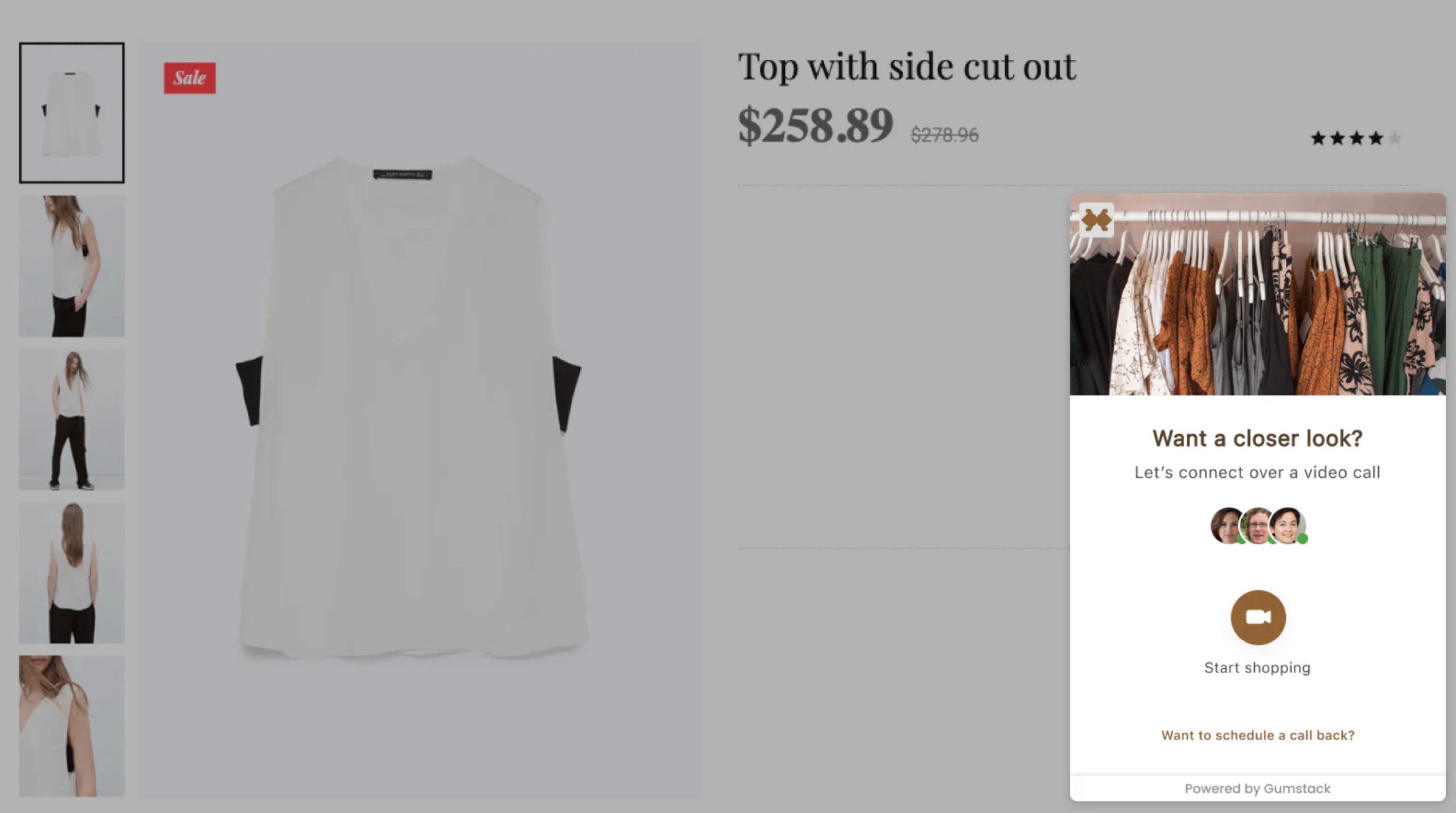
CLIENT EXPERIENCE: A basic video call interface with a pop-up product preview (name, price, and image) and Add to Cart CTA. No browsing, account linking, or product details.
NO PRODUCT INTEGRATION: Products are showcased exclusively through live video, requiring direct communication for details.
STORE AGENT DASHBOARD: Minimal functionality with "Search Products" and "Video Options" buttons. After a call, only agent contact, order details, and call summary are available.
LIMITED POST-CALL INTERACTION: Clients can rate the sales agent, provide feedback, cannot revisit products / shopping history.
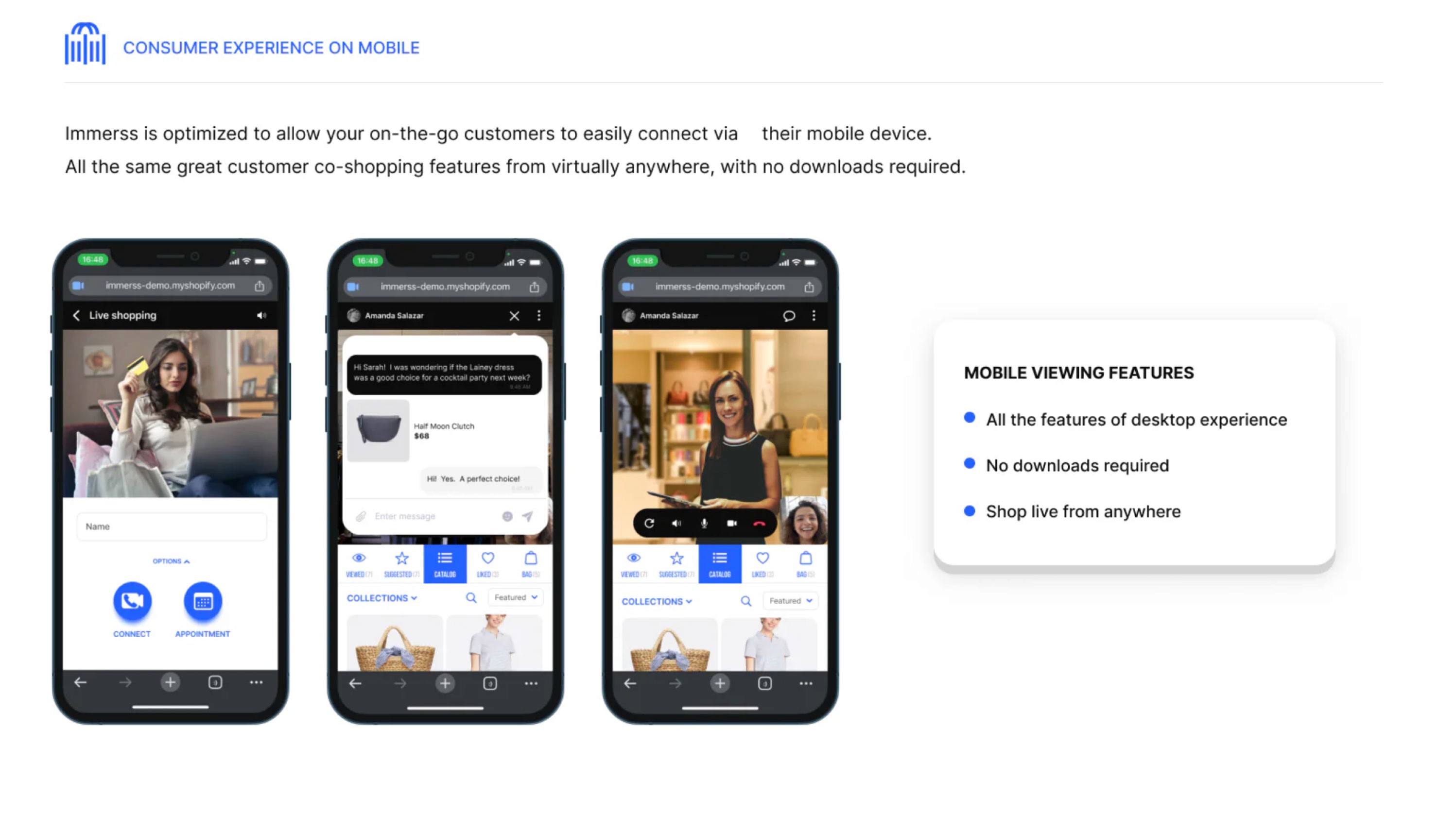
CLIENT EXPERIENCE: 60% VS screen area, shared shopping cart (top-right), and a VSA tab bar for video, chat, and screen expansion. Lower 40% screen area shared content when VSA minimized.
SALES ASSOCIATE DASHBOARD: Identical top-screen layout with host controls (Sharing Now, Demonstrate, Alternatives) and a detailed product display (image, price, size, color, description, and Add to Cart).
SEAMLESS PRODUCT INTEGRATION: Both parties can add products to the cart, ensuring a more engaging, guided shopping experience.
SECONDARY RESEARCH —
NAME: American Dream
LOCATION: East Rutherford, New Jersey, USA
OWNER: Triple Five Group
WEBSITE: americandream.com
American Dream s premier retail and entertainment
complex located within the Meadowlands Sports Complex in East Rutherford, New Jersey. Spanning approximately 3 million square feet, it stands as one of the largest malls in the United States.
MISSION & VISION: American Dream aims to redefine
the shopping and entertainment experience by combining diverse retail options with world-class attractions, creating a destination that appeals to both local residents and tourists.
PRODUCTS & SERVICE: The complex offers a blend of
retail and entertainment.
RETAIL: Over 350 retail establishments, featuring
high-end luxury stores and diverse shopping options.
DINING: More than 100 dining venues, ranging from
casual eateries to fine dining.
ENTERTAINMENT: Features a variety of attractions.
• Nickelodeon Universe: An indoor theme park with various
rides and attractions.• DreamWorks Water Park: An expansive indoor water park
featuring attractions themed around popular Dream Works
franchises.• Big Snow American Dream: Indoor ski & snowboard park.
• The Rink: An NHL-sized ice-skating rink.
• Legoland Discovery Center: An interactive experience
for families and children.
• Sea Life Aquarium: A marine life attraction.
MARKET & INDUSTRY ANALYSIS: Strategically located
near New York City, American Dream attracts both local
visitors and tourists. Its unique ombination of retail and
entertainment positions it competitively within the retail
and amusement industries.
BUSINESS MODEL & REVENUE STREAMS:
American Dream generates revenue through:
• Retail Leasing: Income from leasing space to various retail
tenants.NAME: American Dream
LOCATION: East Rutherford, New Jersey, USA
OWNER: Triple Five Group
WEBSITE: americandream.com
American Dream s premier retail and entertainment
complex located within the Meadowlands Sports Complex in East Rutherford, New Jersey. Spanning approximately 3 million square feet, it stands as one of the largest malls in the United States.
MISSION & VISION: American Dream aims to redefine
the shopping and entertainment experience by combining diverse retail options with world-class attractions, creating a destination that appeals to both local residents and tourists.
PRODUCTS & SERVICE: The complex offers a blend of
retail and entertainment.
RETAIL: Over 350 retail establishments, featuring
high-end luxury stores and diverse shopping options.
DINING: More than 100 dining venues, ranging from
casual eateries to fine dining.
ENTERTAINMENT: Features a variety of attractions.
• Nickelodeon Universe: An indoor theme park with various
rides and attractions.• DreamWorks Water Park: An expansive indoor water park
featuring attractions themed around popular Dream Works
franchises.• Big Snow American Dream: Indoor ski & snowboard park.
• The Rink: An NHL-sized ice-skating rink.
• Legoland Discovery Center: An interactive experience
for families and children.
• Sea Life Aquarium: A marine life attraction.
MARKET & INDUSTRY ANALYSIS: Strategically located
near New York City, American Dream attracts both local
visitors and tourists. Its unique ombination of retail and
entertainment positions it competitively within the retail
and amusement industries.
BUSINESS MODEL & REVENUE STREAMS:
American Dream generates revenue through:
• Retail Leasing: Income from leasing space to various retail
tenants.• Ticket Sales: Revenue from admissions to entertainment
attractions.• Dining: Proceeds from a wide array of dining options.
• Special Events: Hosting events and performances in
dedicated spaces.
FINANCIAL OVERVIEW: In 2022. American Dream reported losses of $254.4 million. In November 2022, JPMorgan Chase extended a four-year extension on over $1.7 billion in con-
struction borrowings. American Dream Mall has faced signif-
icant financial challenges since its opening in October 2019.FINANCIAL LOSSES:
• 2021: The mall reported losses of nearly $60 million.
• 2022: Losses escalated to approximately $245 million, a
substantial increase from the previous year.DEBT AND LOANS:
• Construction Financing: Triple Five Group, the mall's
developer, secured about $1.1 billion in municipal bonds to
finance the $5 billion project.•Loan Extension: In November 2022, JPMorgan Chase
granted a four-year extension on repaying over $1.7
BOND PAYMENT ISSUES:
• August 2024: The mall made overdue interest payments on
$287 million of municipal bonds after more than two years
of delays.• February 2025: Bondholders did not receive expected
interest payments, indicating ongoing difficulties.
MARKETING & GROWTH STRATEGY: American Dream
focuses on offering a unique blend of shopping and entertain-
ment to differentiate itself from traditional malls. Marketing efforts target families, tourists, and shoppers seeking diverse experiences.CHALLENGES & RISKS: The complex has faced financial
challenges, including significant losses and reliance on
substantial financing. Additionally, the COVID-19 pandemic impacted operations and visitor numbers.
RECENT DEVELOPMENTS & ACHIEVEMENTS:
Complex opened in phases, initial debuting in October 2019
Secured a four-year extension on significant construction
loans in November 2022.
NAME: TheAddress
FOUNDED: February 2022
LOCATION: East Rutherford, New Jersey, USA
WEBSITE: theaddressad.com
A specialty department store curated for modest fashion
women of religious faith.
MISSION & VISION: TheAddress aims to provide an elevated shopping experience for the modest fashion community by offering a curated selection of sought-after brands and styles, catering to women, teens, and children.
PRODUCTS & SERVICES: The store offers a diverse range
of products, including:
• Women's Apparel: Dresses, tops, skirts, activewear,
swimwear, and outerwear.• Teens' and Kids' Clothing: Age-appropriate modest fashion
options.• Accessories: Makeup, hair accessories, jewelry & more.
• Home Goods: Various home-related products.
Featured brands include Adee, Adina Las Vegas, Adonis,
Aish Tamid Hat Boxes, A.I Stone, Apparalel, Artscroll, B7ac-
tive, Bliss, BNJR Teen Collection, Byrd, By Tess, and more.
MARKET & INDUSTRY ANALYSIS: As the first depart-
ment store in the U.S. specifically designed for the modest fashion consumer, TheAddress fills a unique niche in the retail in market. The modest fashion industry has seen significant growth, with increasing demand for stylish yet conservative clothing options. By offering a wide range of products and brands under one roof, heAddress appeals to a diverse clientele seeking quality and variety in modest fashion.BUSINESS MODEL & REVENUE STREAMS: Operating
both an online platform and a physical store located within
the American Dream mall, heAddress generates revenue
through:
• Retail Sales: In-store and online purchases of clothing, of
accessories, and home goods.
• Brand Partnerships: Collaborations with various brands
to offer exclusive collections.MARKETING & GROWTH STRATEGY:
TheAddress focuses on community engagement and brand awareness through:
• Social Media Presence: Active engagement on platforms
like Instagram.
• In-Store Events: Hosting events to attract /retain
customers.• Expansion Plans: Phased rollouts of new departments,
including bridalwear and giftware, to continually enhance
the shopping experience.CHALLENGES & RISKS: As a relatively new entrant in the
retail market, TheAddress faces challenges such as:
• Market Competition: Competing with established
retailers and online platforms.• Economic Factors: Navigating economic downturns
that may affect consumer spending.RECENT DEVELOPMENTS & ACHIEVEMENTS:
• Store Launch: Opened in phases, starting with women's
clothing, followed by teens' and kids' departments, and
plans for bridalwear and giftware.
Location: Situated within the American Dream mall, offering extended store hours to accommodate diverse schedules.
1) Upsy Shopping. "Virtual Shopping Assistants vs. Chatbots - What's the Difference?" Upsy Shopping, upsyshopping.com/virtual-shopping-assistants-vs-chatbots/. Accessed 26 Feb. 2025.
2) Scoop Market Research. "Virtual Assistant Statistics." Scoop Market Research, scoop. market.us/virtual-assistant-statistics/. Accessed 26 Feb. 2025.
3) Barron'. "Black Friday Shopping & Cyber Monday Trends." Barron's, 2024, www.barrons.com/articles/black-friday-shopping-cyber-monday-d31144da. Accessed 26 Feb. 2025.
4) Credence Research. "Virtual Shopping Assistant Market Report." Credence Research, 2024, www.credenceresearch.com/report/virtual-shopping-assistant-market. Accessed 26 Feb. 2025.
5) CrossML. "AI Virtual Assistants in Retail." CrossML, 2023, www.crossml.com/ai-virtual-assistants-in-retail/. Accessed 26 Feb. 2025.
6) Reuters. "Al-Influenced Shopping Boosts Online Holiday Sales, Salesforce Data Shows." Reuters, 6 Jan. 2025, www.reuters.com/business/retail-consumer/ai-influenced-shop-
ping-boosts-online-holiday-sales-salesforce-data-shows-2025-01-06/. Accessed 26 Feb. 2025.
RESEARCH SYNTHESIS —
PERSONAS —
Generating personas helped to keep the user's needs central during the design process & improved decision making by filtering the choices through the target user's perspective.

NAME & AGE: MIRIAM / 28
OCCUPATION: HOMEMAKER
EDUCATION: BACHELOR OF ARTS
SHOPPING FREQ: WEEKLY
MARITAL STATUS: MARRIED
CHILDREN: 2 BOYS / 2 GIRLS
INCOME: $120,000/YEAR
"I need a one-stop shop for
stylish, modest fashion for
my entire family.'
PSYCHOGRAPHICS
• Values faith-based living &
prioritizes modesty in fashion
choices for herself & her
daughters.• Enjoys quality, stylish clothing
that aligns with religious
principles.• Prefers shopping at stores that
provide a welcoming, commu-
nity oriented environment.BEHAVIORS
• Shops frequently for family
clothing, especially for Shabbat
and holidays.• Seeks durable and comfortable
clothing for daily wear and spe-
cial occasions.
• Engages with brands that align
with her values, often discover-
ing them through social media.
PAIN POINTS
• Difficulty finding modest
clothing that is both fashion-
able and high-quality.• Struggles with inconsistent
sizing across different brands.
• Prefers in-store shopping but
has limited time due to family
responsibilities.GOALS & MOTIVATIONS
• Wants a single destination
where she can shop for herself
and her children.• Looks for brands that balance
style, comfort, and faith-based
modesty.
• Appreciates a shopping experi-
ence that feels tailored to her
needs as a busy mother.

NAME & AGE: SARAH / 27
OCCUPATION: HR DIRECTOR
EDUCATION: MA BUS ADMIN
SHOPPING FREQ: BI-MONTHLY
MARITAL STATUS: ENGAGED
CHILDREN: NONE
INCOME: $85,000/YEAR
"Elegant, modest fashion should
be effortless and perfect for both the office and social events.'PSYCHOGRAPHICS
• Values modern modest fashion
that fits both professional andsocial settings.
• Interested in ethically sourced
and sustainable fashion.• Prefers shopping at high-end,
faith-conscious brands.BEHAVIORS
• Shops primarily online but
visits stores for special events
and sales.• Invests in high-quality, timeless
pieces rather than fast fashion.
• Prefers minimal, elegant styles
that transition from work to
social occasions.
PAIN POINTS
• Struggles to find modest busi-
ness attire that is trendy yet
professional.• Limited access to in-store
shopping due to a demanding
work schedule.• Finds it difficult to locate high-
quality modest brands in main-
stream department stores.GOALS & MOTIVATIONS
• Seeks a shopping experience
that offers both convenience
and exclusivity.• Values curated collections that
align with her personal style.
• Wants access to exclusive
modest fashion brands in one
location.

NAME & AGE: RIVKA / 23
OCCUPATION: STUDENT
EDUCATION: BA FASHION
SHOPPING FREQ: MONTHLY
MARITAL STATUS: SINGLE
CHILDREN: NONE
INCOME: $20,000/YEAR
"Modest fashion can be trendy too, I want stylish options that reflect
my personality."
PSYCHOGRAPHICS
• Enjoys experimenting w/ mod-
est fashion trends while main-
taining religious guidelines.• Highly engaged in social media,
following modest influencers
and fashion brands.• Prefers shopping experiences
that feel fresh, youthful, and
community-driven.
BEHAVIORS
• Frequently shops tor casual
and social -event outfits.• Engages in online shopping but
prefers in-person experiences
for inspiration.• Shares her fashion finds on
social media, influencing her
peers.
PAIN POINTS
• Limited budget for premium
modest brands.
• Finds some modest styles out-
dated or not aligned with youth-
ful trends.
• Struggles to find modest
activewear and swimwear
options.GOALS & MOTIVATIONS
• Wants affordable, stylish
modest fashion that reflects
her personality.• Seeks an inclusive and trendy
shopping environment catering
to younger women.
• Enjoys community-driven
events, such as modest fashion
shows or influencer meetups.
NAME & AGE: CHAYA / 50
OCCUPATION: COUNSELOR
EDUCATION: BA SOCIAL WORK
SHOPPING FREQ: MONTHLY
MARITAL STATUS: MARRIED
CHILDREN: 2 GROWN
INCOME: $60,000/YEAR
"I invest in timeless, high-end modest fashion that aligns with my values and lifestyle.'
PSYCHOGRAPHICS
• Invests in high-end, timeless
modest fashion for professional
and social settings.
• Strong advocate for supporting
faith-based businesses and de-
signers.
• Prefers classic styles over fast
fashion trends.
BEHAVIORS
• Shops for sophisticated,
elegant attire for events and
community engagements.• Prefers boutique-style
customer service with person-
alized shopping assistance.• Attends in-store events, such
as fashion launches and charitygalas.
PAIN POINTS
• Limited access to high-end
modest designers in main-
stream department stores.• Struggles to find occasion wear
that aligns with her religious
standards.
• Prefers in-person shopping ex-
periences but needs efficient
service due to a busy schedule.
GOALS & MOTIVATIONS
• Wants a refined shopping
experience with exclusive mod-
est brands.• Seeks elegant styles that
reflect both her faith and
professional standing.• Enjoys supporting businesses
that align with her values

NAME & AGE: DEVORAH / 30
OCCUPATION: HOMEMAKER
EDUCATION: AA ECE
SHOPPING FREQ: BI-WEEKLY
MARITAL STATUS: MARRIED
CHILDREN: EXPECTING
INCOME: $90,000/YEAR HI
"I need fashionable yet practical modest clothing for motherhood, from maternity to everyday wear."
PSYCHOGRAPHICS
• Values practical yet stylish
modest clothing for herself and
her growing family.
• Focuses on high-quality, long -
lasting pieces.• Enjoys shopping as part of self-
care & community engagementBEHAVIORS
• Regularly shops for both
maternity and postpartum-
friendly modest fashion.• Engages with faith-based influ-
encers for modest fashion
inspiration.• Prefers shopping in stores
where she can touch and feel
fabrics before purchasing.PAIN POINTS
• Limited options for stylish
maternity and nursing-friendly
modest clothing.• Difficulty finding affordable,
high-quality modest fashion for
different life stages.
• Navigating modest activewear
options that balance function
and faith-based values.GOALS & MOTIVATIONS
•Wants convenient, all-in-one
shopping for herself and her
child.
• Seeks fashionable yet comfort-
able modest options.
• Enjoys a welcoming, family
friendly shopping environment.
EMPATHY MAPPING —
Creating empathy mapping helped in understanding the users emotions, perspectives, and motivations far beyond what the secondary research established.
THINK AND FEEL
• Shops for family clothing, especially for Shabbat &
holidays.• Buys in bulk when finding a reliable modest fashion
brand.• Seeks inspiration religious & social media
communities.HEAR
• Friends discussing where to find the best modest
clothing.• Faith-based influencers promoting brands w/
religious values.• Children requesting comfortable yet stylish outfits for
school and events.
SEE
• Limited stylish modest fashion in mainstream stores.
• Inconsistent sizing across different brands.
• Other mothers also struggling to find fashionable,
faith-aligned clothing.
THINK AND FEEL
• Shopping should be convenient/efficient for busy
mothers.• Quality and durability are just as important as
aesthetics.• Modest fashion should be stylish, comfortable, &
reflective of my faith.GAIN
• A one-stop shop with stylish, modest clothing for herself & her kids.
• Brands that consistently offer modest, comfortable & durable fashion.
• A welcoming shopping experience catering to busy mothers.
PAIN
• Difficulty finding modest clothing that is both high-quality & fashionable.
• Struggles with inconsistent sizing across different brands.
• Prefers in-store shopping but limited time due to family responsibilities.
THINK AND FEEL
• Shops online - convenience / visits stores - exclusive
for special events.• Follows faith-conscious & sustainable fashion brands.
• Invests in timeless, high-quality pieces, not fast
fashion.HEAR
• Colleagues complimenting her elegant, modest outfits.
• Influencers covering sustainable & high-end modest
brands.• Peers recommending exclusive shopping events
SEE
• Online stores with inconsistent quality and fit.
• Luxury brands lacking modest yet fashionable work
attire.• Limited professional modest fashion options in main
stream stores.
THINK AND FEEL
• Modest fashion should be professional, stylish, &
versatile.• Ethical & sustainable fashion is a priority in my
purchases.• Convenience and exclusivity matter when shopping
for high-end fashion.GAIN
• A curated shopping experience offering exclusivity and convenience.
• Access to high-quality, faith-conscious fashion in one location.
• Stylish, modest clothing that transitions from work to social settings.
PAIN
• Hard to find trendy yet professional modest businesswear.
• Limited time for in-store shopping due to a demanding schedule.
• Few mainstream retailers offer high-end modest fashion options.
THINK AND FEEL
• Frequently shops for casual and social -event outfits.
• Posts fashion finds on social media, influencing her
peers.• Prefers in-store shopping for inspiration but buys
online for the best deals.HEAR
• Peers talking about trendy but modest outfit
inspirations.• Brands promoting fast fashion over modest
alternatives.• Online communities sharing shopping hacks for
modest apparel styles.SEE
• Social media influencers showcasing stylish modest
outfits.• Limited affordable modest fashion options in most
stores.• Friends experimenting with modest fashion but strug-
gling to find trendy styles. a with Shon butTHINK AND FEEL
• Modest fashion should be trendy, youthful, and
expressive.• Shopping should be fun, inclusive, and community-
driven.• Staying within budget while keeping up with fashion
trends is challenging.
GAIN
• Affordable, stylish modest fashion that reflects her personality.
• A trendy shopping environment catering to young women.
• Access to community-driven fashion events and influencer meetups.
PAIN
• Limited budget for high-end modest brands.
• Struggles to find activewear and swimwear that align with her faith.
• Many modest styles feel outdated for young shoppers.
THINK AND FEEL
• Shops monthly for sophisticated, occasion-appropriate
attire.• Attends fashion launches, charity events & social
gatherings.• Prefers boutique-style customer service and
personalized shopping experiences.HEAR
• Boutique owners discussing exclusive fashion
collections.• Community members admiring her refined fashion
choices.• Fashion consultants recommending timeless modest
styles.SEE
• Limited availability of luxury modest fashion in stores.
• Exclusive in-store events showcasing elegant designs.
• Faith-based stores promoting modest, high-end
fashion.THINK AND FEEL
• Fashion should reflect both professionalism and
faith.• High-end modest designers should be more
accessible.• Shopping should be efficient yet enjoyable.
GAIN
• An exclusive shopping experience tailored to her refined taste.
• Elegant styles that align with her faith and professional standing.
• A seamless, personalized service that enhances shopping efficiency.
PAIN
• Limited access to luxury modest brands in mainstream retail.
• Struggles to find high-quality occasion wear meeting religious standards.
• Needs efficient in-person shopping due to a demanding schedule.
THINK AND FEEL
• Shops bi-weekly for maternity, nursing & baby apparel.
• Prefers in-store shopping to assess fabric quality & fit.
• Engages w/modest fashion influencers for
recommendations.HEAR
• Friends discussing challange finding modest maternity
wear.• Influencers recommending modest brands for
mothers.• Sales associates suggesting fabrics & fits for
postpartumSEE
• Limited stylish maternity & nursing-friendly modest
options.• Mothers struggling to find faith-aligned, practical
clothing.
• Faith-based influencers promoting modest fashion
brands.THINK AND FEEL
• Shopping should be convenient & efficient for a busy
mother.• Clothing should be high-quality, long-lasting &
comfortable.• Modest maternity / postpartum clothing should be
stylish and functional. u clothing should be stylishGAIN
• A one-stop shop for herself and her child's modest fashion needs.
• Comfortable yet stylish clothing for different life stages.
• A welcoming, family-friendly shopping environment.
PAIN
• Few maternity and nursing-friendly modest clothing options.
• Struggles to find affordable yet high-quality modest fashion.
• Limited activewear options that balance function and modesty.
MOOD BOARD —
A mood board was created to help with the ideation process by beginning to organize and communicate a particular aesthetic and serve as a source of inspiration Creating this visual representation of desired goals or tasks the product would accomplish is an invaluable resource during the initial steps of the design process.

"Personal video
shopping consultations
would allow me to shop more
frequently given my busy
work schedule." — Sarah
INFORMATION ARCHITECTURE —
USER FLOW RED ROUTES —
Creating empathy mapping helped in understanding the users emotions, perspectives, and motivations far beyond what the secondary research established.


LOW FIDELITY DESIGNS —
WIREFRAMES —
Designing wireframes based on the user flow blueprints helped to maintain focus on the structure, layout, and functionality. Wireframes are the first visual culmination of the preliminary research phase of the design process, and help to maintain focus on the structure over visual aesthetics.


HIGH FIDELITY DESIGN R1 —
PROTOTYPE —
One of the most exciting and rewarding stages of the design process is the creation of the first iteration of nigh fidelity mock-ups. Seeing everything come together in color with more refined details is the moment where the product design comes to life. This first iteration is a direct reflection of the amount of time and effort put into the previous stages.


"The sizing page was clear and
straightforward, I didn't see the need
for the body shape questions." - Christina
"The sizing page was clear and
straightforward, I didn't see the need
for the body shape questions." - Christina
Survey participants felt
the curated outfit example
section needed to offer a
more diverse selection of
styles/outfits.
Respondents directly or
indirectly communicated a
desire for a larger product
area within each screen
over the video caller image.
Participants felt having the
ability to upload images of
their wardrobe or types of
clothing they were seeking
was very attractive feature.
Survey participants
acknowledged how useful
the service could be and
how it could increase their
purchasing frequency.
USABILITY TESTING THE PROTOTYPE REVEALED
VALIDATE R1 —
USABILITY TEST REPORT —
Usability testing of the first high-fidelity prototypes revealed that while participants could navigate the sales associate call interface with ease, the small screen space allocated to the apparel archive, Shop Together, and media share features caused visual strain and hindered comprehension. Participants also noted issues with the proximity of the call toolbar to other menus and the small font size of product descriptions. Based on this feedback, the design was refined to prioritize sales-driving features by expanding their screen presence, simplifying navigation, and improving visual hierarchy. Adjustments included making customer intake information and the apparel archive more accessible within the dashboard, replacing the gradient navigation with the standard branded menu for consistency, and adding clearer call initiation options within the appointment workflow.
ERROR RATING
PROBLEM
SOLUTION
CRITICAL
The space showcasing the presented products should be larger than the video feed area.
Rework design/layout so that the product section is the hero of each screen.
MINOR
Curated outfits "None match my preferences."
Update examples to include a more diverse selection
MINOR
Would more likely to use if available the same day.
Maybe offer "Drop in today section" for same day app.
MINOR
Having entered pertinent sizing information, questioned the need for "Describe my body shape." follow section.
Remove the "Describe my body shape," since the all it provides is additional descriptive value.
MINOR
Questioned the need for intake areas other than size information and brand preference for conusltation.
Possibly make the other intake information areas an option left up to the individual scheduling.
NORMAL
On a video call is there a need for chat?
Yes, to provide recordable information such as sizing….

HIGH FIDELITY DESIGN R2 —
PROTOTYPE —
Incorporating feedback from usability testing participants, fellow team members, and the client, a second iteration of high-fidelity mock-ups were developed with significant refinements. Insights from usability tests and team members highlighted areas that needed better clarity, accessibility, and usability. These perspec-
tives helped shape a more intuitive, visually balanced & functionally effective design for the next phase of development.


VALIDATE R2 —
USABILITY TEST REPORT —
In the second round of usability testing, participants completed tasks smoothly without visual strain, showing that typography improvements enhanced readability. They requested additional intake details, such as contact numbers, mailing addresses, and payment information, while also expressing confusion between the Apparel Archive and Shop Together features. Although participants praised the media share tool for its potential to create virtual in-store experiences, it was removed due to internal team concerns. Significant redesigns to the intake and scheduling flows led to the omission of brand preference selection, a feature that could have improved personalization for the store’s niche, faith-based customer base but was ultimately excluded despite its relevance.
ERROR RATING
PROBLEM
SOLUTION
CRITICAL
Buttons not working correctly in intake process.
Fix prototype linking, make sure all CTA's are functional
MINOR
Intake process could be simplified and shortened.
Rework user flow to reduce number of screens in intake.
MINOR
Provide ability to select colors from color wheel, instead of a set selection of colors.
Rework intake screen to replace the selection of colors with a color wheel that allows users to select their own.
FINAL PROTOTYPE —

PROTOTYPE —


THE RUNDOWN —
WHAT I LEARNED —
Working on the American Dream shopping mall’s The Address project allowed me to apply the product development process I learned through the Springboard program while collaborating with a team of designers under real-world project constraints. Collaborating from the ideation stage through to high-fidelity design enabled us to create a more robust, innovative, and user-centered solution by incorporating diverse perspectives. This collaborative approach also accelerated the project timeline, allowing us to develop a successful user-centered MVP much faster than a single designer could have on their own.
WHAT IT SOLVED —
The browser-based solution we developed addressed the store's challenge of utilizing slow customer traffic periods by enabling sales associates to provide personalized shopping consultations remotely, allowing customers to shop from the comfort of their own homes during these times. By implementing a service model that required customers to pay a deposit, which could be applied toward any purchases made as a result of the consultation but retained if no purchase was made, allowing the store to continue generating revenue even during low traffic periods.
PROBLEM
Identifying restaurants that satisfy flavor preferences and food allergy needs remains a challenge, often leading to overlooked options and missed dining opportunities.
SOLUTION
Develop an innovative app that maps flavor profiles and tracks food allergies, enabling confident restaurant discovery.
MY ROLE
Conduct & synthesize research, and develop iterative solutions through user testing from low to high-fidelity prototyping.
RESEARCH PLAN —
SCHEDULE —
— PHASE 1 —
DISCOVERY
PLAN RESEARCH
1. Formulate Research Plan
2. Define User Audience
CONDUCT RESEARCH
1. Competitive Lanscape
2. Secondary Research
RESEARCH SYNTHESIZE
1. User Personas
2. Empathy Mapping
3. Mood Board
— PHASE 2 —
DESIGN R1
DESIGN INFORMATION ARCHITECTURE
1. User Flow Red Routes
DESIGN IN LOW FIDELITY
1. Computer Wireframes
2. Group Critique
3. Combine Concepts
DESIGN PROTOTYPE
1. Refine Design & Incorporate
Prototype Functionality
— PHASE 3 —
VALIDATE R1
PREPARE TO TEST
1. Create Test Script
2. Identify & Book Test Users
CONDUCT TESTING
1. Conduct Remote Moderated
Usability Tests
SYNTHESIZE RESULTS
1. Create Usability Test Report
2. Address Errors
3. Present Concept to Client
— PHASE 4 —
DESIGN R2
DESIGN IN HIGH FIDELITY
1. Refine Design Based On
Usability Test Findings,
Group and Client Feedback
— PHASE 5 —
VALIDATE R2
PREPARE TO TEST
1. Create Modified Test Script
2. Identify & Book Test Users
CONDUCT TESTING
1. Conduct Remote Moderated
Usability Tests
SYNTHESIZE RESULTS
1. Create Usability Test Report
2. Address Errors
3. Present Concept to Client
— PHASE 6 —
DESIGN R3
ITERATE IN HIGH FIDELITY
1. Refine Design Based On
Usability Test Findings,
Group and Client Feedback
2. Final Presentation to Client
3. Handoff Final Deliverables
to Client
• Faith-conscious women 25-50
• Prefer elegant/modest fashion
• Desire a curated shopping experience
• Alignment with their beliefs & style
USER AUDIENCE
PRELIMINARY RESEARCH —
COMPETITIVE LANDSCAPE / COMPARISON —
APPLICATION FEATURE
Category
Video Shopping Type
Human Element
Integration Level
Key Features
Pricing
Best For
Example Use Cases
BOUTIQ PERSONAL VIDEO SHOPPING
Shopify App
1-to-1 personal video clienteling (instant or by appointment)
Yes - live video with real agents
Full Shopify sync (cart,
checkout, analytics)
Shoppable video, checkout sync, analytics, abandoned cart follow-up
From $90/month + usage fees
Sellers wanting personalized,
high-touch video shopping
Upselling fashion items via
live video sessions
IMMERSIVE SHOPPING & VIDEOS
Shopify App
Autonomous or human-assisted video commerce
Optional (Al-driven or pre-recorded)
Shopify store embedded
videos and product display
Shoppable recorded/live
videos, product demos
Not listed, contact for pricing
Stores needing interactive shoppable video without agents
DIY demonstrations or automated product walkthroughs
GUMSTACK
Service / Platform
1-to-1 live video shopping with brand ambassadors
Yes - real brand ambassadors
providing shop support
Website integration with
shoppable video calls
Brand ambassador matching, CSAT/PS tracking, instant help
Custom packages
Brands offering expert-led
personal shopping experience
Appliance or complex product
consultations via video
CONFER WITH
Service / Platform
Shoppable video, checkout sync, analytics, abandoned cart follow-up
Yes - on-demand agent via video
Web/app integration for
live video calls
1-click video, mobile-first,
callback scheduling
Not listed, contact for pricing
Stores needing fast on-site video
customer support
Virtual store visits or real-time
visual assistance
COMPETITIVE LANDSCAPE / ANALYSIS —
Analyzing the competitive landscape I identified strengths & weakness of the other products currently or the market offering similar services. The primary feature of all products was the video chat feature, but each was paired with different complimentary features.
DECISION FATIGUE FROM TOO MANY CHOICES: Displays client video, purchase history, sizing, spending trends, style notes, and curated recommendation showroom.
CLIENT EXPERIENCE: Half-screen video with cart access, checkout,
and showroom recommendations.
INSTANT OR SCHEDULED CALLS: Product pages include a "Start
Video Chat To See This" CTA for immediate or scheduled consultations.
ANALYTICS & SALES INTELLIGENCE: Tracks calls, conversions, sales
per call, AOV, and engagement metrics.
THIRD-PARTY INTEGRATIONS: Supports Klaviyo, Calendly, and Acuity
for seamless workflow.
AI LIVE CHAT & VIDEO SHOPPING: Provides real-time product assistance
and personalized recommendations.
RECORDED & LIVE SHOPPING EVENTS: Group video sales, interactive
product showcases, and PDP video integration.
CLIENT EXPERIENCE: 60% VS screen area, product catalog browsing, and
interactive tab navigation (Items Viewed, Suggested, Wishlist, Bag).
SALES ASSOCIATE DASHBOARD: Displays customer history, purchases,
and engagement data with quick actions for live interactions.
PRODUCT DETAIL & EVENT PAGES: Carousel images, stock availability,
material details, event thumbnails w/ reminders & sharing options.
SEAMLESS INTEGRATIONS: Connects with checkout systems, customer
service tools (Gorgias, Zendesk, Olark, Intercom, Tidio, LiveChat).
CLIENT EXPERIENCE: A basic video call interface with a pop-up product preview (name, price, and image) and Add to Cart CTA. No browsing, account linking, or product details.
NO PRODUCT INTEGRATION: Products are showcased exclusively through live video, requiring direct communication for details.
STORE AGENT DASHBOARD: Minimal functionality with "Search Products" and "Video Options" buttons. After a call, only agent contact, order details, and call summary are available.
LIMITED POST-CALL INTERACTION: Clients can rate the sales agent, provide feedback, cannot revisit products / shopping history.


CLIENT EXPERIENCE: 60% VS screen area, shared shopping cart (top-right), and a VSA tab bar for video, chat, and screen expansion. Lower 40% screen area shared content when VSA minimized.
SALES ASSOCIATE DASHBOARD: Identical top-screen layout with host controls (Sharing Now, Demonstrate, Alternatives) and a detailed product display (image, price, size, color, description, and Add to Cart).
SEAMLESS PRODUCT INTEGRATION: Both parties can add products to the cart, ensuring a more engaging, guided shopping experience.
SECONDARY RESEARCH —
NAME: American Dream
LOCATION: East Rutherford, New Jersey, USA
OWNER: Triple Five Group
WEBSITE: americandream.com
American Dream s premier retail and entertainment
complex located within the Meadowlands Sports Complex in East Rutherford, New Jersey. Spanning approximately 3 million square feet, it stands as one of the largest malls in the United States.
MISSION & VISION: American Dream aims to redefine
the shopping and entertainment experience by combining diverse retail options with world-class attractions, creating a destination that appeals to both local residents and tourists.
PRODUCTS & SERVICE: The complex offers a blend of
retail and entertainment.
RETAIL: Over 350 retail establishments, featuring
high-end luxury stores and diverse shopping options.
DINING: More than 100 dining venues, ranging from
casual eateries to fine dining.
ENTERTAINMENT: Features a variety of attractions.
• Nickelodeon Universe: An indoor theme park with various
rides and attractions.• DreamWorks Water Park: An expansive indoor water park
featuring attractions themed around popular Dream Works
franchises.• Big Snow American Dream: Indoor ski & snowboard park.
• The Rink: An NHL-sized ice-skating rink.
• Legoland Discovery Center: An interactive experience
for families and children.
• Sea Life Aquarium: A marine life attraction.
MARKET & INDUSTRY ANALYSIS: Strategically located
near New York City, American Dream attracts both local
visitors and tourists. Its unique ombination of retail and
entertainment positions it competitively within the retail
and amusement industries.
BUSINESS MODEL & REVENUE STREAMS:
American Dream generates revenue through:
• Retail Leasing: Income from leasing space to various retail
tenants.NAME: American Dream
LOCATION: East Rutherford, New Jersey, USA
OWNER: Triple Five Group
WEBSITE: americandream.com
American Dream s premier retail and entertainment
complex located within the Meadowlands Sports Complex in East Rutherford, New Jersey. Spanning approximately 3 million square feet, it stands as one of the largest malls in the United States.
MISSION & VISION: American Dream aims to redefine
the shopping and entertainment experience by combining diverse retail options with world-class attractions, creating a destination that appeals to both local residents and tourists.
PRODUCTS & SERVICE: The complex offers a blend of
retail and entertainment.
RETAIL: Over 350 retail establishments, featuring
high-end luxury stores and diverse shopping options.
DINING: More than 100 dining venues, ranging from
casual eateries to fine dining.
ENTERTAINMENT: Features a variety of attractions.
• Nickelodeon Universe: An indoor theme park with various
rides and attractions.• DreamWorks Water Park: An expansive indoor water park
featuring attractions themed around popular Dream Works
franchises.• Big Snow American Dream: Indoor ski & snowboard park.
• The Rink: An NHL-sized ice-skating rink.
• Legoland Discovery Center: An interactive experience
for families and children.
• Sea Life Aquarium: A marine life attraction.
MARKET & INDUSTRY ANALYSIS: Strategically located
near New York City, American Dream attracts both local
visitors and tourists. Its unique ombination of retail and
entertainment positions it competitively within the retail
and amusement industries.
BUSINESS MODEL & REVENUE STREAMS:
American Dream generates revenue through:
• Retail Leasing: Income from leasing space to various retail
tenants.• Ticket Sales: Revenue from admissions to entertainment
attractions.• Dining: Proceeds from a wide array of dining options.
• Special Events: Hosting events and performances in
dedicated spaces.
FINANCIAL OVERVIEW: In 2022. American Dream reported losses of $254.4 million. In November 2022, JPMorgan Chase extended a four-year extension on over $1.7 billion in con-
struction borrowings. American Dream Mall has faced signif-
icant financial challenges since its opening in October 2019.FINANCIAL LOSSES:
• 2021: The mall reported losses of nearly $60 million.
• 2022: Losses escalated to approximately $245 million, a
substantial increase from the previous year.DEBT AND LOANS:
• Construction Financing: Triple Five Group, the mall's
developer, secured about $1.1 billion in municipal bonds to
finance the $5 billion project.•Loan Extension: In November 2022, JPMorgan Chase
granted a four-year extension on repaying over $1.7
BOND PAYMENT ISSUES:
• August 2024: The mall made overdue interest payments on
$287 million of municipal bonds after more than two years
of delays.• February 2025: Bondholders did not receive expected
interest payments, indicating ongoing difficulties.
MARKETING & GROWTH STRATEGY: American Dream
focuses on offering a unique blend of shopping and entertain-
ment to differentiate itself from traditional malls. Marketing efforts target families, tourists, and shoppers seeking diverse experiences.CHALLENGES & RISKS: The complex has faced financial
challenges, including significant losses and reliance on
substantial financing. Additionally, the COVID-19 pandemic impacted operations and visitor numbers.
RECENT DEVELOPMENTS & ACHIEVEMENTS:
Complex opened in phases, initial debuting in October 2019
Secured a four-year extension on significant construction
loans in November 2022.
NAME: TheAddress
FOUNDED: February 2022
LOCATION: East Rutherford, New Jersey, USA
WEBSITE: theaddressad.com
A specialty department store curated for modest fashion
women of religious faith.
MISSION & VISION: TheAddress aims to provide an elevated shopping experience for the modest fashion community by offering a curated selection of sought-after brands and styles, catering to women, teens, and children.
PRODUCTS & SERVICES: The store offers a diverse range
of products, including:
• Women's Apparel: Dresses, tops, skirts, activewear,
swimwear, and outerwear.• Teens' and Kids' Clothing: Age-appropriate modest fashion
options.• Accessories: Makeup, hair accessories, jewelry & more.
• Home Goods: Various home-related products.
Featured brands include Adee, Adina Las Vegas, Adonis,
Aish Tamid Hat Boxes, A.I Stone, Apparalel, Artscroll, B7ac-
tive, Bliss, BNJR Teen Collection, Byrd, By Tess, and more.
MARKET & INDUSTRY ANALYSIS: As the first depart-
ment store in the U.S. specifically designed for the modest fashion consumer, TheAddress fills a unique niche in the retail in market. The modest fashion industry has seen significant growth, with increasing demand for stylish yet conservative clothing options. By offering a wide range of products and brands under one roof, heAddress appeals to a diverse clientele seeking quality and variety in modest fashion.BUSINESS MODEL & REVENUE STREAMS: Operating
both an online platform and a physical store located within
the American Dream mall, heAddress generates revenue
through:
• Retail Sales: In-store and online purchases of clothing, of
accessories, and home goods.
• Brand Partnerships: Collaborations with various brands
to offer exclusive collections.MARKETING & GROWTH STRATEGY:
TheAddress focuses on community engagement and brand awareness through:
• Social Media Presence: Active engagement on platforms
like Instagram.
• In-Store Events: Hosting events to attract /retain
customers.• Expansion Plans: Phased rollouts of new departments,
including bridalwear and giftware, to continually enhance
the shopping experience.CHALLENGES & RISKS: As a relatively new entrant in the
retail market, TheAddress faces challenges such as:
• Market Competition: Competing with established
retailers and online platforms.• Economic Factors: Navigating economic downturns
that may affect consumer spending.RECENT DEVELOPMENTS & ACHIEVEMENTS:
• Store Launch: Opened in phases, starting with women's
clothing, followed by teens' and kids' departments, and
plans for bridalwear and giftware.
Location: Situated within the American Dream mall, offering extended store hours to accommodate diverse schedules.
1) Upsy Shopping. "Virtual Shopping Assistants vs. Chatbots - What's the Difference?" Upsy Shopping, upsyshopping.com/virtual-shopping-assistants-vs-chatbots/. Accessed 26 Feb. 2025.
2) Scoop Market Research. "Virtual Assistant Statistics." Scoop Market Research, scoop. market.us/virtual-assistant-statistics/. Accessed 26 Feb. 2025.
3) Barron'. "Black Friday Shopping & Cyber Monday Trends." Barron's, 2024, www.barrons.com/articles/black-friday-shopping-cyber-monday-d31144da. Accessed 26 Feb. 2025.
4) Credence Research. "Virtual Shopping Assistant Market Report." Credence Research, 2024, www.credenceresearch.com/report/virtual-shopping-assistant-market. Accessed 26 Feb. 2025.
5) CrossML. "AI Virtual Assistants in Retail." CrossML, 2023, www.crossml.com/ai-virtual-assistants-in-retail/. Accessed 26 Feb. 2025.
6) Reuters. "Al-Influenced Shopping Boosts Online Holiday Sales, Salesforce Data Shows." Reuters, 6 Jan. 2025, www.reuters.com/business/retail-consumer/ai-influenced-shop-
ping-boosts-online-holiday-sales-salesforce-data-shows-2025-01-06/. Accessed 26 Feb. 2025.
RESEARCH SYNTHESIS —
PERSONAS —
Generating personas helped to keep the user's needs central during the design process & improved decision making by filtering the choices through the target user's perspective.
NAME & AGE: MIRIAM / 28
OCCUPATION: HOMEMAKER
EDUCATION: BACHELOR OF ARTS
SHOPPING FREQ: WEEKLY
MARITAL STATUS: MARRIED
CHILDREN: 2 BOYS / 2 GIRLS
INCOME: $120,000/YEAR
"I need a one-stop shop for
stylish, modest fashion for
my entire family.'
PSYCHOGRAPHICS
• Values faith-based living &
prioritizes modesty in fashion
choices for herself & her
daughters.• Enjoys quality, stylish clothing
that aligns with religious
principles.• Prefers shopping at stores that
provide a welcoming, commu-
nity oriented environment.BEHAVIORS
• Shops frequently for family
clothing, especially for Shabbat
and holidays.• Seeks durable and comfortable
clothing for daily wear and spe-
cial occasions.
• Engages with brands that align
with her values, often discover-
ing them through social media.
PAIN POINTS
• Difficulty finding modest
clothing that is both fashion-
able and high-quality.• Struggles with inconsistent
sizing across different brands.
• Prefers in-store shopping but
has limited time due to family
responsibilities.GOALS & MOTIVATIONS
• Wants a single destination
where she can shop for herself
and her children.• Looks for brands that balance
style, comfort, and faith-based
modesty.
• Appreciates a shopping experi-
ence that feels tailored to her
needs as a busy mother.
NAME & AGE: SARAH / 27
OCCUPATION: HR DIRECTOR
EDUCATION: MA BUS ADMIN
SHOPPING FREQ: BI-MONTHLY
MARITAL STATUS: ENGAGED
CHILDREN: NONE
INCOME: $85,000/YEAR
"Elegant, modest fashion should
be effortless and perfect for both the office and social events.'PSYCHOGRAPHICS
• Values modern modest fashion
that fits both professional andsocial settings.
• Interested in ethically sourced
and sustainable fashion.• Prefers shopping at high-end,
faith-conscious brands.BEHAVIORS
• Shops primarily online but
visits stores for special events
and sales.• Invests in high-quality, timeless
pieces rather than fast fashion.
• Prefers minimal, elegant styles
that transition from work to
social occasions.
PAIN POINTS
• Struggles to find modest busi-
ness attire that is trendy yet
professional.• Limited access to in-store
shopping due to a demanding
work schedule.• Finds it difficult to locate high-
quality modest brands in main-
stream department stores.GOALS & MOTIVATIONS
• Seeks a shopping experience
that offers both convenience
and exclusivity.• Values curated collections that
align with her personal style.
• Wants access to exclusive
modest fashion brands in one
location.
NAME & AGE: RIVKA / 23
OCCUPATION: STUDENT
EDUCATION: BA FASHION
SHOPPING FREQ: MONTHLY
MARITAL STATUS: SINGLE
CHILDREN: NONE
INCOME: $20,000/YEAR
"Modest fashion can be trendy too, I want stylish options that reflect
my personality."
PSYCHOGRAPHICS
• Enjoys experimenting w/ mod-
est fashion trends while main-
taining religious guidelines.• Highly engaged in social media,
following modest influencers
and fashion brands.• Prefers shopping experiences
that feel fresh, youthful, and
community-driven.
BEHAVIORS
• Frequently shops tor casual
and social -event outfits.• Engages in online shopping but
prefers in-person experiences
for inspiration.• Shares her fashion finds on
social media, influencing her
peers.
PAIN POINTS
• Limited budget for premium
modest brands.
• Finds some modest styles out-
dated or not aligned with youth-
ful trends.
• Struggles to find modest
activewear and swimwear
options.GOALS & MOTIVATIONS
• Wants affordable, stylish
modest fashion that reflects
her personality.• Seeks an inclusive and trendy
shopping environment catering
to younger women.
• Enjoys community-driven
events, such as modest fashion
shows or influencer meetups.NAME & AGE: CHAYA / 50
OCCUPATION: COUNSELOR
EDUCATION: BA SOCIAL WORK
SHOPPING FREQ: MONTHLY
MARITAL STATUS: MARRIED
CHILDREN: 2 GROWN
INCOME: $60,000/YEAR
"I invest in timeless, high-end modest fashion that aligns with my values and lifestyle.'
PSYCHOGRAPHICS
• Invests in high-end, timeless
modest fashion for professional
and social settings.
• Strong advocate for supporting
faith-based businesses and de-
signers.
• Prefers classic styles over fast
fashion trends.
BEHAVIORS
• Shops for sophisticated,
elegant attire for events and
community engagements.• Prefers boutique-style
customer service with person-
alized shopping assistance.• Attends in-store events, such
as fashion launches and charitygalas.
PAIN POINTS
• Limited access to high-end
modest designers in main-
stream department stores.• Struggles to find occasion wear
that aligns with her religious
standards.
• Prefers in-person shopping ex-
periences but needs efficient
service due to a busy schedule.
GOALS & MOTIVATIONS
• Wants a refined shopping
experience with exclusive mod-
est brands.• Seeks elegant styles that
reflect both her faith and
professional standing.• Enjoys supporting businesses
that align with her values
NAME & AGE: DEVORAH / 30
OCCUPATION: HOMEMAKER
EDUCATION: AA ECE
SHOPPING FREQ: BI-WEEKLY
MARITAL STATUS: MARRIED
CHILDREN: EXPECTING
INCOME: $90,000/YEAR HI
"I need fashionable yet practical modest clothing for motherhood, from maternity to everyday wear."
PSYCHOGRAPHICS
• Values practical yet stylish
modest clothing for herself and
her growing family.
• Focuses on high-quality, long -
lasting pieces.• Enjoys shopping as part of self-
care & community engagementBEHAVIORS
• Regularly shops for both
maternity and postpartum-
friendly modest fashion.• Engages with faith-based influ-
encers for modest fashion
inspiration.• Prefers shopping in stores
where she can touch and feel
fabrics before purchasing.PAIN POINTS
• Limited options for stylish
maternity and nursing-friendly
modest clothing.• Difficulty finding affordable,
high-quality modest fashion for
different life stages.
• Navigating modest activewear
options that balance function
and faith-based values.GOALS & MOTIVATIONS
•Wants convenient, all-in-one
shopping for herself and her
child.
• Seeks fashionable yet comfort-
able modest options.
• Enjoys a welcoming, family
friendly shopping environment.
EMPATHY MAPPING —
Creating empathy mapping helped in understanding the users emotions, perspectives, and motivations far beyond what the secondary research established.
THINK AND FEEL
• Shops for family clothing, especially for Shabbat &
holidays.• Buys in bulk when finding a reliable modest fashion
brand.• Seeks inspiration religious & social media
communities.HEAR
• Friends discussing where to find the best modest
clothing.• Faith-based influencers promoting brands w/
religious values.• Children requesting comfortable yet stylish outfits for
school and events.
SEE
• Limited stylish modest fashion in mainstream stores.
• Inconsistent sizing across different brands.
• Other mothers also struggling to find fashionable,
faith-aligned clothing.
THINK AND FEEL
• Shopping should be convenient/efficient for busy
mothers.• Quality and durability are just as important as
aesthetics.• Modest fashion should be stylish, comfortable, &
reflective of my faith.GAIN
• A one-stop shop with stylish, modest clothing for herself & her kids.
• Brands that consistently offer modest, comfortable & durable fashion.
• A welcoming shopping experience catering to busy mothers.
PAIN
• Difficulty finding modest clothing that is both high-quality & fashionable.
• Struggles with inconsistent sizing across different brands.
• Prefers in-store shopping but limited time due to family responsibilities.
THINK AND FEEL
• Shops online - convenience / visits stores - exclusive
for special events.• Follows faith-conscious & sustainable fashion brands.
• Invests in timeless, high-quality pieces, not fast
fashion.HEAR
• Colleagues complimenting her elegant, modest outfits.
• Influencers covering sustainable & high-end modest
brands.• Peers recommending exclusive shopping events
SEE
• Online stores with inconsistent quality and fit.
• Luxury brands lacking modest yet fashionable work
attire.• Limited professional modest fashion options in main
stream stores.
THINK AND FEEL
• Modest fashion should be professional, stylish, &
versatile.• Ethical & sustainable fashion is a priority in my
purchases.• Convenience and exclusivity matter when shopping
for high-end fashion.GAIN
• A curated shopping experience offering exclusivity and convenience.
• Access to high-quality, faith-conscious fashion in one location.
• Stylish, modest clothing that transitions from work to social settings.
PAIN
• Hard to find trendy yet professional modest businesswear.
• Limited time for in-store shopping due to a demanding schedule.
• Few mainstream retailers offer high-end modest fashion options.
THINK AND FEEL
• Frequently shops for casual and social -event outfits.
• Posts fashion finds on social media, influencing her
peers.• Prefers in-store shopping for inspiration but buys
online for the best deals.HEAR
• Peers talking about trendy but modest outfit
inspirations.• Brands promoting fast fashion over modest
alternatives.• Online communities sharing shopping hacks for
modest apparel styles.SEE
• Social media influencers showcasing stylish modest
outfits.• Limited affordable modest fashion options in most
stores.• Friends experimenting with modest fashion but strug-
gling to find trendy styles. a with Shon butTHINK AND FEEL
• Modest fashion should be trendy, youthful, and
expressive.• Shopping should be fun, inclusive, and community-
driven.• Staying within budget while keeping up with fashion
trends is challenging.
GAIN
• Affordable, stylish modest fashion that reflects her personality.
• A trendy shopping environment catering to young women.
• Access to community-driven fashion events and influencer meetups.
PAIN
• Limited budget for high-end modest brands.
• Struggles to find activewear and swimwear that align with her faith.
• Many modest styles feel outdated for young shoppers.
THINK AND FEEL
• Shops monthly for sophisticated, occasion-appropriate
attire.• Attends fashion launches, charity events & social
gatherings.• Prefers boutique-style customer service and
personalized shopping experiences.HEAR
• Boutique owners discussing exclusive fashion
collections.• Community members admiring her refined fashion
choices.• Fashion consultants recommending timeless modest
styles.SEE
• Limited availability of luxury modest fashion in stores.
• Exclusive in-store events showcasing elegant designs.
• Faith-based stores promoting modest, high-end
fashion.THINK AND FEEL
• Fashion should reflect both professionalism and
faith.• High-end modest designers should be more
accessible.• Shopping should be efficient yet enjoyable.
GAIN
• An exclusive shopping experience tailored to her refined taste.
• Elegant styles that align with her faith and professional standing.
• A seamless, personalized service that enhances shopping efficiency.
PAIN
• Limited access to luxury modest brands in mainstream retail.
• Struggles to find high-quality occasion wear meeting religious standards.
• Needs efficient in-person shopping due to a demanding schedule.
THINK AND FEEL
• Shops bi-weekly for maternity, nursing & baby apparel.
• Prefers in-store shopping to assess fabric quality & fit.
• Engages w/modest fashion influencers for
recommendations.HEAR
• Friends discussing challange finding modest maternity
wear.• Influencers recommending modest brands for
mothers.• Sales associates suggesting fabrics & fits for
postpartumSEE
• Limited stylish maternity & nursing-friendly modest
options.• Mothers struggling to find faith-aligned, practical
clothing.
• Faith-based influencers promoting modest fashion
brands.THINK AND FEEL
• Shopping should be convenient & efficient for a busy
mother.• Clothing should be high-quality, long-lasting &
comfortable.• Modest maternity / postpartum clothing should be
stylish and functional. u clothing should be stylishGAIN
• A one-stop shop for herself and her child's modest fashion needs.
• Comfortable yet stylish clothing for different life stages.
• A welcoming, family-friendly shopping environment.
PAIN
• Few maternity and nursing-friendly modest clothing options.
• Struggles to find affordable yet high-quality modest fashion.
• Limited activewear options that balance function and modesty.
MOOD BOARD —
A mood board was created to help with the ideation process by beginning to organize and communicate a particular aesthetic and serve as a source of inspiration Creating this visual representation of desired goals or tasks the product would accomplish is an invaluable resource during the initial steps of the design process.


"Personal video shopping
consultations would allow me to
shop more frequently given my busy
work schedule." — Sarah
INFORMATION ARCHITECTURE —
USER FLOW RED ROUTES —
Creating empathy mapping helped in understanding the users emotions, perspectives, and motivations far beyond what the secondary research established.
LOW FIDELITY DESIGNS —
WIREFRAMES —
Designing wireframes based on the user flow blueprints helped to maintain focus on the structure, layout, and functionality. Wireframes are the first visual culmination of the preliminary research phase of the design process, and help to maintain focus on the structure over visual aesthetics.
HIGH FIDELITY DESIGN R1 —
PROTOTYPE —
One of the most exciting and rewarding stages of the design process is the creation of the first iteration of nigh fidelity mock-ups. Seeing everything come together in color with more refined details is the moment where the product design comes to life. This first iteration is a direct reflection of the amount of time and effort put into the previous stages.
USABILITY TESTING THE PROTOTYPE REVEALED

“The sizing page was clear
and straightforward, I didn’t
see the need for the body
shape questions.” – Christina
“The sizing page was clear
and straightforward, I didn’t
see the need for the body
shape questions.” – Christina
VALIDATE R1 —
USABILITY TEST REPORT —
Usability testing of the first high-fidelity prototypes revealed that while participants could navigate the sales associate call interface with ease, the small screen space allocated to the apparel archive, Shop Together, and media share features caused visual strain and hindered comprehension. Participants also noted issues with the proximity of the call toolbar to other menus and the small font size of product descriptions. Based on this feedback, the design was refined to prioritize sales-driving features by expanding their screen presence, simplifying navigation, and improving visual hierarchy. Adjustments included making customer intake information and the apparel archive more accessible within the dashboard, replacing the gradient navigation with the standard branded menu for consistency, and adding clearer call initiation options within the appointment workflow.
ERROR RATING
PROBLEM
SOLUTION
CRITICAL
The space showcasing the presented products should be larger than the video feed area.
Rework design/layout so that the product section is the hero of each screen.
MINOR
Curated outfits "None match my preferences."
Update examples to include a more diverse selection
MINOR
Would more likely to use if available the same day.
Maybe offer "Drop in today section" for same day app.
MINOR
Having entered pertinent sizing information, questioned the need for "Describe my body shape." follow section.
Remove the "Describe my body shape," since the all it provides is additional descriptive value.
MINOR
Questioned the need for intake areas other than size information and brand preference for conusltation.
Possibly make the other intake information areas an option left up to the individual scheduling.
NORMAL
On a video call is there a need for chat?
Yes, to provide recordable information such as sizing….
HIGH FIDELITY DESIGN R2 —
PROTOTYPE —
Incorporating feedback from usability testing participants, fellow team members, and the client, a second iteration of high-fidelity mock-ups were developled with significant refinements. Insights from usability tests and team members highlighted areas that needed better clarity, accessibility, and usability. These perspectives helped shape a more intuitive, visually balanced & functionally effective design for the next phase of development.
VALIDATE R2 —
USABILITY TEST REPORT —
In the second round of usability testing, participants completed tasks smoothly without visual strain, showing that typography improvements enhanced readability. They requested additional intake details, such as contact numbers, mailing addresses, and payment information, while also expressing confusion between the Apparel Archive and Shop Together features. Although participants praised the media share tool for its potential to create virtual in-store experiences, it was removed due to internal team concerns. Significant redesigns to the intake and scheduling flows led to the omission of brand preference selection, a feature that could have improved personalization for the store’s niche, faith-based customer base but was ultimately excluded despite its relevance.
ERROR RATING
PROBLEM
SOLUTION
CRITICAL
Buttons not working correctly in intake process.
Fix prototype linking, make sure all CTA's are functional
MINOR
Intake process could be simplified and shortened.
Rework user flow to reduce number of screens in intake.
MINOR
Provide ability to select colors from color wheel, instead of a set selection of colors.
Rework intake screen to replace the selection of colors with a color wheel that allows users to select their own.
THE RUNDOWN —
WHAT I LEARNED —
Working on the American Dream shopping mall’s The Address project allowed me to apply the product development process I learned through the Springboard program while collaborating with a team of designers under real-world project constraints. Collaborating from the ideation stage through to high-fidelity design enabled us to create a more robust, innovative, and user-centered solution by incorporating diverse perspectives. This collaborative approach also accelerated the project timeline, allowing us to develop a successful user-centered MVP much faster than a single designer could have on their own.
WHAT IT SOLVED —
The browser-based solution we developed addressed the store's challenge of utilizing slow customer traffic periods by enabling sales associates to provide personalized shopping consultations remotely, allowing customers to shop from the comfort of their own homes during these times. By implementing a service model that required customers to pay a deposit, which could be applied toward any purchases made as a result of the consultation but retained if no purchase was made, allowing the store to continue generating revenue even during low traffic periods.
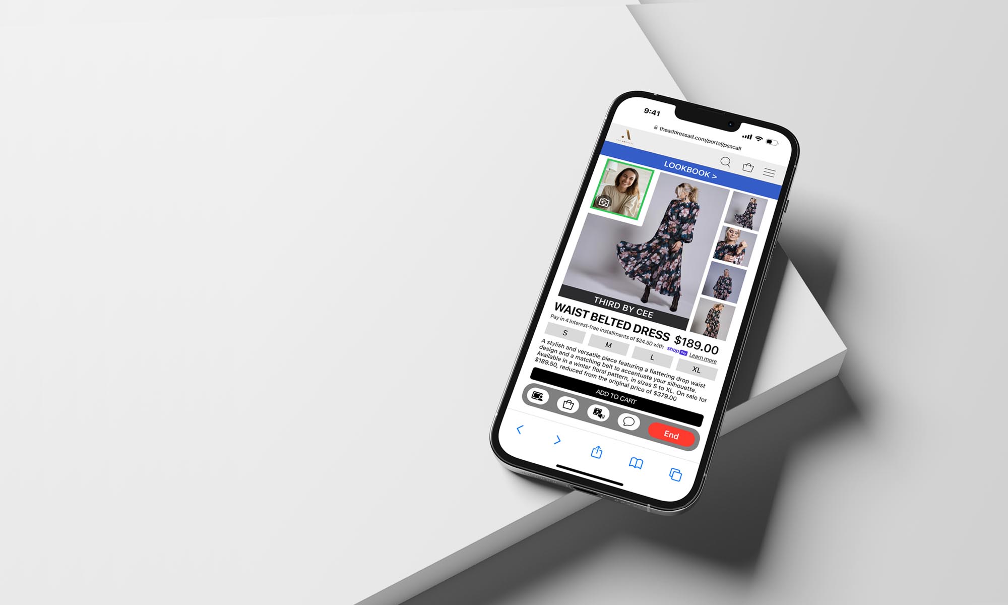
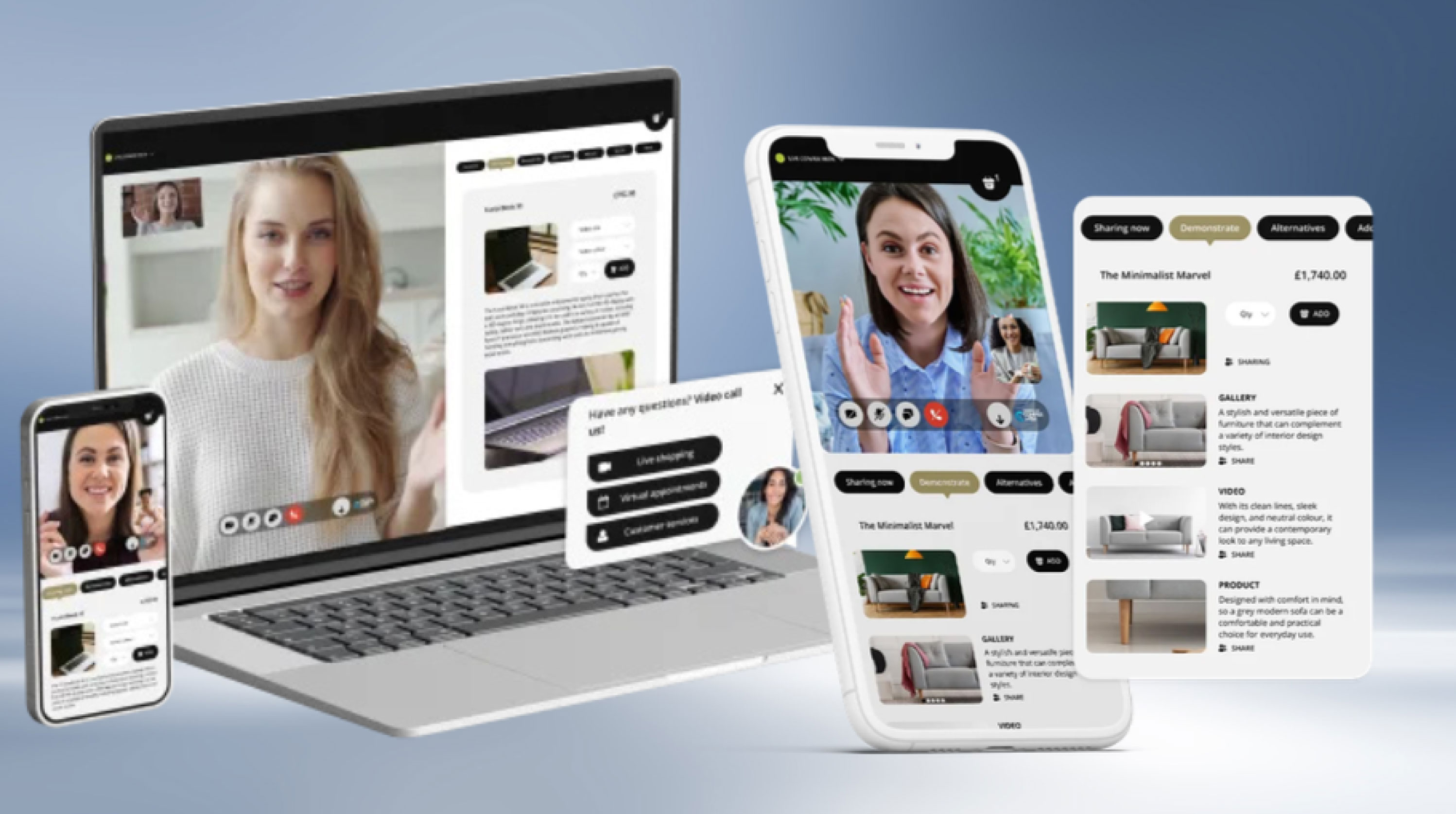
FINAL PROTOTYPE —
PROTOTYPE —
PROBLEM
Sales associates face low productivity during slow periods, missing opportunities to engage customers and increase sales.
SOLUTION
Design an app that enables sales associates to provide personalized shopping consultations utilizing the same sales techniques used for in-store shoppers.
MY ROLE
Through competitive analysis and user research design and develop a solution that provides seamless virtual consultations.
RESEARCH PLAN —
SCHEDULE —
— PHASE 1 —
DISCOVERY
PLAN RESEARCH
1. Formulate Research Plan
2. Define User Audience
CONDUCT RESEARCH
1. Competitive Lanscape
2. Secondary Research
RESEARCH SYNTHESIZE
1. User Personas
2. Empathy Mapping
3. Mood Board
— PHASE 2 —
DESIGN R1
DESIGN INFORMATION ARCHITECTURE
1. User Flow Red Routes
DESIGN IN LOW FIDELITY
1. Computer Wireframes
2. Group Critique
3. Combine Concepts
DESIGN PROTOTYPE
1. Refine Design & Incorporate
Prototype Functionality
— PHASE 3 —
VALIDATE R1
PREPARE TO TEST
1. Create Test Script
2. Identify & Book Test Users
CONDUCT TESTING
1. Conduct Remote Moderated
Usability Tests
SYNTHESIZE RESULTS
1. Create Usability Test Report
2. Address Errors
3. Present Concept to Client
— PHASE 4 —
DESIGN R2
DESIGN IN HIGH FIDELITY
1. Refine Design Based On
Usability Test Findings,
Group and Client Feedback
— PHASE 5 —
VALIDATE R2
PREPARE TO TEST
1. Create Modified Test Script
2. Identify & Book Test Users
CONDUCT TESTING
1. Conduct Remote Moderated
Usability Tests
SYNTHESIZE RESULTS
1. Create Usability Test Report
2. Address Errors
3. Present Concept to Client
— PHASE 6 —
DESIGN R3
ITERATE IN HIGH FIDELITY
1. Refine Design Based On
Usability Test Findings,
Group and Client Feedback
2. Final Presentation to Client
3. Handoff Final Deliverables
to Client
• Faith-conscious women 25-50
• Prefer elegant/modest fashion
• Desire a curated shopping experience
• Alignment with their beliefs & style
USER AUDIENCE
PRELIMINARY RESEARCH —
COMPETITIVE LANDSCAPE / COMPARISON —
APPLICATION FEATURE
Category
Video Shopping Type
Human Element
Integration Level
Key Features
Pricing
Best For
Example Use Cases
BOUTIQ PERSONAL VIDEO SHOPPING
Shopify App
1-to-1 personal video clienteling (instant or by appointment)
Yes - live video with real agents
Full Shopify sync (cart,
checkout, analytics)
Shoppable video, checkout sync, analytics, abandoned cart follow-up
From $90/month + usage fees
Sellers wanting personalized,
high-touch video shopping
Upselling fashion items via
live video sessions
IMMERSIVE SHOPPING & VIDEOS
Shopify App
Autonomous or human-assisted video commerce
Optional (Al-driven or pre-recorded)
Shopify store embedded
videos and product display
Shoppable recorded/live
videos, product demos
Not listed, contact for pricing
Stores needing interactive shoppable video without agents
DIY demonstrations or automated product walkthroughs
GUMSTACK
Service / Platform
1-to-1 live video shopping with brand ambassadors
Yes - real brand ambassadors
providing shop support
Website integration with
shoppable video calls
Brand ambassador matching, CSAT/PS tracking, instant help
Custom packages
Brands offering expert-led
personal shopping experience
Appliance or complex product
consultations via video
CONFER WITH
Service / Platform
Shoppable video, checkout sync, analytics, abandoned cart follow-up
Yes - on-demand agent via video
Web/app integration for
live video calls
1-click video, mobile-first,
callback scheduling
Not listed, contact for pricing
Stores needing fast on-site video
customer support
Virtual store visits or real-time
visual assistance
COMPETITIVE LANDSCAPE / ANALYSIS —
Analyzing the competitive landscape I identified strengths & weakness of the other products currently or the market offering similar services. The primary feature of all products was the video chat feature, but each was paired with different complimentary features.
DECISION FATIGUE FROM TOO MANY CHOICES: Displays client video, purchase history, sizing, spending trends, style notes, and curated recommendation showroom.
CLIENT EXPERIENCE: Half-screen video with cart access, checkout,
and showroom recommendations.
INSTANT OR SCHEDULED CALLS: Product pages include a "Start
Video Chat To See This" CTA for immediate or scheduled consultations.
ANALYTICS & SALES INTELLIGENCE: Tracks calls, conversions, sales
per call, AOV, and engagement metrics.
THIRD-PARTY INTEGRATIONS: Supports Klaviyo, Calendly, and Acuity
for seamless workflow.
AI LIVE CHAT & VIDEO SHOPPING: Provides real-time product assistance
and personalized recommendations.
RECORDED & LIVE SHOPPING EVENTS: Group video sales, interactive
product showcases, and PDP video integration.
CLIENT EXPERIENCE: 60% VS screen area, product catalog browsing, and
interactive tab navigation (Items Viewed, Suggested, Wishlist, Bag).
SALES ASSOCIATE DASHBOARD: Displays customer history, purchases,
and engagement data with quick actions for live interactions.
PRODUCT DETAIL & EVENT PAGES: Carousel images, stock availability,
material details, event thumbnails w/ reminders & sharing options.
SEAMLESS INTEGRATIONS: Connects with checkout systems, customer
service tools (Gorgias, Zendesk, Olark, Intercom, Tidio, LiveChat).
CLIENT EXPERIENCE: A basic video call interface with a pop-up product preview (name, price, and image) and Add to Cart CTA. No browsing, account linking, or product details.
NO PRODUCT INTEGRATION: Products are showcased exclusively through live video, requiring direct communication for details.
STORE AGENT DASHBOARD: Minimal functionality with "Search Products" and "Video Options" buttons. After a call, only agent contact, order details, and call summary are available.
LIMITED POST-CALL INTERACTION: Clients can rate the sales agent, provide feedback, cannot revisit products / shopping history.
CLIENT EXPERIENCE: 60% VS screen area, shared shopping cart (top-right), and a VSA tab bar for video, chat, and screen expansion. Lower 40% screen area shared content when VSA minimized.
SALES ASSOCIATE DASHBOARD: Identical top-screen layout with host controls (Sharing Now, Demonstrate, Alternatives) and a detailed product display (image, price, size, color, description, and Add to Cart).
SEAMLESS PRODUCT INTEGRATION: Both parties can add products to the cart, ensuring a more engaging, guided shopping experience.
SECONDARY RESEARCH —
NAME: American Dream
LOCATION: East Rutherford, New Jersey, USA
OWNER: Triple Five Group
WEBSITE: americandream.com
American Dream s premier retail and entertainment
complex located within the Meadowlands Sports Complex in East Rutherford, New Jersey. Spanning approximately 3 million square feet, it stands as one of the largest malls in the United States.
MISSION & VISION: American Dream aims to redefine
the shopping and entertainment experience by combining diverse retail options with world-class attractions, creating a destination that appeals to both local residents and tourists.
PRODUCTS & SERVICE: The complex offers a blend of
retail and entertainment.
RETAIL: Over 350 retail establishments, featuring
high-end luxury stores and diverse shopping options.
DINING: More than 100 dining venues, ranging from
casual eateries to fine dining.
ENTERTAINMENT: Features a variety of attractions.
• Nickelodeon Universe: An indoor theme park with various
rides and attractions.• DreamWorks Water Park: An expansive indoor water park
featuring attractions themed around popular Dream Works
franchises.• Big Snow American Dream: Indoor ski & snowboard park.
• The Rink: An NHL-sized ice-skating rink.
• Legoland Discovery Center: An interactive experience
for families and children.
• Sea Life Aquarium: A marine life attraction.
MARKET & INDUSTRY ANALYSIS: Strategically located
near New York City, American Dream attracts both local
visitors and tourists. Its unique ombination of retail and
entertainment positions it competitively within the retail
and amusement industries.
BUSINESS MODEL & REVENUE STREAMS:
American Dream generates revenue through:
• Retail Leasing: Income from leasing space to various retail
tenants.NAME: American Dream
LOCATION: East Rutherford, New Jersey, USA
OWNER: Triple Five Group
WEBSITE: americandream.com
American Dream s premier retail and entertainment
complex located within the Meadowlands Sports Complex in East Rutherford, New Jersey. Spanning approximately 3 million square feet, it stands as one of the largest malls in the United States.
MISSION & VISION: American Dream aims to redefine
the shopping and entertainment experience by combining diverse retail options with world-class attractions, creating a destination that appeals to both local residents and tourists.
PRODUCTS & SERVICE: The complex offers a blend of
retail and entertainment.
RETAIL: Over 350 retail establishments, featuring
high-end luxury stores and diverse shopping options.
DINING: More than 100 dining venues, ranging from
casual eateries to fine dining.
ENTERTAINMENT: Features a variety of attractions.
• Nickelodeon Universe: An indoor theme park with various
rides and attractions.• DreamWorks Water Park: An expansive indoor water park
featuring attractions themed around popular Dream Works
franchises.• Big Snow American Dream: Indoor ski & snowboard park.
• The Rink: An NHL-sized ice-skating rink.
• Legoland Discovery Center: An interactive experience
for families and children.
• Sea Life Aquarium: A marine life attraction.
MARKET & INDUSTRY ANALYSIS: Strategically located
near New York City, American Dream attracts both local
visitors and tourists. Its unique ombination of retail and
entertainment positions it competitively within the retail
and amusement industries.
BUSINESS MODEL & REVENUE STREAMS:
American Dream generates revenue through:
• Retail Leasing: Income from leasing space to various retail
tenants.• Ticket Sales: Revenue from admissions to entertainment
attractions.• Dining: Proceeds from a wide array of dining options.
• Special Events: Hosting events and performances in
dedicated spaces.
FINANCIAL OVERVIEW: In 2022. American Dream reported losses of $254.4 million. In November 2022, JPMorgan Chase extended a four-year extension on over $1.7 billion in con-
struction borrowings. American Dream Mall has faced signif-
icant financial challenges since its opening in October 2019.FINANCIAL LOSSES:
• 2021: The mall reported losses of nearly $60 million.
• 2022: Losses escalated to approximately $245 million, a
substantial increase from the previous year.DEBT AND LOANS:
• Construction Financing: Triple Five Group, the mall's
developer, secured about $1.1 billion in municipal bonds to
finance the $5 billion project.•Loan Extension: In November 2022, JPMorgan Chase
granted a four-year extension on repaying over $1.7
BOND PAYMENT ISSUES:
• August 2024: The mall made overdue interest payments on
$287 million of municipal bonds after more than two years
of delays.• February 2025: Bondholders did not receive expected
interest payments, indicating ongoing difficulties.
MARKETING & GROWTH STRATEGY: American Dream
focuses on offering a unique blend of shopping and entertain-
ment to differentiate itself from traditional malls. Marketing efforts target families, tourists, and shoppers seeking diverse experiences.CHALLENGES & RISKS: The complex has faced financial
challenges, including significant losses and reliance on
substantial financing. Additionally, the COVID-19 pandemic impacted operations and visitor numbers.
RECENT DEVELOPMENTS & ACHIEVEMENTS:
Complex opened in phases, initial debuting in October 2019
Secured a four-year extension on significant construction
loans in November 2022.
NAME: TheAddress
FOUNDED: February 2022
LOCATION: East Rutherford, New Jersey, USA
WEBSITE: theaddressad.com
A specialty department store curated for modest fashion
women of religious faith.
MISSION & VISION: TheAddress aims to provide an elevated shopping experience for the modest fashion community by offering a curated selection of sought-after brands and styles, catering to women, teens, and children.
PRODUCTS & SERVICES: The store offers a diverse range
of products, including:
• Women's Apparel: Dresses, tops, skirts, activewear,
swimwear, and outerwear.• Teens' and Kids' Clothing: Age-appropriate modest fashion
options.• Accessories: Makeup, hair accessories, jewelry & more.
• Home Goods: Various home-related products.
Featured brands include Adee, Adina Las Vegas, Adonis,
Aish Tamid Hat Boxes, A.I Stone, Apparalel, Artscroll, B7ac-
tive, Bliss, BNJR Teen Collection, Byrd, By Tess, and more.
MARKET & INDUSTRY ANALYSIS: As the first depart-
ment store in the U.S. specifically designed for the modest fashion consumer, TheAddress fills a unique niche in the retail in market. The modest fashion industry has seen significant growth, with increasing demand for stylish yet conservative clothing options. By offering a wide range of products and brands under one roof, heAddress appeals to a diverse clientele seeking quality and variety in modest fashion.BUSINESS MODEL & REVENUE STREAMS: Operating
both an online platform and a physical store located within
the American Dream mall, heAddress generates revenue
through:
• Retail Sales: In-store and online purchases of clothing, of
accessories, and home goods.
• Brand Partnerships: Collaborations with various brands
to offer exclusive collections.MARKETING & GROWTH STRATEGY:
TheAddress focuses on community engagement and brand awareness through:
• Social Media Presence: Active engagement on platforms
like Instagram.
• In-Store Events: Hosting events to attract /retain
customers.• Expansion Plans: Phased rollouts of new departments,
including bridalwear and giftware, to continually enhance
the shopping experience.CHALLENGES & RISKS: As a relatively new entrant in the
retail market, TheAddress faces challenges such as:
• Market Competition: Competing with established
retailers and online platforms.• Economic Factors: Navigating economic downturns
that may affect consumer spending.RECENT DEVELOPMENTS & ACHIEVEMENTS:
• Store Launch: Opened in phases, starting with women's
clothing, followed by teens' and kids' departments, and
plans for bridalwear and giftware.
Location: Situated within the American Dream mall, offering extended store hours to accommodate diverse schedules.
1) Upsy Shopping. "Virtual Shopping Assistants vs. Chatbots - What's the Difference?" Upsy Shopping, upsyshopping.com/virtual-shopping-assistants-vs-chatbots/. Accessed 26 Feb. 2025.
2) Scoop Market Research. "Virtual Assistant Statistics." Scoop Market Research, scoop. market.us/virtual-assistant-statistics/. Accessed 26 Feb. 2025.
3) Barron'. "Black Friday Shopping & Cyber Monday Trends." Barron's, 2024, www.barrons.com/articles/black-friday-shopping-cyber-monday-d31144da. Accessed 26 Feb. 2025.
4) Credence Research. "Virtual Shopping Assistant Market Report." Credence Research, 2024, www.credenceresearch.com/report/virtual-shopping-assistant-market. Accessed 26 Feb. 2025.
5) CrossML. "AI Virtual Assistants in Retail." CrossML, 2023, www.crossml.com/ai-virtual-assistants-in-retail/. Accessed 26 Feb. 2025.
6) Reuters. "Al-Influenced Shopping Boosts Online Holiday Sales, Salesforce Data Shows." Reuters, 6 Jan. 2025, www.reuters.com/business/retail-consumer/ai-influenced-shop-
ping-boosts-online-holiday-sales-salesforce-data-shows-2025-01-06/. Accessed 26 Feb. 2025.
RESEARCH SYNTHESIS —
PERSONAS —
Generating personas helped to keep the user's needs central during the design process & improved decision making by filtering the choices through the target user's perspective.
NAME & AGE: MIRIAM / 28
OCCUPATION: HOMEMAKER
EDUCATION: BACHELOR OF ARTS
SHOPPING FREQ: WEEKLY
MARITAL STATUS: MARRIED
CHILDREN: 2 BOYS / 2 GIRLS
INCOME: $120,000/YEAR
"I need a one-stop shop for
stylish, modest fashion for
my entire family.'
PSYCHOGRAPHICS
• Values faith-based living &
prioritizes modesty in fashion
choices for herself & her
daughters.• Enjoys quality, stylish clothing
that aligns with religious
principles.• Prefers shopping at stores that
provide a welcoming, commu-
nity oriented environment.BEHAVIORS
• Shops frequently for family
clothing, especially for Shabbat
and holidays.• Seeks durable and comfortable
clothing for daily wear and spe-
cial occasions.
• Engages with brands that align
with her values, often discover-
ing them through social media.
PAIN POINTS
• Difficulty finding modest
clothing that is both fashion-
able and high-quality.• Struggles with inconsistent
sizing across different brands.
• Prefers in-store shopping but
has limited time due to family
responsibilities.GOALS & MOTIVATIONS
• Wants a single destination
where she can shop for herself
and her children.• Looks for brands that balance
style, comfort, and faith-based
modesty.
• Appreciates a shopping experi-
ence that feels tailored to her
needs as a busy mother.
NAME & AGE: SARAH / 27
OCCUPATION: HR DIRECTOR
EDUCATION: MA BUS ADMIN
SHOPPING FREQ: BI-MONTHLY
MARITAL STATUS: ENGAGED
CHILDREN: NONE
INCOME: $85,000/YEAR
"Elegant, modest fashion should
be effortless and perfect for both the office and social events.'PSYCHOGRAPHICS
• Values modern modest fashion
that fits both professional andsocial settings.
• Interested in ethically sourced
and sustainable fashion.• Prefers shopping at high-end,
faith-conscious brands.BEHAVIORS
• Shops primarily online but
visits stores for special events
and sales.• Invests in high-quality, timeless
pieces rather than fast fashion.
• Prefers minimal, elegant styles
that transition from work to
social occasions.
PAIN POINTS
• Struggles to find modest busi-
ness attire that is trendy yet
professional.• Limited access to in-store
shopping due to a demanding
work schedule.• Finds it difficult to locate high-
quality modest brands in main-
stream department stores.GOALS & MOTIVATIONS
• Seeks a shopping experience
that offers both convenience
and exclusivity.• Values curated collections that
align with her personal style.
• Wants access to exclusive
modest fashion brands in one
location.
NAME & AGE: RIVKA / 23
OCCUPATION: STUDENT
EDUCATION: BA FASHION
SHOPPING FREQ: MONTHLY
MARITAL STATUS: SINGLE
CHILDREN: NONE
INCOME: $20,000/YEAR
"Modest fashion can be trendy too, I want stylish options that reflect
my personality."
PSYCHOGRAPHICS
• Enjoys experimenting w/ mod-
est fashion trends while main-
taining religious guidelines.• Highly engaged in social media,
following modest influencers
and fashion brands.• Prefers shopping experiences
that feel fresh, youthful, and
community-driven.
BEHAVIORS
• Frequently shops tor casual
and social -event outfits.• Engages in online shopping but
prefers in-person experiences
for inspiration.• Shares her fashion finds on
social media, influencing her
peers.
PAIN POINTS
• Limited budget for premium
modest brands.
• Finds some modest styles out-
dated or not aligned with youth-
ful trends.
• Struggles to find modest
activewear and swimwear
options.GOALS & MOTIVATIONS
• Wants affordable, stylish
modest fashion that reflects
her personality.• Seeks an inclusive and trendy
shopping environment catering
to younger women.
• Enjoys community-driven
events, such as modest fashion
shows or influencer meetups.NAME & AGE: CHAYA / 50
OCCUPATION: COUNSELOR
EDUCATION: BA SOCIAL WORK
SHOPPING FREQ: MONTHLY
MARITAL STATUS: MARRIED
CHILDREN: 2 GROWN
INCOME: $60,000/YEAR
"I invest in timeless, high-end modest fashion that aligns with my values and lifestyle.'
PSYCHOGRAPHICS
• Invests in high-end, timeless
modest fashion for professional
and social settings.
• Strong advocate for supporting
faith-based businesses and de-
signers.
• Prefers classic styles over fast
fashion trends.
BEHAVIORS
• Shops for sophisticated,
elegant attire for events and
community engagements.• Prefers boutique-style
customer service with person-
alized shopping assistance.• Attends in-store events, such
as fashion launches and charitygalas.
PAIN POINTS
• Limited access to high-end
modest designers in main-
stream department stores.• Struggles to find occasion wear
that aligns with her religious
standards.
• Prefers in-person shopping ex-
periences but needs efficient
service due to a busy schedule.
GOALS & MOTIVATIONS
• Wants a refined shopping
experience with exclusive mod-
est brands.• Seeks elegant styles that
reflect both her faith and
professional standing.• Enjoys supporting businesses
that align with her values
NAME & AGE: DEVORAH / 30
OCCUPATION: HOMEMAKER
EDUCATION: AA ECE
SHOPPING FREQ: BI-WEEKLY
MARITAL STATUS: MARRIED
CHILDREN: EXPECTING
INCOME: $90,000/YEAR HI
"I need fashionable yet practical modest clothing for motherhood, from maternity to everyday wear."
PSYCHOGRAPHICS
• Values practical yet stylish
modest clothing for herself and
her growing family.
• Focuses on high-quality, long -
lasting pieces.• Enjoys shopping as part of self-
care & community engagementBEHAVIORS
• Regularly shops for both
maternity and postpartum-
friendly modest fashion.• Engages with faith-based influ-
encers for modest fashion
inspiration.• Prefers shopping in stores
where she can touch and feel
fabrics before purchasing.PAIN POINTS
• Limited options for stylish
maternity and nursing-friendly
modest clothing.• Difficulty finding affordable,
high-quality modest fashion for
different life stages.
• Navigating modest activewear
options that balance function
and faith-based values.GOALS & MOTIVATIONS
•Wants convenient, all-in-one
shopping for herself and her
child.
• Seeks fashionable yet comfort-
able modest options.
• Enjoys a welcoming, family
friendly shopping environment.
EMPATHY MAPPING —
Creating empathy mapping helped in understanding the users emotions, perspectives, and motivations far beyond what the secondary research established.
SAY & DO
• Shops for family clothing, especially for Shabbat &
holidays.• Buys in bulk when finding a reliable modest fashion
brand.• Seeks inspiration religious & social media
communities.HEAR
• Friends discussing where to find the best modest
clothing.• Faith-based influencers promoting brands w/
religious values.• Children requesting comfortable yet stylish outfits for
school and events.
SEE
• Limited stylish modest fashion in mainstream stores.
• Inconsistent sizing across different brands.
• Other mothers also struggling to find fashionable,
faith-aligned clothing.
THINK & FEEL
• Shopping should be convenient/efficient for busy
mothers.• Quality and durability are just as important as
aesthetics.• Modest fashion should be stylish, comfortable, &
reflective of my faith.GAIN
• A one-stop shop with stylish, modest clothing for herself & her kids.
• Brands that consistently offer modest, comfortable & durable fashion.
• A welcoming shopping experience catering to busy mothers.
PAIN
• Difficulty finding modest clothing that is both high-quality & fashionable.
• Struggles with inconsistent sizing across different brands.
• Prefers in-store shopping but limited time due to family responsibilities.
SAY & DO
• Shops online - convenience / visits stores - exclusive
for special events.• Follows faith-conscious & sustainable fashion brands.
• Invests in timeless, high-quality pieces, not fast
fashion.HEAR
• Colleagues complimenting her elegant, modest outfits.
• Influencers covering sustainable & high-end modest
brands.• Peers recommending exclusive shopping events
SEE
• Online stores with inconsistent quality and fit.
• Luxury brands lacking modest yet fashionable work
attire.• Limited professional modest fashion options in main
stream stores.
THINK & FEEL
• Modest fashion should be professional, stylish, &
versatile.• Ethical & sustainable fashion is a priority in my
purchases.• Convenience and exclusivity matter when shopping
for high-end fashion.GAIN
• A curated shopping experience offering exclusivity and convenience.
• Access to high-quality, faith-conscious fashion in one location.
• Stylish, modest clothing that transitions from work to social settings.
PAIN
• Hard to find trendy yet professional modest businesswear.
• Limited time for in-store shopping due to a demanding schedule.
• Few mainstream retailers offer high-end modest fashion options.
SAY & DO
• Frequently shops for casual and social -event outfits.
• Posts fashion finds on social media, influencing her
peers.• Prefers in-store shopping for inspiration but buys
online for the best deals.HEAR
• Peers talking about trendy but modest outfit
inspirations.• Brands promoting fast fashion over modest
alternatives.• Online communities sharing shopping hacks for
modest apparel styles.SEE
• Social media influencers showcasing stylish modest
outfits.• Limited affordable modest fashion options in most
stores.• Friends experimenting with modest fashion but strug-
gling to find trendy styles. a with Shon butTHINK & FEEL
• Modest fashion should be trendy, youthful, and
expressive.• Shopping should be fun, inclusive, and community-
driven.• Staying within budget while keeping up with fashion
trends is challenging.
GAIN
• Affordable, stylish modest fashion that reflects her personality.
• A trendy shopping environment catering to young women.
• Access to community-driven fashion events and influencer meetups.
PAIN
• Limited budget for high-end modest brands.
• Struggles to find activewear and swimwear that align with her faith.
• Many modest styles feel outdated for young shoppers.
SAY & DO
• Shops monthly for sophisticated, occasion-appropriate
attire.• Attends fashion launches, charity events & social
gatherings.• Prefers boutique-style customer service and
personalized shopping experiences.HEAR
• Boutique owners discussing exclusive fashion
collections.• Community members admiring her refined fashion
choices.• Fashion consultants recommending timeless modest
styles.SEE
• Limited availability of luxury modest fashion in stores.
• Exclusive in-store events showcasing elegant designs.
• Faith-based stores promoting modest, high-end
fashion.THINK & FEEL
• Fashion should reflect both professionalism and
faith.• High-end modest designers should be more
accessible.• Shopping should be efficient yet enjoyable.
GAIN
• An exclusive shopping experience tailored to her refined taste.
• Elegant styles that align with her faith and professional standing.
• A seamless, personalized service that enhances shopping efficiency.
PAIN
• Limited access to luxury modest brands in mainstream retail.
• Struggles to find high-quality occasion wear meeting religious standards.
• Needs efficient in-person shopping due to a demanding schedule.
SAY & DO
• Shops bi-weekly for maternity, nursing & baby apparel.
• Prefers in-store shopping to assess fabric quality & fit.
• Engages w/modest fashion influencers for
recommendations.HEAR
• Friends discussing challange finding modest maternity
wear.• Influencers recommending modest brands for
mothers.• Sales associates suggesting fabrics & fits for
postpartumSEE
• Limited stylish maternity & nursing-friendly modest
options.• Mothers struggling to find faith-aligned, practical
clothing.
• Faith-based influencers promoting modest fashion
brands.THINK & FEEL
• Shopping should be convenient & efficient for a busy
mother.• Clothing should be high-quality, long-lasting &
comfortable.• Modest maternity / postpartum clothing should be
stylish and functional. u clothing should be stylishGAIN
• A one-stop shop for herself and her child's modest fashion needs.
• Comfortable yet stylish clothing for different life stages.
• A welcoming, family-friendly shopping environment.
PAIN
• Few maternity and nursing-friendly modest clothing options.
• Struggles to find affordable yet high-quality modest fashion.
• Limited activewear options that balance function and modesty.
MOOD BOARD +
A mood board was created to help with the ideation process by beginning to organize and communicate a particular aesthetic and serve as a source of inspiration. Creating this visual representation of desired goals or tasks the product would accomplish is an invaluable resource during the initial steps of the design process.
"Personal video shopping
consultations would allow me to
shop more frequently given my busy
work schedule." — Sarah
INFORMATION ARCHITECTURE —
USER FLOW RED ROUTES —
Creating empathy mapping helped in understanding the users emotions, perspectives, and motivations far beyond what the secondary research established.
LOW FIDELITY DESIGNS —
WIREFRAMES —
Designing wireframes based on the user flow blueprints helped to maintain focus on the structure, layout, and functionality. Wireframes are the first visual culmination of the preliminary research phase of the design process, and help to maintain focus on the structure over visual aesthetics.
HIGH FIDELITY DESIGNS R1 —
PROTOTYPE —
One of the most exciting and rewarding stages of the design process is the creation of the first iteration of nigh fidelity mock-ups. Seeing everything come together in color with more refined details is the moment where the product design comes to life. This first iteration is a direct reflection of the amount of time and effort put into the previous stages.
"The sizing page was clear
and straightforward, I didn't
see the need for the body
shape questions." — Christina
USABILITY TESTING THE PROTOTYPE REVEALED
Survey participants felt
the curated outfit example section needed to offer a more diverse selection of styles/outfits.
Survey participants felt
the curated outfit example section needed to offer a more diverse selection of styles/outfits.
Respondents directly or indirectly communicated a desire for a larger product area within each screen over the video caller image.
Respondents directly or indirectly communicated a desire for a larger product area within each screen over the video caller image.
Participants felt having the ability to upload images of their wardrobe or types of clothing they were seeking was very attractive feature.
Participants felt having the ability to upload images of their wardrobe or types of clothing they were seeking was very attractive feature.
Survey participants acknowledged how useful the service could be and how it could increase their purchasing frequency.
Survey participants acknowledged how useful the service could be and how it could increase their purchasing frequency.
VALIDATE R1 —
USABILITY TEST REPORT —
Usability testing of the first high-fidelity prototypes revealed that while participants could navigate the sales associate call interface with ease, the small screen space allocated to the apparel archive, Shop Together, and media share features caused visual strain and hindered comprehension. Participants also noted issues with the proximity of the call toolbar to other menus and the small font size of product descriptions. Based on this feedback, the design was refined to prioritize sales-driving features by expanding their screen presence, simplifying navigation, and improving visual hierarchy. Adjustments included making customer intake information and the apparel archive more accessible within the dashboard, replacing the gradient navigation with the standard branded menu for consistency, and adding clearer call initiation options within the appointment workflow.
ERROR RATING
PROBLEM
SOLUTION
CRITICAL
The space showcasing the presented products should be larger than the video feed area.
Rework design/layout so that the product section is the hero of each screen.
MINOR
Curated outfits "None match my preferences."
Update examples to include a more diverse selection
MINOR
Would more likely to use if available the same day.
Maybe offer "Drop in today section" for same day app.
MINOR
Having entered pertinent sizing information, questioned the need for "Describe my body shape." follow section.
Remove the "Describe my body shape," since the all it provides is additional descriptive value.
MINOR
Questioned the need for intake areas other than size information and brand preference for conusltation.
Possibly make the other intake information areas an option left up to the individual scheduling.
NORMAL
On a video call is there a need for chat?
Yes, to provide recordable information such as sizing….
HIGH FIDELITY DESIGN R2 —
PROTOTYPE —
Incorporating feedback from usability testing participants, fellow team members, and the client, a second iteration of high-fidelity mock-ups were developed with significant refinements. Insights from usability tests and team members highlighted areas that needed better clarity, accessibility, and usability. These perspectives helped shape a more intuitive, visually balanced & functionally effective design for the next phase of development.
VALIDATE R2 —
USABILITY TEST REPORT —
In the second round of usability testing, participants completed tasks smoothly without visual strain, showing that typography improvements enhanced readability. They requested additional intake details, such as contact numbers, mailing addresses, and payment information, while also expressing confusion between the Apparel Archive and Shop Together features. Although participants praised the media share tool for its potential to create virtual in-store experiences, it was removed due to internal team concerns. Significant redesigns to the intake and scheduling flows led to the omission of brand preference selection, a feature that could have improved personalization for the store’s niche, faith-based customer base but was ultimately excluded despite its relevance.
ERROR RATING
PROBLEM
SOLUTION
CRITICAL
Buttons not working correctly in intake process.
Fix prototype linking, make sure all CTA's are functional
MINOR
Intake process could be simplified and shortened.
Rework user flow to reduce number of screens in intake.
MINOR
Provide ability to select colors from color wheel, instead of a set selection of colors.
Rework intake screen to replace the selection of colors with a color wheel that allows users to select their own.
FINAL PROTOTYPE —
PROTOTYPE —
THE RUNDOWN —
WHAT I LEARNED —
Working on the American Dream shopping mall’s The Address project allowed me to apply the product development process I learned through the Springboard program while collaborating with a team of designers under real-world project constraints. Collaborating from the ideation stage through to high-fidelity design enabled us to create a more robust, innovative, and user-centered solution by incorporating diverse perspectives. This collaborative approach also accelerated the project timeline, allowing us to develop a successful user-centered MVP much faster than a single designer could have on their own.
WHAT IT SOLVED —
The browser-based solution we developed addressed the store’s challenge of utilizing slow customer traffic periods by enabling sales associates to provide personalized shopping consultations remotely, allowing customers to shop from the comfort of their own homes during these times. By implementing a service model that required customers to pay a deposit, which could be applied toward any purchases made as a result of the consultation but retained if no purchase was made, allowing the store to continue generating revenue even during low traffic periods.


Interested in connecting?
Let’s talk projects, collaborations, or anything design!
Interested in connecting?
Let’s talk projects, collaborations, or anything design!

Interested in connecting?
Let’s talk projects, collaborations, or anything design!
Interested in connecting?
Let’s talk projects, collaborations, or anything design!