

WHAT IF ART PATRONS HAD CONCISE, CLEAR ARTWORK INFO THAT ENHANCED VISITS & ALLOWED DEEPER FOLLOW-UP
WHAT IF ART PATRONS HAD CONCISE, CLEAR ARTWORK INFO
THAT ENHANCED VISITS & ALLOWED DEEPER FOLLOW-UP
WHAT IF ART PATRONS HAD CONCISE, CLEAR ARTWORK INFO
THAT ENHANCED VISITS & ALLOWED DEEPER FOLLOW-UP
PROBLEM
Museum patrons struggle to access clear and engaging information about artwork, limiting their ability to enjoy an enriching experience despite lots of online resources.
SOLUTION
Develop an app that makes artwork information easily accessible and presents it in an easy to consume concise format, while providing the option to learn more.
MY ROLE
Develop a minimum viable product
through a five day Google Venture Design Sprint format.
DESIGN SPRINT PLAN —
5 DAY CALENDAR —
— SPRINT DAY 1 —
MAP
UNDERSTAND
• DEFINE TARGET AUDIENCE
MAP
• MAP END-TO-END EXPERIENCE
• Explore mapping options
• Select 1
— SPRINT DAY 2 —
SKETCH
LIGHTNING DEMOS
• COMPETITIVE LANDSCAPE ANALYSIS
CRAZY 8'S
• SKETCH OPTIONS FOR MAIN SCREEN
— SPRINT DAY 3 —
DECIDE
SELECT CONCEPT
• SELECT 1 CONCEPT FROM CRAZY 8's
STORYBOARD
• CREATE RED ROUTE STORYBOARD
— SPRINT DAY 4 —
PROTOTYPE
Design Prototype
• DESIGN FIGMA PROTOTYPE
— SPRINT DAY 5 —
TEST
VALIDATE DESIGN
• CONDUCT USABILITY TESTING

"I don't need to know
everything, just don't want
to feel like I was missing out
on something." — Angela
"I don't need to know
everything, just don't want
to feel like I was missing out
on something." — Angela
SPRINT DAY 1 —
TARGET AUDIENCE —
Prior to mapping the MVP it was important to outline key areas of the target audience to keep a user centered approach.

PERSONA:
• Angela / 23 / Jr. Art Director
LOCATION:
• New York. NY
BEHAVIOR:
• Goes to trending/popular museums, says doesn't
look at specific exhibits or artist.
• Views whatever is being showcased.
• Typically goes alone.
FRUSTRATIONS:
• Want to be more informed about artists &
artworks, more enriching experience.
• Tried in past to obtain information, due to
length/format lost interest and didn't read.
GOALS:
• To be able to get QUICK information (key facts, highlights, rundown.) for optimal experience.
QUOTES:
• "I enjoy going to the museum, but I often leave
feeling like didn't appreciate the art to it's full
potential."
• "I don't need to know everything; just don't want
to feel like was missing out on something."
MAPPING THE MVP —
The first step in the GVDS was to map the minimum viable product outlining the necessary steps to solve the problem.
MAPPING
THE MVP

OPEN
01
PATRON ENTERS VENUE & OPENS GALLERYPAL
Geolocation services fill the home screen with venues and/or events in the area.
Banner for current museum shown and selected.

SELECT
VENUE
02
MUSEUM INFO PAGE & EXHIBITION SELECTED
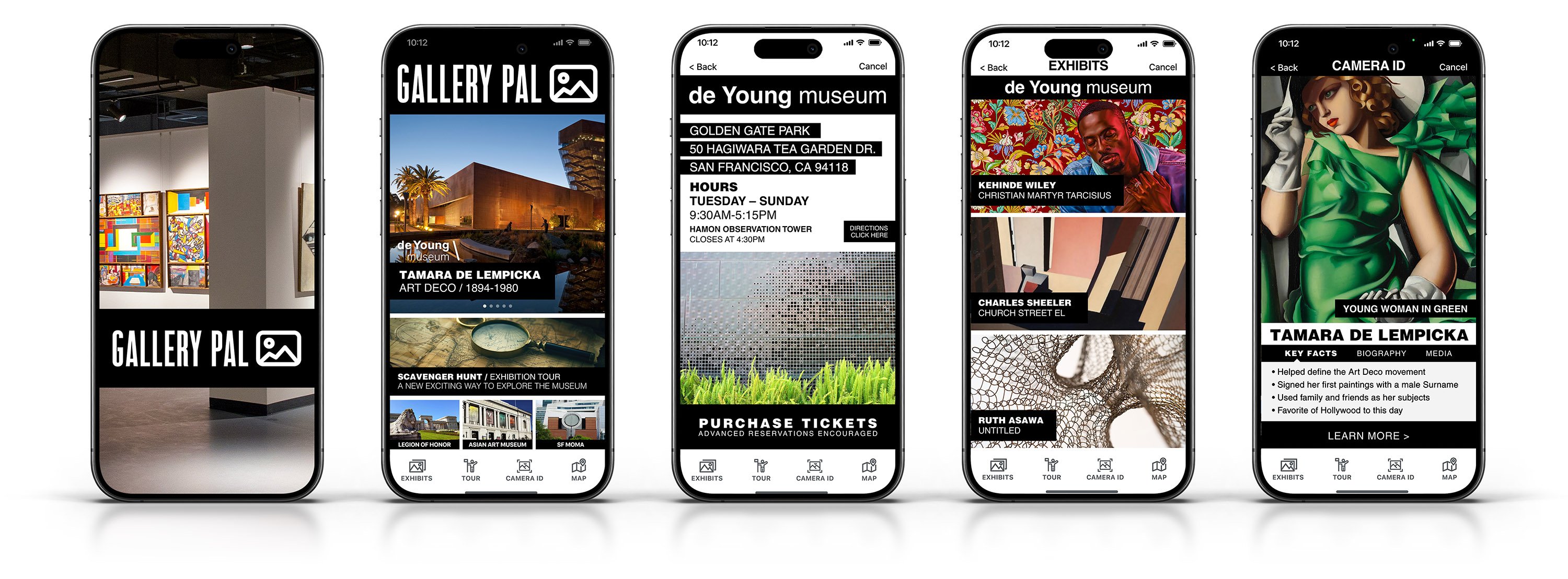
The museum information page shows hours, address, and provides the ability to purchase tickets. Clicking the Exhibition tab option shows all current exhibitions.

CAMERA
ID ART
03
CAMERA ID ARTWORK
Only interested in certain pieces patron does not follow typical order. As a result doesn't want to scroll through exhibit to find current piece viewing. Click the Camera ID tab and takes picture of artwork.

KEY
FACTS
04
ARTWORK ID KEY FACTS
Artwork identified and user presented with key facts, bullet bio, media and the option to learn more through a variety of resources if desired.

LEARN
MORE
05
QUICK ACCESS TO INFO, LEARN MORE....
User is quickly presented with key facts in no time with such ease that they decide to explore more detailed information about the artwork/ artist through the Learn More option the resources it provides.
SPRINT DAY 2 —
COMPETITIVE LANDSCAPE ANALYSIS —
There are few applications available on the iOS App Store, likely because most museums sell audio- guided tours at a premium.
Existing apps are primarily limited to major institutions such as
the Metropolitan Museum of Art, Vatican Museums, and the Louvre Museum Visitor Guide. Closes options available were Google Arts
& Culture, The Met, and Walt Disney Family Museum.
APPLICATION FEATURE
iOS App Store Rating
Cost to Use (App)
User Reviews & Ratings
Reservation Booking
Search Filters
Mapping & Directions
Ticket Purchasing
Camera Artwork Identification
Offline Access
Customized Tour Creation
GOOGLE ARTS & CULTURE

4.6 / 5
FREE
THE MET

4.8 / 5
FREE
WALT DISNEY FAMILY MUSEUM

4.7/ 5
FREE
I found inspiration from the Disney+ interface design that had minimal text and relied on images and icons. An approach that would allow users to easily navigate while out and on the go, and not having to read mice copy to operate.


CRAZY 8'S —
After completing the lighting demos I gained a better understanding of the style of information architecture employed by
similar applications. All the apps also utilized a similar style of home screen design with the main panel at the top with a hero
image or an image carousel. Below the main panel there is typically text base information set in banners or cells with multiple
call to action buttons to explore more detailed information.

The lightning demos gave me a solid grid structure and information architecture/ visual hierarchy style to emulate during the Crazy 8's sketching. I explored two distinct design structures in my sketching for the critical screen of the MVP. The other design structure was utilized as the screen for the exhibitions currently featured, that precedes the critical screen (the critical screen being screen with key facts about current artwork being viewed).

PROBLEM
PROBLEM
Museum patrons struggle to access clear and engaging information about artwork, limiting their ability to enjoy an enriching experience despite abundance of online resources.
Museum patrons struggle to access clear and engaging
information about artwork, limiting their ability to enjoy an
enriching experience despite abundance of online resources.
SOLUTION
SOLUTION
Develop an app that makes artwork information easily accessible and presents it in an easy to consume concise format, while providing the option to learn more in depth.
Develop an app that makes artwork information easily accessible and presents it in an easy to consume concise format, while providing the option to learn more in depth.
MY ROLE
MY ROLE
Develop a minimum viable product through a five day Google Venture Design Sprint format.
Develop a minimum viable product through a five day Google Venture Design Sprint format.
DESIGN SPRINT PLAN —
5 DAY CALENDAR —
— SPRINT DAY 1 —
MAP
UNDERSTAND
• DEFINE TARGET AUDIENCE
MAP
• MAP END-TO-END EXPERIENCE
• Explore mapping options
• Select 1
— SPRINT DAY 2 —
SKETCH
LIGHTNING DEMOS
• COMPETITIVE LANDSCAPE ANALYSIS
CRAZY 8'S
• SKETCH OPTIONS FOR MAIN SCREEN
— SPRINT DAY 3 —
DECIDE
SELECT CONCEPT
• SELECT 1 CONCEPT FROM CRAZY 8's
STORYBOARD
• CREATE RED ROUTE STORYBOARD
— SPRINT DAY 4 —
PROTOTYPE
Design Prototype
• DESIGN FIGMA PROTOTYPE
— SPRINT DAY 5 —
TEST
VALIDATE DESIGN
• CONDUCT USABILITY TESTING
SPRINT DAY 1 —
TARGET AUDIENCE —
Prior to mapping the MVP it was important to outline the target audience to keep a user centered approach.
PERSONA:
• Angela / 23 / Jr. Art Director
LOCATION:
• New York. NY
BEHAVIOR:
• Goes to trending/popular museums, says doesn't
look at specific exhibits or artist.
• Views whatever is being showcased.
• Typically goes alone.
FRUSTRATIONS:
• Want to be more informed about artists & artworks,
more enriching experience.
• Tried in past to obtain information, due to length
and format lost interest and didn't read.
GOALS:
• To be able to get QUICK information (key facts, highlights, rundown.) for optimal experience.
QUOTES:
• "I enjoy going to the museum, but I often leave
feeling like didn't appreciate the art to it's full
potential."
• "I don't need to know everything; just don't want
to feel like was missing out on something."
MAPPING THE MVP —
The first step was to map the minimum viable product outlining the necessary steps to solve the problem.
MAPPING
THE MVP
OPEN
01
PATRON ENTERS VENUE & OPENS GALLERYPAL
Geolocation services fill the home screen with venues and/or events in the area. Banner for current museum shown and selected.
SELECT
VENUE
02
MUSEUM INFO PAGE & EXHIBITION SELECTED
The museum information page shows hours, address, and provides the ability to purchase tickets. Clicking the Exhibition tab option shows all current exhibitions.
CAMERA
ID ART
03
CAMERA ID ARTWORK
Only interested in certain pieces patron does not follow typical order.
As a result doesn't want to scroll through exhibit to find current piece viewing. Click the Camera ID tab and takes picture of artwork.
KEY
FACTS
04
ARTWORK ID KEY FACTS
Artwork identified and user presented with key facts, bullet bio, media and the option to learn more through : variety of resources if desired.
LEARN
MORE
05
QUICK ACCESS TO INFO, LEARN MORE...
User is quickly presented with key facts in no time with such ease that they decide to explore more detailed information about the artwork/artist through the Learn More option the resources it provides.
DESIGN SPRINT PLAN —
5 DAY CALENDAR —
— SPRINT DAY 1 —
MAP
UNDERSTAND
• DEFINE TARGET AUDIENCE
MAP
• MAP END-TO-END EXPERIENCE
• Explore mapping options
• Select 1
— SPRINT DAY 2 —
SKETCH
LIGHTNING DEMOS
• COMPETITIVE LANDSCAPE ANALYSIS
CRAZY 8'S
• SKETCH OPTIONS FOR MAIN SCREEN
— SPRINT DAY 3 —
DECIDE
SELECT CONCEPT
• SELECT 1 CONCEPT FROM CRAZY 8's
STORYBOARD
• CREATE RED ROUTE STORYBOARD
— SPRINT DAY 4 —
PROTOTYPE
Design Prototype
• DESIGN FIGMA PROTOTYPE
— SPRINT DAY 5 —
TEST
VALIDATE DESIGN
• CONDUCT USABILITY TESTING
SPRINT DAY 2 —
COMPETITIVE LANDSCAPE ANALYSIS —
There are few applications available on the iOS App Store, likely because most museums sell audio- guided tours at a premium. Existing apps are primarily limited to major institutions such as the Metropolitan Museum of Art, Vatican Museums, and the Louvre Museum Visitor Guide. Closes options available were Google Arts & Culture, The Met, and Walt Disney Family Museum.
APPLICATION FEATURE
iOS App Store Rating
Cost to Use (App)
User Reviews & Ratings
Reservation Booking
Search Filters
Mapping & Directions
Ticket Purchasing
Camera Artwork Identification
Offline Access
Customized Tour Creation
GOOGLE ARTS & CULTURE
4.6 / 5
FREE
THE MET
4.8 / 5
FREE
WALT DISNEY FAMILY MUSEUM
4.7/ 5
FREE
I found inspiration from the Disney+ interface design that had minimal text and relied on images and icons. An approach that would allow users to easily navigate while out and on the go not having to read mice copy to operate.
CRAZY 8's —
After completing the lighting demos I gained a better understanding of the style of information architecture employed by similar applications. All the apps also utilized a similar style of home screen design with the main panel at the top with a hero image or an image carousel. Below the main panel there is typically text base information set in banners or cells with multiple call to action buttons to explore more detailed information.
The lightning demos gave me a solid grid structure and information architecture/ visual hierarchy style to emulate during the Crazy 8's sketching. I explored two distinct design structures in my sketching for the critical screen of the MVP. The other design structure was utilized as the screen for the exhibitions currently featured, that precedes the critical screen (the critical screen being screen with key facts about current artwork being viewed).

"Love the learn more feature to access more detailed information later…" — Rachel
SPRINT DAY 4 —
DESIGN PROTOTYPE —
On the fourth day a functional prototype was designed utilizing the Crazy 8 sketches & storyboard sketches as a blue print.

SPRINT DAY 5 —
TESTING PARTICIPANTS —
• Above 30 years of age.
PARTICIPANT: Ryan
PROFESSION: Firefighter
MUSEUM VISIT FREQUENCY: 1-2 a year
atmost. Typically attends when invited by others. Enjoys going but not something he would typically do. Often for dates or with family occasionally.
PARTICIPANT: Rachel
PROFESSION: Marketing Manager
MUSEUM VISIT FREQUENCY: 5-6 visits a year at least. Traveling for work provides op-
portunity to visit a variety of museums, galleries, installations throughout the country.
PARTICIPANT: MIchelle
PROFESSION: Graphic Designer
MUSEUM VISIT FREQUENCY: 1 a year. Typically, with out-of-town family or friends when showing he bay area. Attends smaller artist events several times a year though.
PARTICIPANT: Erin
PROFESSION: Restaurant Asst. Manager
MUSEUM VISIT FREQUENCY: 2-3 limes a year, bay area museums/gallery/exhibitions. Typically attends with friends or family and visiting is always special all day occasion.
PARTICIPANT: Javier
PROFESSION: Industrial Designer
MUSEUM VISIT FREQUENCY: 1 this last year,
but typically 2-3 times a year. Often visits small gallery events when visiting back home in New York. Love the Museum of Modern Art.
USABILITY TEST REPORT —
Utilizing the feedback provided by usability participants, I briefly revised a few screens from the minimum viable product. Two of the participants had feedback relating to the "More Artwork Nearby" icons on the critical screen. One of the participants had commented that the key facts would have higher legibility if that section was removed, because they preceded the key facts in the visual hierarchy with their visual weight. Another had commented that the "Learn More" call to action provided similar content. I ended up removing the section and adjusting the layout to increase legibility. The design is much stronger and the key facts take center stage.
I also revised the splash screen by changing the image to a vibrantly colored sleek modern art gallery that was more reflective of the apps design energy. One of the participants had said in passing that it seemed out of place compared to the other styles of imagery utilized in the app when searching for criticism of something. Due to time constants of the design sprint, it was a low priority in the design process. The simple change does make a dramatic difference in first impressions though.
I added an iOS keyboard to the bottom of the Exhibits screen to make it more clear at first glance that it was a search entry field. No participant gave feedback regarding the screen, however multiple participants seemed to momentarily linger when navigating to the Exhibit screen before returning to the Home screen. While it was only seconds, my visual observation of the participants body language and eye movement suggested it was not immediately clear to them.
ERROR RATING
PROBLEM
SOLUTION
CRITICAL
Image link on main screen forwards to wrong screen.
Correct the prototype links to the corresponding screen.
CRITICAL
"More Artwork Nearby" icons higher level in visual hierarchy than key facts on main screen.
Remove this section from top portion of the screen layout and reincorporate in the lower area.
MINOR
Splash screen feels like its from different app.
Adjust the splash screen to more align with app design
MINOR
The camera ID screen should not be blank in demo, show the artwork in setting being shot…
Find an image of the artwork being identified with camera ID feature in museum/gallery setting.
MINOR
Splash screen feels like its from different app.
Adjust the splash screen to more align with app design
NORMAL
Need splash screen with logo and tagline first screen.
Add splash screen with logo.
THE RUNDOWN —

WHAT I LEARNED —
Through the GV Design Sprints' accelerated pace, I gained experience in how to quickly take an idea and turn it into an MVP
(minimum viable product) and immediately obtain user feedback through usability testing. This design process reduces the risk of developing the wrong products or features, avoiding wasting unnecessary time and resources while accelerating innovation and production time. The time-boxed format helps to keeps the design process focused from wasting unnecessary time polishing concepts and design elements that are not verified by target users.
WHAT IT SOLVED —
The Gallery Pal app enables users to easily access information about artworks using a camera identification feature. Information is presented in a concise format, allowing museum patrons to obtain valuable details without navigating lengthy texts or scrolling through extensive web pages. The app also offers a 'Learn More' feature that links users to additional resources such as books, videos, and podcasts for deeper exploration of the artists and their works. It simplifies museum visits further by automatically identifying nearby venues through geolocation and enabling ticket purchases directly within the app. With access to museum maps and the ability to create custom tours focusing on preferred artworks or artists, Gallery Pal is an invaluable tool for enhancing the museum experience.
SPRINT DAY 3 —
STORYBOARD RED ROUTE —
The concept that I chose successfully provided quick key facts pertaining to the artwork front and center in the hero image panel, with the ability to toggle between key facts, biographical information, and short 10-30 second video and audio clips on that screen. The design also provided users the ability to easily explore the artist or artwork in more detail by utilizing the Learn More feature. The apps geolocation services automatically populate the app with venues nearby. The user would arrive at the museum (potentially purchasing tickets through the application if desired) and select the venue from the home screen. This would bring the user to a basic style title page with venue address, hours of operation, phone number, and CTA to purchase tickets. Then the user would select the Exhibition screen from the tab bar where they would be presented with the exhibitions and artworks currently available. Should the user select an exhibition and hop around looking at only what interests them, they can use the Camera ID feature to quickly identify an artwork and quickly view key facts.


"I don't need to know everything, just
don't want to feel like was missing out
on something." — Angela
"I don't need to know everything, just
don't want to feel like was missing out
on something." — Angela
SPRINT DAY 1 —
TARGET AUDIENCE —
Prior to mapping the MVP it was important to outline key areas of the target audience to keep a user centered approach.
PERSONA:
• Angela / 23 / Jr. Art Director
LOCATION:
• New York. NY
BEHAVIOR:
• Goes to trending/popular museums, says doesn't
look at specific exhibits or artist.
• Views whatever is being showcased.
• Typically goes alone.
FRUSTRATIONS:
• Want to be more informed about artists &
artworks, more enriching experience.
• Tried in past to obtain information, due to
length/format lost interest and didn't read.
GOALS:
• To be able to get QUICK information (key facts, highlights, rundown.) for optimal experience.
QUOTES:
• "I enjoy going to the museum, but I often leave
feeling like didn't appreciate the art to it's full
potential."
• "I don't need to know everything; just don't want
to feel like was missing out on something."
MAPPING THE MVP —
The first step in the GVDS was to map the minimum viable product outlining the necessary steps to solve the problem.
MAPPING
THE MVP
OPEN
01
PATRON ENTERS VENUE & OPENS GALLERYPAL
Geolocation services fill the home screen with venues and/or events in the area. Banner for current museum shown and selected.
SELECT
VENUE
02
MUSEUM INFO PAGE & EXHIBITION SELECTED
The museum information page shows hours, address, and provides the
ability to purchase tickets. Clicking the Exhibition tab option shows all current exhibitions.
CAMERA
ID ART
03
CAMERA ID ARTWORK
Only interested in certain pieces patron does not follow typical order.
As a result doesn't want to scroll through exhibit to find current piece viewing. Click the Camera ID tab and takes picture of artwork.
KEY
FACTS
04
ARTWORK ID KEY FACTS
Artwork identified and user presented with key facts, bullet bio, media and the option to learn more through : variety of resources if desired.
LEARN
MORE
05
QUICK ACCESS TO INFO, LEARN MORE...
User is quickly presented with key facts in no time with such ease that they decide to explore more detailed information about the artwork/artist through the Learn More option the resources it provides.
SPRINT DAY 2 —
COMPETITIVE LANDSCAPE ANALYSIS —
There were few applications available on the iOS App Store, likely because most museums sell audio-guided tours at a premium. Existing apps are primarily limited to major institutions such as the Metropolitan Museum of Art. the Vatican Museums, and the Louvre Museum Visitor Guide. Closes options available were Google Arts & Culture, The Met, and Walt Disney Family Museum.
APPLICATION FEATURE
iOS App Store Rating
Cost to Use (App)
User Reviews & Ratings
Reservation Booking
Search Filters
Mapping & Directions
Ticket Purchasing
Camera Artwork Identification
Offline Access
Customized Tour Creation
GOOGLE ARTS & CULTURE
4.6 / 5
FREE
THE MET
4.8 / 5
FREE
WALT DISNEY FAMILY MUSEUM
4.7/ 5
FREE
I found inspiration from the Disney+ interface design that had minimal text and relied on images and icons. An approach that would allow users to easily navigate while out and on the go, and not having to read mice copy to operate.
CRAZY 8's —
After completing the lighting demos I gained a better understanding of the style of information architecture employed by similar applications. All the apps also utilized a similar style of home screen design with the main panel at the top with a hero image or an image carousel. Below the main panel there is typically text base information set in banners or cells with multiple call to action buttons to explore more detailed information.
The lightning demos gave me a solid grid structure and information architecture/ visual hierarchy style to emulate during the Crazy 8's sketching. I explored two distinct design structures in my sketching for the critical screen of the MVP. The other design structure was utilized as the screen for the exhibitions currently featured, that precedes the critical screen (the critical screen being screen with key facts about current artwork being viewed).
"Love the learn more feature to access more detailed information later…" — Rachel
SPRINT DAY 3 —
STORYBOARD RED ROUTE —
The concept that I chose successfully provided quick key facts pertaining to the artwork front and center in the hero image panel, with the ability to toggle between key facts, biographical information, and short 10-30 second video and audio clips on that screen. The design also provided users the ability to easily explore the artist or artwork in more detail by utilizing the Learn More feature. The apps geolocation services automatically populate the app with venues nearby. The user would arrive at the museum (potentially purchasing tickets through the application if desired) and select the venue from the home screen. This would bring the user to a basic style title page with venue address, hours of operation, phone number, and CTA to purchase tickets. Then the user would select the Exhibition screen from the tab bar where they would be presented with the exhibitions and artworks currently available. Should the user select an exhibition and hop around looking at only what interests them, they can use the Camera ID feature to quickly identify an artwork and quickly view key facts.
SPRINT DAY 4 —
DESIGN PROTOTYPE —
On the fourth day a functional prototype was designed utilizing the Crazy 8 sketches and storyboard sketches as a design blue print.
SPRINT DAY 5 —
TESTING PARTICIPANTS —
• Above 30 years of age.
PARTICIPANT: Ryan
PROFESSION: Firefighter
MUSEUM VISIT FREQUENCY: 1-2 a year
atmost. Typically attends when invited by others. Enjoys going but not something he would typically do. Often for dates or with family occasionally.
PARTICIPANT: Rachel
PROFESSION: Marketing Manager
MUSEUM VISIT FREQUENCY: 5-6 visits a year at least. Traveling for work provides op-
portunity to visit a variety of museums, galleries, installations throughout the country.
PARTICIPANT: MIchelle
PROFESSION: Graphic Designer
MUSEUM VISIT FREQUENCY: 1 a year. Typically, with out-of-town family or friends when showing he bay area. Attends smaller artist events several times a year though.
PARTICIPANT: Erin
PROFESSION: Restaurant Asst. Manager
MUSEUM VISIT FREQUENCY: 2-3 limes a year, bay area museums/gallery/exhibitions. Typically attends with friends or family and visiting is always special all day occasion.
PARTICIPANT: Javier
PROFESSION: Industrial Designer
MUSEUM VISIT FREQUENCY: 1 this last year,
but typically 2-3 times a year. Often visits small gallery events when visiting back home in New York. Love the Museum of Modern Art.
USABILTY TEST REPORT —
Utilizing the feedback provided by usability participants, I briefly revised a few screens from the minimum viable product. Two of the participants had feedback relating to the "More Artwork Nearby" icons on the critical screen. One of the participants had commented that the key facts would have higher legibility if that section was removed, because they preceded the key facts in the visual hierarchy with their visual weight.
I also revised the splash screen by changing the image to a vibrantly colored sleek modern art gallery that was more reflective of the apps design energy. One of the participants had said in passing that it seemed out of place compared to the other styles of imagery
utilized in the app when searching for criticism of something. Due to time constants of the design sprint, it was a low priority in the design process. The simple change does make a dramatic difference in first impressions though.
I added an iOS keyboard to the bottom of the Exhibits screen to make it more clear at first glance that it was a search entry field. No participant gave feedback regarding the screen, however multiple participants seemed to momentarily linger when navigating to
the Exhibit screen before returning to the Home screen. While it was only seconds, my visual observation of the participants body language and eye movement suggested it was not immediately clear to them.
ERROR RATING
PROBLEM
SOLUTION
CRITICAL
Image link on main screen forwards to wrong screen.
Correct the prototype links to the corresponding screen.
CRITICAL
"More Artwork Nearby" icons higher level in visual hierarchy than key facts on main screen.
Remove this section from top portion of the screen layout and reincorporate in the lower area.
MINOR
Splash screen feels like its from different app.
Adjust the splash screen to more align with app design
MINOR
The camera ID screen should not be blank in demo, show the artwork in setting being shot…
Find an image of the artwork being identified with camera ID feature in museum/gallery setting.
MINOR
Splash screen feels like its from different app.
Adjust the splash screen to more align with app design
NORMAL
Need splash screen with logo and tagline first screen.
Add splash screen with logo.
"Love the learn more
feature to access more
detailed information
later..." —Rachel
THE RUNDOWN —
WHAT I LEARNED —
Through the GV Design Sprints’ accelerated pace, I gained experience in how to quickly take an idea and turn it into an MVP (minimum viable product) and immediately obtain user feedback through usability testing. This design process reduces the risk of developing the wrong products or features, avoiding wasting unnecessary time and resources while accelerating innovation and production time. The time-boxed format helps to keeps the design process focused from wasting unnecessary time polishing concepts and design elements that are not verified by target users.
WHAT IT SOLVED —
The Gallery Pal app enables users to easily access information about artworks using a camera identification feature. Information is presented in a concise format, allowing museum patrons to obtain valuable details without navigating lengthy texts or scrolling through extensive web pages. The app also offers a 'Learn More' feature that links users to additional resources such as books, videos, and podcasts for deeper exploration of the artists and their works. It simplifies museum visits further by automatically identifying nearby venues through geolocation and enabling ticket purchases directly within the app. With access to museum maps and the ability to create custom tours focusing on preferred artworks or artists, Gallery Pal is an invaluable tool for enhancing the museum experience.
SPRINT DAY 4 —
DESIGN PROTOTYPE —
On the fourth day a functional prototype was designed utilizing
the Crazy 8 sketches and storyboard sketches as a blue print.
THE RUNDOWN —
WHAT I LEARNED —
Through the GV Design Sprints' accelerated pace, I gained experience in how to quickly take an idea and turn it into an MVP
(minimum viable product) and immediately obtain user feedback through usability testing. This design process reduces the risk of
developing the wrong products or features, avoiding wasting unnecessary time and resources while accelerating innovation and
production time. The time-boxed format helps to keeps the design process focused from wasting unnecessary time polishing
concepts and design elements that are not verified by target users.
WHAT IT SOLVED —
The Gallery Pal app enables users to easily access information about artworks using a camera identification feature. Information is presented in a concise format, allowing museum patrons to obtain valuable details without navigating lengthy texts or scrolling through extensive web pages. The app also offers a 'Learn More' feature that links users to additional resources such as books, videos, and podcasts for deeper exploration of the artists and their works. It simplifies museum visits further by automatically identifying nearby venues through geolocation and enabling ticket purchases directly within the app. With access to museum maps and the ability to create custom tours focusing on preferred artworks or artists, Gallery Pal is an invaluable tool for enhancing the museum experience.
SPRINT DAY 5 —
TESTING PARTICIPANTS —
A second round of moderated usability testing was conducted with another group of participants for more feedback.
PARTICIPANT: Ryan
PROFESSION: Firefighter
MUSEUM VISIT FREQUENCY: 1-2 a year
atmost. Typically attends when invited by others. Enjoys going but not something he would typically do. Often for dates or with family occasionally.
PARTICIPANT: Rachel
PROFESSION: Marketing Manager
MUSEUM VISIT FREQUENCY: 5-6 visits a year at least. Traveling for work provides op-
portunity to visit a variety of museums, galleries, installations throughout the country.
PARTICIPANT: Erin
PROFESSION: Restaurant Asst. Manager
MUSEUM VISIT FREQUENCY: 2-3 limes a year, bay area museums/gallery/exhibitions. Typically attends with friends or family and visiting is always special all day occasion.
PARTICIPANT: Javier
PROFESSION: Industrial Designer
MUSEUM VISIT FREQUENCY: 1 this last year,
but typically 2-3 times a year. Often visits small gallery events when visiting back home in New York. Love the Museum of Modern Art.
PARTICIPANT: MIchelle
PROFESSION: Graphic Designer
MUSEUM VISIT FREQUENCY: 1 a year. Typically, with out-of-town family or friends when showing he bay area. Attends smaller artist events several times a year though.
USABILITY TEST REPORT —
Utilizing the feedback provided by usability participants, I briefly revised a few screens from the minimum viable product. Two of the
participants had feedback relating to the "More Artwork Nearby" icons on the critical screen. One of the participants had commented that the key facts would have higher legibility if that section was removed, because they preceded the key facts in the visual hierarchy with their visual weight. Another had commented that the "Learn More" call to action provided similar content. ended up removing the section and adjusting the layout to increase legibility. The design is much stronger and the key facts take center stage.
I also revised the splash screen by changing the image to a vibrantly colored sleek modern art gallery that was more reflective of the apps design energy. One of the participants had said in passing that it seemed out of place compared to the other styles of imagery utilized in the app when searching for criticism of something. Due to time constants of the design sprint, it was a low priority in the design process. The simple change does make a dramatic difference in first impressions though.
I added an iOS keyboard to the bottom of the Exhibits screen to make it more clear at first glance that it was a search entry field. No
participant gave feedback regarding the screen, however multiple participants seemed to momentarily linger when navigating to
the Exhibit screen before returning to the Home screen. While it was only seconds, my visual observation of the participants body
language and eye movement suggested it was not immediately clear to them.
ERROR RATING
PROBLEM
SOLUTION
CRITICAL
Image link on main screen forwards to wrong screen.
Correct the prototype links to the corresponding screen.
CRITICAL
"More Artwork Nearby" icons higher level in visual hierarchy than key facts on main screen.
Remove this section from top portion of the screen layout and reincorporate in the lower area.
MINOR
Splash screen feels like its from different app.
Adjust the splash screen to more align with app design
MINOR
The camera ID screen should not be blank in demo, show the artwork in setting being shot…
Find an image of the artwork being identified with camera ID feature in museum/gallery setting.
MINOR
Splash screen feels like its from different app.
Adjust the splash screen to more align with app design
NORMAL
Need splash screen with logo and tagline first screen.
Add splash screen with logo.
SPRINT DAY 3 —
STORYBOARD RED ROUTE —
The concept that I chose successfully provided quick key facts pertaining to the artwork front and center in the hero image panel,
with the ability to toggle between key facts, biographical information, and short 10-30 second video and audio clips on that screen. The design also provided users the ability to easily explore the artist or artwork in more detail by utilizing the Learn More feature. The apps geolocation services automatically populate the app with venues nearby. The user would arrive at the museum (potentially purchasing tickets through the application if desired) and select the venue from the home screen. This would bring the user to a basic style title page with venue address, hours of operation, phone number, and CTA to purchase tickets. Then the user would select the Exhibition screen from the tab bar where they would be presented with the exhibitions and artworks currently available. Should the user select an exhibition and hop around looking at only what interests them, they can use the Camera ID feature to quickly identify an artwork and quickly view key facts.


Interested in connecting?
Let’s talk projects, collaborations, or anything design!
Interested in connecting?
Let’s talk projects, collaborations, or anything design!

Interested in connecting?
Let’s talk projects, collaborations, or anything design!
Interested in connecting?
Let’s talk projects, collaborations, or anything design!