
RESTAURANT DISCOVERY
THROUGH FLAVOR AND
ALLERGY PROFILING.
RESTAURANT DISCOVERY
THROUGH FLAVOR AND
ALLERGY PROFILING.
WHAT IF EVERY NEW RESTAURANT EXPERIENCE DELIVERED
THE FLAVORS YOU LOVE IN NEW FOODS AND CUISINES
WHAT IF EVERY NEW RESTAURANT EXPERIENCE DELIVERED
THE FLAVORS YOU LOVE IN NEW FOODS AND CUISINES
WHAT IF EVERY NEW RESTAURANT EXPERIENCE DELIVERED THE FLAVORS
YOU LOVE IN NEW FOODS & CUISINES

PROBLEM
PROBLEM
Identifying restaurants that satisfy flavor preferences and food allergy needs remains a challenge, often leading to overlooked options and missed dining opportunities.
Identifying restaurants that satisfy flavor preferences and food allergy needs remains a challenge, often leading to overlooked options and missed dining opportunities.
SOLUTION
SOLUTION
Develop an innovative app that maps flavor profiles and tracks food allergies, enabling confident restaurant discovery.
Develop an innovative app that maps flavor profiles and tracks food allergies, enabling confident restaurant discovery.
MY ROLE
MY ROLE
Conduct & synthesize research, and develop iterative solutions through user testing from low to high-fidelity prototyping.
Conduct & synthesize research, and develop iterative solutions through user testing from low to high-fidelity prototyping.

RESTAURANT
DISCOVERY
THROUGH
FLAVOR AND
ALLERGY
PROFILING.
RESTAURANT
DISCOVERY
THROUGH
FLAVOR AND
ALLERGY
PROFILING.
RESEARCH PLAN —
SCHEDULE —
— PHASE 1 —
DISCOVERY
PLAN RESEARCH
1. Formulate Research Plan
2. Define User Audience
CONDUCT RESEARCH
1. Secondary Research
2. User Interview Prep
• Create Screener Survey
• Create Questionnaire
3. User Interviews
RESEARCH
1. User Personas
2. Jobs To Be Done
3. Empathy Mapping
4. User Stories
5. Thematic Analysis
5. How Might We Statements
— PHASE 1 —
DESIGN R1
DESIGN INFORMATION ARCHITECTURE
1. Create Site Map
2. User Flow Red Routes
DESIGN IN LOW FIDELITY
1. Red Route Sketches
2. Computer Wireframes
3. Edge Cases
4. Wireflow Red Routes
5. Define Color Palette/Type
6. Flavor Map Infographic
7. Icon Library
DESIGN INFORMATION ARCHITECTURE
1. Refine Design & Incorporate
Prototype Functionality
2. Begin Component Library
— PHASE 3 —
VALIDATE R1
PREPARE TO TEST
1. Create Test Script
2. Identify & Book Test Users
CONDUCT TESTING
1. Conduct Remote Moderated
Usability Tests
SYNTHESIZE RESULTS
1. Analyze Interview Videos
2. Notarize Findings
3. Create Usability Test Report
— PHASE 4 —
DESIGN R2
DESIGN IN HIGH FIDELITY
1. Refine Design Based On
Usability Test Findings
2. Complete Component
Library
— PHASE 5 —
VALIDATE R2
PREPARE TO TEST
1. Create Modified Test Script
2. Identify & Book Test Users
CONDUCT TESTING
1. Conduct Remote Moderated
Usability Tests
SYNTHESIZE RESULTS
1. Analyze Interview Videos
2. Notarize Findings
3. Create Usability Test Report
— PHASE 6 —
DESIGN R3
ITERATE IN HIGH FIDELITY
1. Refine Design Based On
Usability Test Findings
2. Finalize Component Library
PROBLEM
Identifying restaurants that satisfy flavor preferences & food allergy needs remains
a challenge, often leading to overlooked options and missed dining opportunities.
SOLUTION
Develop an innovative app that maps flavor profiles and tracks food allergies, enabling confident restaurant discovery.
MY ROLE
Conduct & synthesize research, and develop iterative solutions through user testing from low to high-fidelity prototypes.

• Above 21 years of age.
• Eats out at least 2-3 times a month.
• Utilizes smartphone to identify restaurants.
• Enjoys trying new restaurants/cuisines.
USER AUDIENCE
SECONDARY RESEARCH —
COMPETIVE ANALYSIS —
APPLICATION FEATURE
iOS App Store Rating
Cost to Use (App)
User Reviews & Ratings
Reservation Booking
Driving Route Options
Menu Viewing
Photo Uploads & Galleries
Offline Access
Search Filters
Mapping & Directions
Flavor Profiling
Allergy Profiling
FOURSQUARE

4.3 / 5
FREE
OPENTABLE

4.3 / 5
FREE
YELP

4.3 / 5
FREE
UNDERSTANDING THE DINING DECISION +
SECONDARY RESEARCH —
COMPETIVE ANALYSIS —
APPLICATION FEATURE
iOS App Store Rating
Cost to Use (App)
User Reviews & Ratings
Reservation Booking
Driving Route Options
Menu Viewing
Photo Uploads & Galleries
Offline Access
Search Filters
Mapping & Directions
Flavor Profiling
Allergy Profiling
FOURSQUARE
4.3 / 5
FREE
OPENTABLE
4.3 / 5
FREE
YELP
4.3 / 5
FREE
UNDERSTANDING THE DINING DECISION +
QUALITATIVE RESEARCH +
Survey participants said they often had difficulty locating new restaurants and/or cuisines offering the flavors they truly craved.
Respondents stated food allergies had prevented them or their group from trying new restaurants or cuisines in the past experiences.
Survey participants reported difficulty finding restaurants that provided flavors each group member craved when dinning out.
Subjects acknowledged experiencing choice overload when utilizing restaurant discovery apps or search engines during discovery.

"I have to go through all
search results even though
it can be overwhelming
at times." — Nicole
RESEARCH PLAN —
SCHEDULE —
— PHASE 1 —
DISCOVERY
PLAN RESEARCH
1. Formulate Research Plan
2. Define User Audience
CONDUCT RESEARCH
1. Secondary Research
2. User Interview Prep
• Create Screener Survey
• Create Questionnaire
3. User Interviews
RESEARCH SYNTHESIZE
1. User Personas
2. Jobs To Be Done
3. Empathy Mapping
4. User Stories
5. Thematic Analysis
5. How Might We Statements
— PHASE 2 —
DESIGN R1
DESIGN INFORMATION ARCHITECTURE
1. Create Site Map
2. User Flow Red Routes
DESIGN IN LOW FIDELITY
1. Red Route Sketches
2. Computer Wireframes
3. Edge Cases
4. Wireflow Red Routes
5. Define Color Palette/Type
6. Flavor Map Infographic
7. Icon Library
DESIGN PROTOTYPE
1. Refine Design & Incorporate
Prototype Functionality
2. Begin Component Library
— PHASE 3 —
VALIDATE R1
PREPARE TO TEST
1. Create Test Script
2. Identify & Book Test Users
CONDUCT TESTING
1. Conduct Remote Moderated
Usability Tests
SYNTHESIZE RESULTS
1. Analyze Interview Videos
2. Notarize Findings
3. Create Usability Test Report
— PHASE 4 —
DESIGN R2
DESIGN IN HIGH FIDELITY
1. Refine Design Based On
Usability Test Findings
2. Complete Component
Library
— PHASE 5 —
VALIDATE R2
PREPARE TO TEST
1. Create Modified Test Script
2. Identify & Book Test Users
CONDUCT TESTING
1. Conduct Remote Moderated
Usability Tests
SYNTHESIZE RESULTS
1. Analyze Interview Videos
2. Notarize Findings
3. Create Usability Test Report
— PHASE 6 —
DESIGN R3
ITERATE IN HIGH FIDELITY
1. Refine Design Based On
Usability Test Findings
2. Finalize Component Library
SECONDARY RESEARCH —
COMPETITIVE LANDSCAPE —
APPLICATION FEATURE
iOS App Store Rating
Cost to Use (App)
User Reviews & Ratings
Reservation Booking
Driving Route Options
Menu Viewing
Photo Uploads & Galleries
Offline Access
Search Filters
Mapping & Directions
Flavor Profiling
Allergy Profiling
FOURSQUARE

4.3 / 5
FREE
OPENTABLE

4.3 / 5
FREE
YELP

4.3 / 5
FREE
UNDERSTANDING THE DINING DECISION +
SECONDARY RESEARCH —
COMPETITIVE LANDSCAPE —
APPLICATION FEATURE
iOS App Store Rating
Cost to Use (App)
User Reviews & Ratings
Reservation Booking
Driving Route Options
Menu Viewing
Photo Uploads & Galleries
Offline Access
Search Filters
Mapping & Directions
Flavor Profiling
Allergy Profiling
FOURSQUARE
4.3 / 5
FREE
OPENTABLE
4.3 / 5
FREE
YELP
4.3 / 5
FREE
UNDERSTANDING THE DINING DECISION +

"I have to go through all search results
even though it can be overwhelming
at times." — Nicole
QUALITATIVE RESEARCH +
Survey participants said they often had difficulty locating new restaurants and/or cuisines offering the flavors they truly craved.
Respondents stated food allergies had prevented them or their group from trying new restaurants or cuisines in the past.
Survey participants reported dificulty finding restaurants that provided flavors each group member craved when dinning out.
Subjects acknowledged experiencing choice overload when utilizing restaurant discovery apps or search engines.
INSIGHTS INTO USER EXPERIENCES & DINING DECISIONS
RESEARCH SYNTHESIS —
USER PERSONAS —
Creating user personas helped empathize with users' challenges and prioritize what critical features to include, ensuring the product effectively solved key problems and maintain focus on the target users needs.

PARTICIPANT 1: KIM
GENDER: FEMALE
OCCUPATION: EXECUTIVE RECRUITER
LOCATION: MADSISON, WI
TIMES PER MONTH: 5-10
MARRIED: YES
CHILDREN: 4
SEARCH RESOURCES UTILIZED
GOOGLE
OTHER SEARCH ENGINE
YELP
OPEN TABLE
ROAD TRIPPERS
PRINT PUBLICATIONS
WORD OF MOUTH
SOCIAL MEDIA
FOREIGN COUNTRY APPLICATION
INFLUENCED BY
RATING
PRICE
LOCATION
CLEANLINESS
MENU VARIETY
HOLDS SMARTPHONE
LEFT HAND
BOTH HANDS
RIGHT HAND
SCROLLING / TYPING
LEFT HAND
BOTH HANDS
RIGHT HAND
"Don't want to be influenced
by the hype."EFFECTED BY CHOICE OVERLOAD
PAIN POINTS:
• FOOD ALLERGY COMPLIANCE
• CLEANLINESS / HYGIENIC
THOUGHTS:
• ALWAYS LOOKING FOR NEW PLACES
• SOMETHING WE DO FRIDAYS
SEEKING:
• WELL ROUNDED EXPERIENCE
• BLENDS OF FAVORITE FLAVORS
PARAMETERS:
• GOOD COCKTAILS & WINE LIST
• REASONABLE WAIT TIMES
CRAVING:
• GOOD CURY DISHES
• AUTHENTIC THAI FOOD

PARTICIPANT 2: JOHN
GENDER: MALE
OCCUPATION: CONTENT CREATOR
LOCATION: MADSISON, WI
TIMES PER MONTH: 2-3
MARRIED: YES
CHILDREN: NONE
SEARCH RESOURCES UTILIZED
GOOGLE
OTHER SEARCH ENGINE
YELP
OPEN TABLE
ROAD TRIPPERS
PRINT PUBLICATIONS
WORD OF MOUTH
SOCIAL MEDIA
FOREIGN COUNTRY APPLICATION
INFLUENCED BY
RATING
PRICE
LOCATION
CLEANLINESS
MENU VARIETY
HOLDS SMARTPHONE
LEFT HAND
BOTH HANDS
RIGHT HAND
SCROLLING / TYPING
LEFT HAND
BOTH HANDS
RIGHT HAND
"I'll try the burger that seems like nobody is going to buy."
EFFECTED BY CHOICE OVERLOAD
PAIN POINTS:
• EXTENDED TRAVEL DISTANCES
• OPTIONS WITH FAVORITE FLAVORS
THOUGHTS:
• REVIEWS NOT INDICATIVE OF QUALITY
• SMELL THE SMELLS
SEEKING:
• SAFE FOR FOR WIFE WITH FOOD ALLERGIES
• NEW UNIQUE CUISINES AND EXPERIENCES
PARAMETERS:
• THE LESSER KNOWN GEMS
• REASONABLE PRICE
CRAVING:
• SPICY FOODS AND FLAVORS
• PICKLED AND SOUR TASTING

PARTICIPANT 3: ALEX
GENDER: MALE
OCCUPATION: SIGNAGE INSTALLER
LOCATION: SAN JOSE, CA
TIMES PER MONTH: 8-12
MARRIED: YES
CHILDREN: 2
SEARCH RESOURCES UTILIZED
GOOGLE
OTHER SEARCH ENGINE
YELP
OPEN TABLE
ROAD TRIPPERS
PRINT PUBLICATIONS
WORD OF MOUTH
SOCIAL MEDIA
FOREIGN COUNTRY APPLICATION
INFLUENCED BY
RATING
PRICE
LOCATION
CLEANLINESS
MENU VARIETY
HOLDS SMARTPHONE
LEFT HAND
BOTH HANDS
RIGHT HAND
SCROLLING / TYPING
LEFT HAND
BOTH HANDS
RIGHT HAND
"I'm in the mood for some
greasy goodness."EFFECTED BY CHOICE OVERLOAD
PAIN POINTS:
• PRICEY JOINTS WITH SMALL PORTIONS
• LIMITED OPTIONS WITH FLAVORS CRAVED
THOUGHTS:
• USUALLY PLAY IT SAFE
• APPRECIATE BAY AREA DIVERSITY
SEEKING:
• KID FRIENDLY OPTIONS
• FOODY TYPE SPOTS
PARAMETERS:
• HIGHEST RATING THAT'S REASONABLE
• PLACES THAT OFFERS FAVORITES
CRAVING:
• GOOD MEXICAN FOOD
• FAVORITE FLAVORS IN NEW DISHES

PARTICIPANT 4: NICOLE
GENDER: FEMALE
OCCUPATION: DEDICATED MOTHER
LOCATION: APPLETON, WI
TIMES PER MONTH: 1-4
MARRIED: YES
CHILDREN: 2
SEARCH RESOURCES UTILIZED
GOOGLE
OTHER SEARCH ENGINE
YELP
OPEN TABLE
ROAD TRIPPERS
PRINT PUBLICATIONS
WORD OF MOUTH
SOCIAL MEDIA
FOREIGN COUNTRY APPLICATION
INFLUENCED BY
RATING
PRICE
LOCATION
CLEANLINESS
MENU VARIETY
HOLDS SMARTPHONE
LEFT HAND
BOTH HANDS
RIGHT HAND
SCROLLING / TYPING
LEFT HAND
BOTH HANDS
RIGHT HAND
"I have to go through all search results
even though it can be overwhelming."EFFECTED BY CHOICE OVERLOAD
PAIN POINTS:
• OVER PRICED OFFERINGS
• LACK OF FAVORITE FLAVORS IN DISHES
THOUGHTS:
• ALWAYS ORDER THE SAME THING
• TRY TO ADHERE TO DIET
SEEKING:
• CATCH ALL RESTAURANT
• WHAT'S ON THE WAY
PARAMETERS:
• CHILDREN COMPATIBLE
• REASONABLE PRICE
CRAVING:
• SPICY FOOD ON OCCASION
• GOOD TACOS

PARTICIPANT 5: EMILY
GENDER: FEMALE
OCCUPATION: ADMIN ASSISTANT
LOCATION: SAN FRANCISCO, CA
TIMES PER MONTH: 10-15
MARRIED: YES
CHILDREN: NONE / TWO DOGS
SEARCH RESOURCES UTILIZED
GOOGLE
OTHER SEARCH ENGINE
YELP
OPEN TABLE
ROAD TRIPPERS
PRINT PUBLICATIONS
WORD OF MOUTH
SOCIAL MEDIA
FOREIGN COUNTRY APPLICATION
INFLUENCED BY
RATING
PRICE
LOCATION
CLEANLINESS
MENU VARIETY
HOLDS SMARTPHONE
LEFT HAND
BOTH HANDS
RIGHT HAND
SCROLLING / TYPING
LEFT HAND
BOTH HANDS
RIGHT HAND
"One of the perks of my job is I get to dine out frequently."
EFFECTED BY CHOICE OVERLOAD
PAIN POINTS:
• IDENTIFYING OPTIONS WITH MY FLAVORS
• FOOD ALLERGY SAFE OPTIONS
THOUGHTS:
• PREFER MANAGEABLE NUMBER OPTIONS
• WORD OF MOUTH SUGGESTIONS
SEEKING:
• HIGH RATING / REVIEWS
• GOOD WHITE TABLE CLOTH RESTAURANT
PARAMETERS:
• ALIGN WITH CLIENTS PREFERENCES
• GREAT SERVICE
CRAVING:
• UNAMI AND GARLIC FLAVORS
• GOOD COCKTAILS
JOBS TO BE DONE —
Writing Jobs to Be Done statements helped clarify user needs, prioritizing feature development around meaningful goals and reduced choice overload by directing attention to what truly matters.

JTBD statements were key to understanding customer needs and driving product innovation.
MAIN JOB: IDENTIFY NEW RESTAURANTS
RELATED JOBS: 1) DISCOVER NEW FOODS. 2) FIND FAVORITE FLAVORS.
NEED STATEMENTS: DIRECTION OF CHANGE + UNIT OF MEASURE + OBJECT + CLARIFIER
1) REDUCE + THE NUMBER + OF UNDESIRABLE RESTAURANTS + FROM SEARCH.
2) INCREASE + THE SELECTION + OF DESIRED RESTAURANTS + PRESENTED.
3) EXPLORE + FAVORITE FLAVORS + AT NEW RESTAURANTS + DISCOVERED.
4) DISCOVER + NEW DISHES + WITH FAVORITE FLAVORS + AT NEW RESTAURANTS.
5) EXPOSURE TO + NEW CUISINES + WITH FAVORITE FLAVORS + NEW EXPERIENCES.
JOBS (WHAT):
HUNGRY PERSON
MAIN JOB:
IDENTIFY NEW RESTAURANTS.
RELATED JOBS:
1) DISCOVER NEW FOOD.
2) FIND FAVORITE FLAVORS.
EMOTIONAL JOBS:
POSTIVLEY STIMULATE FLAVOR PALETE.
SOCIAL JOBS:
IDENTIFY OTHER PEOPLE WITH SIMILAR TASTES.
CIRCUMSTANCES
(WHEN / WHERE):
1) FINDING A RESTARAUNT COMPATIBLE WITH
EACH GROUP MEMBER.
2) IDENTIFYING RESTARAUNT COMPATIBLE
WITH PERSONS FOOD ALLERIES.
EMPATHY MAPPING —
Developing empathy maps uncovered unmet user needs while highlighting pain points in the restaurant discovery process and helped reduce assumptions, resulting in more user centered design solutions.

THINK AND FEEL
• "…had an opportunity to eat out a lot, go to real nice
establishments, and is where I think I became a little bit
of a foody."• "Want a well-rounded experience. "
• "Don't want to be influenced by the hype.
• Analyze menu prior to visit to verify food allergy
compliance.HEAR
• Local papers, Social (Facebook) local tapas restaurant
promoting itself via social media• Very particular about reviews referencing hygiene of
restaurant (result of parents working in the industry)• Not influenced by hype
SEE
• Look for good cocktail and wine menu
• Always looking for curry reminiscent of home
• Look at menu prior to visit
THINK AND FEEL
• Lots of Chicago natives in area, a lot great
restaurants as result• Love blends of flavors fusion cuisine, unexpected
combinations• Sometimes overwhelmed by choices
• Wait time a big factor
GAIN
• Good cocktail menu & wine list
• Well rounded experience
PAIN
• Food allergy compliance
• Sometimes overwhelmed by number choices
• Hype / Wait time
THINK AND FEEL
• Don't really go by reviews, feel they're not really
indicative of the quality that restaurant• "I'll try the burger that seems like nobody is going to
buy."• "Walk around the mall to see what we like"
• "Smell the smells"
HEAR
• Chinese app talks about best local places and what to
avoid and what's "super pricy."• Gravitate towards suggestions from other that are
lesser know• Only listen to reviews by natives of cuisine
SEE
• Look for a place unique to area when with group of
people who have different mindset• Use Google to search to see what's good near me
• Look for restaurants by walking around
THINK AND FEEL
• Due to different palette of westerners won't rely on
Google reviews
• Don't want to drive to far and have to leave city
• Certain parts of the city don't really want to go to
• To many options can be a demotivating factor"
• Really into spicy foodGAIN
• New unique establishments
• Lesser know dishes
• Spicy and Sour (pickled) flavors
PAIN
• Extended travel distances
• Too many options
• High price point
THINK AND FEEL
• When using the smartphone to search (web or app
search) hold phone in left hand. Use both hands only
when typing or zooming in.• Frequent places that have favorites they usually order.
•"In the mood for some greasy goodness."
• "Highest rating with reasonable pricing."
HEAR
• Decision second guessed
• Kids input
SEE
• Web search using Google, Yelp app sometimes.
• Look for restaurants that appease the kids taste
• Casual restaurants/spots primarily
THINK AND FEEL
• Really no common flavors among diverse group
of favorites• Small restaurants, food trucks and takeout spots
• No food allergies or anything try to avoid.
• Usually able to find solutions to cravings
• Lucky to live in a diverse area where there is an
abundance of all type of foods.GAIN
• Greasy comfort food
• Places that offer favorites
• Diverse options available in Bay Area - able to satisfy cravings
PAIN
• Wife second guessing decision
• Kid compatible option
• Pricey restaurants
THINK AND FEEL
• "I have to go through them all, even though can
be overwhelming"• "When don't want to spend a million dollars today.'
• "Number one would be Google"
• "Once in a while crave spicy food"
• "Crave tacos all the time"
HEAR
• Good Ratings
• Kids needs
• Husbands opinion
SEE
• DoorDash for foods images
• Whats on the way in Roadtrippers app
• Google listings with top ratings & images
THINK AND FEEL
• Rating primarily drives the decision along with
image of food• With kids in hard to stay for prolonged periods of time
• Prefer less options with filters, 30 to 5 options
• Always order the same thing
• Winter crave meat comfort food
• Currently dieting
GAIN
• Offer good selection of Salads and/or bowls
• Options that are close within route
• "Catchall" restaurants
PAIN
• Don't want to take chance ordering something will not like
• Has to be on the route when traveling by car
• Finding kid compatible option
THINK AND FEEL
• "Sometimes will go somewhere for cocktails
before eating.• "White tablecloth restaurant for an evening out"
• Hold phone in right hand, thumb to navigate
• "Get to dine out frequently for business.
• "Somehow stumbled across"
HEAR
• Local papers, Social (Facebook) local tapas restaurant
promoting itself via social media• Very particular about reviews referencing hygiene of
restaurant (as result of parents working in the industry)• Not influenced by hype
SEE
• Google reviews with good ratings
• Occasionally discover new place by accident
• Open Table and Yelp reviews when out
THINK AND FEEL
• Prefer manageable number of options
• Decisions for work are influenced solely by rating
• Dinning out with husband nothing to expensive
• Love garlic and unami flavors
• Chinese, Thai, and Seafood are favorites
GAIN
• Eating out frequently free for work
• Nice cocktails before eating
• Satisfy flavor cravings
PAIN
• Restaurants that please clients preferences
• Not too expensive
• Not finding flavor or food being craved
USER STORIES —
By creating user stories, I was able to translate broad problems into specific user challenges, which clarified priorities and informed product development decisions.

DISCOVER NEW
RESTAURANTS

CREATE A FOOD ALLERGY PROFILE

CREATE A
FLAVOR PROFILE

VIEW IMAGES
OF FOOD &
BEVERAGES

IDENTIFY "CATCHALL"
RESTAURANTS
OPTIONS THAT
ARE CLEAN & HYGIENIC
WELL ROUND DINNING OPTIONS
RESTAURANT WITH GOOD PORTION SIZES
SOME PLACE THAT
HAS OPTIONS TO ADHEAR TO DIET
ON THE ROUTE
WE ARE
TRAVELLING
RESTAURANTS
WITH LOW WAIT TIMES

EXAMINE THE
MENU
OPTIONS THAT
ARE CHILDREN COMPATIBLE
SOMETHING
NEAR BY
A REASONABLE PRICED OPTION, WON'T BREAK
THE BANK
RESTAURANT THAT GIVES YOU YOUR
MONEYS WORTH
SOME PLACE THAT
OFFERS QUICK SERVICE
SOME PLACE WITH AN OUTDOOR SEATING OPTION
A GOOD WHITE TABLECLOTH
OPTION

CREATE A USER PROFILE
FIND FOOD
ALLERGY
COMPLIANT
OPTIONS
TO SAFELY
EXPLORE NEW FLAVORS
REDUCE OPTIONS AND MAKE MORE MANAGEABLE
FIND AUTHENTIC
CUISINE
DISCOVER NEW FOODS WITH MY FAVORITE FLAVORS
FIND THE BEST
SPICY FOOD NEAR
ME
FIND UNAMI
RICH FOODS

GOOD MEXICAN
FOOD

GOOD THAI
FOOD

FOODY TYPE
SPOTS
GOOD TACOS
CREATE A GROUP FOOD ALLERGY PROFILE
FIND COMPATIBLE DNNING OPTIONS
CREATE A GROUP FLAVOR PROFILE
FIND DINNING OPTION WITH SOMETHING FOR EVERYONE
VIEW LOCAL USER
SUGGESTIONS
TO SEE WHAT'S TRENDING
TO SEE
WHAT'S NEW
FIND OPTIONS
NEAR ME
THEMATIC ANALYSIS —
Through thematic analysis, I identified common themes across participants, which helped me empathize with their pain points in the restaurant discovery process.
AMOUNT OF OPTIONS

SECONDARY
STEPS

TYPICAL FIRST STEPS
PREFFERENCES
SEEKING
DRIVING FACTORS
SPECIAL PARAMETERS
HOLDING
PHONE
START WITH
GOOGLE
SEARCH FOR NEAR
ME AND GO FROM
THERE
GOOGLE & THEN
VERIFY WITH
YELP
"NUMBER ONE
WOULD BE
GOOGLE"
GOOGLE BECAUSE
EASIER TO
BROWSE
COMBINATION OF
PLATFORMS AND RESOURCES
USE ROADTRIPPER
WHEN TRAVELING
BY CAR
LIKE STREAMLINED
PROCESS OF OPENTABLE
DECISION DRIVEN
BY RATINGS AND IMAGES
ANALYZE MENU
OVERWHELMED
BY CHOICES
TOO MANY
OPTIONS CAN BE
DEMOTIVATING
OVER A COUPLE DOZEN RARELY REVIEW ALL
OPTIONS
CHOICE OVERLOAD
CAN AFFECT THE
PROCESS
"HAVE TO REVIEW ALL OPTIONS,
EVEN IF IT'S OVERWHELMING."
"CATCHALL RESTAURANT OFFERING SEVERAL
CUISINES."
"DON'T WANT TO BE INFLUENCED BY THE HYPE."
TRY WHAT NO ONE ELESE WILL TRY
"GREASY
GOODNESS"
"WANT A WELL ROUNDED EXPERIENCE"
FIRST AVAILABLE OPTION THAT
LOOKS GOOD
WHAT'S NEAR
BY ME
I'M IN THE
MOOD FOR…
"GRAVITATE TOWARDS THE LESSER KNOWN"
ALWAYS LOOKING
FOR PLACES
"SOMEHOW STUMBLED
ACROSS"
"USUALLY PLAY IT SAFE"
"SMELL THE
SMELLS"
IMAGES AND
VIDEOS CREATE CRAVINGS
"EATING OUT IS
A SPECIAL
EVENT FOR US"
NO FOOD
ALLERGIES OR
ANYTHING WE
AVOID
FOOD ALLERGY
COMPATIBILTY
CURRENTLY
DIETING
DOORDASH
IMAGES, TO SEE
WHAT I'M IN THE MOOD FOR
ALWAYS ORDER
THE SAME THING
"SMALL RESTAURANTS,
FOOD TRUCKS, OR TAKEOUT SPOTS
HOLD AND TYPE
IN ONE HAND
HOLD IN ONE HAND
& USE THUMB
TO SCROLL
USUALLY HOLD
PHONE IN
ONE HAND
HOLD IN ONE HAND
BROWSING, TWO
WHEN TYPING
HOW MIGHT WE STATEMENTS —
Reframed user problems into meaningful opportunities for design, helping to identify a range of creative solutions.
HOW MIGHT WE (HMW) - FINDING THE RIGHT RESTAURANT
1) HOW MIGHT WE MAKE THE RESTAURANT DISCOVERY PROCESS MORE ACCESSIBLE.
2) HOW MIGHT WE INCREASE PEOPLE'S ABILITY TO IDENTIFY COMPATIBLE DINING OPTIONS.
3) HOW MIGHT WE ASSIST PEOPLE IN DISCOVERING NEW CUISINES.
4) HOW MIGHT WE MAKE DINERS IDENTIFY THEIR FAVORITE FLAVORS.
5) HOW MIGHT WE ENABLE EASIER IDENTIFICATION OF ALLERGY RESTRICTIONS AT DINING OPTIONS.
RESEARCH SYNTHESIS —
USER PERSONAS —
Creating user personas helped empathize with users' challenges and prioritize what critical features to include, ensuring the product effectively solved key problems and maintain focus on the target users needs.
PARTICIPANT 1: KIM
GENDER: FEMALE
OCCUPATION: EXECUTIVE RECRUITER
LOCATION: MADSISON, WI
TIMES PER MONTH: 5-10
MARRIED: YES
CHILDREN: 4
SEARCH RESOURCES UTILIZED
GOOGLE
OTHER SEARCH ENGINE
YELP
OPEN TABLE
ROAD TRIPPERS
PRINT PUBLICATIONS
WORD OF MOUTH
SOCIAL MEDIA
FOREIGN COUNTRY APPLICATION
INFLUENCED BY
RATING
PRICE
LOCATION
CLEANLINESS
MENU VARIETY
HOLDS SMARTPHONE
LEFT HAND
BOTH HANDS
RIGHT HAND
SCROLLING / TYPING
LEFT HAND
BOTH HANDS
RIGHT HAND
"Don't want to be influenced
by the hype."EFFECTED BY CHOICE OVERLOAD
PAIN POINTS:
• FOOD ALLERGY COMPLIANCE
• CLEANLINESS / HYGIENIC
THOUGHTS:
• ALWAYS LOOKING FOR NEW PLACES
• SOMETHING WE DO FRIDAYS
SEEKING:
• WELL ROUNDED EXPERIENCE
• BLENDS OF FAVORITE FLAVORS
PARAMETERS:
• GOOD COCKTAILS & WINE LIST
• REASONABLE WAIT TIMES
CRAVING:
• GOOD CURY DISHES
• AUTHENTIC THAI FOOD
PARTICIPANT 2: JOHN
GENDER: MALE
OCCUPATION: CONTENT CREATOR
LOCATION: MADSISON, WI
TIMES PER MONTH: 2-3
MARRIED: YES
CHILDREN: NONE
SEARCH RESOURCES UTILIZED
GOOGLE
OTHER SEARCH ENGINE
YELP
OPEN TABLE
ROAD TRIPPERS
PRINT PUBLICATIONS
WORD OF MOUTH
SOCIAL MEDIA
FOREIGN COUNTRY APPLICATION
INFLUENCED BY
RATING
PRICE
LOCATION
CLEANLINESS
MENU VARIETY
HOLDS SMARTPHONE
LEFT HAND
BOTH HANDS
RIGHT HAND
SCROLLING / TYPING
LEFT HAND
BOTH HANDS
RIGHT HAND
"I'll try the burger that seems like nobody is going to buy."
EFFECTED BY CHOICE OVERLOAD
PAIN POINTS:
• EXTENDED TRAVEL DISTANCES
• OPTIONS WITH FAVORITE FLAVORS
THOUGHTS:
• REVIEWS NOT INDICATIVE OF QUALITY
• SMELL THE SMELLS
SEEKING:
• SAFE FOR FOR WIFE WITH FOOD ALLERGIES
• NEW UNIQUE CUISINES AND EXPERIENCES
PARAMETERS:
• THE LESSER KNOWN GEMS
• REASONABLE PRICE
CRAVING:
• SPICY FOODS AND FLAVORS
• PICKLED AND SOUR TASTING
PARTICIPANT 3: ALEX
GENDER: MALE
OCCUPATION: SIGNAGE INSTALLER
LOCATION: SAN JOSE, CA
TIMES PER MONTH: 8-12
MARRIED: YES
CHILDREN: 2
SEARCH RESOURCES UTILIZED
GOOGLE
OTHER SEARCH ENGINE
YELP
OPEN TABLE
ROAD TRIPPERS
PRINT PUBLICATIONS
WORD OF MOUTH
SOCIAL MEDIA
FOREIGN COUNTRY APPLICATION
INFLUENCED BY
RATING
PRICE
LOCATION
CLEANLINESS
MENU VARIETY
HOLDS SMARTPHONE
LEFT HAND
BOTH HANDS
RIGHT HAND
SCROLLING / TYPING
LEFT HAND
BOTH HANDS
RIGHT HAND
"I'm in the mood for some
greasy goodness."EFFECTED BY CHOICE OVERLOAD
PAIN POINTS:
• PRICEY JOINTS WITH SMALL PORTIONS
• LIMITED OPTIONS WITH FLAVORS CRAVED
THOUGHTS:
• USUALLY PLAY IT SAFE
• APPRECIATE BAY AREA DIVERSITY
SEEKING:
• KID FRIENDLY OPTIONS
• FOODY TYPE SPOTS
PARAMETERS:
• HIGHEST RATING THAT'S REASONABLE
• PLACES THAT OFFERS FAVORITES
CRAVING:
• GOOD MEXICAN FOOD
• FAVORITE FLAVORS IN NEW DISHES
PARTICIPANT 4: NICOLE
GENDER: FEMALE
OCCUPATION: DEDICATED MOTHER
LOCATION: APPLETON, WI
TIMES PER MONTH: 1-4
MARRIED: YES
CHILDREN: 2
SEARCH RESOURCES UTILIZED
GOOGLE
OTHER SEARCH ENGINE
YELP
OPEN TABLE
ROAD TRIPPERS
PRINT PUBLICATIONS
WORD OF MOUTH
SOCIAL MEDIA
FOREIGN COUNTRY APPLICATION
INFLUENCED BY
RATING
PRICE
LOCATION
CLEANLINESS
MENU VARIETY
HOLDS SMARTPHONE
LEFT HAND
BOTH HANDS
RIGHT HAND
SCROLLING / TYPING
LEFT HAND
BOTH HANDS
RIGHT HAND
"I have to go through all search results
even though it can be overwhelming."EFFECTED BY CHOICE OVERLOAD
PAIN POINTS:
• OVER PRICED OFFERINGS
• LACK OF FAVORITE FLAVORS IN DISHES
THOUGHTS:
• ALWAYS ORDER THE SAME THING
• TRY TO ADHERE TO DIET
SEEKING:
• CATCH ALL RESTAURANT
• WHAT'S ON THE WAY
PARAMETERS:
• CHILDREN COMPATIBLE
• REASONABLE PRICE
CRAVING:
• SPICY FOOD ON OCCASION
• GOOD TACOS
PARTICIPANT 5: EMILY
GENDER: FEMALE
OCCUPATION: ADMIN ASSISTANT
LOCATION: SAN FRANCISCO, CA
TIMES PER MONTH: 10-15
MARRIED: YES
CHILDREN: NONE / TWO DOGS
SEARCH RESOURCES UTILIZED
GOOGLE
OTHER SEARCH ENGINE
YELP
OPEN TABLE
ROAD TRIPPERS
PRINT PUBLICATIONS
WORD OF MOUTH
SOCIAL MEDIA
FOREIGN COUNTRY APPLICATION
INFLUENCED BY
RATING
PRICE
LOCATION
CLEANLINESS
MENU VARIETY
HOLDS SMARTPHONE
LEFT HAND
BOTH HANDS
RIGHT HAND
SCROLLING / TYPING
LEFT HAND
BOTH HANDS
RIGHT HAND
"One of the perks of my job is I get to dine out frequently."
EFFECTED BY CHOICE OVERLOAD
PAIN POINTS:
• IDENTIFYING OPTIONS WITH MY FLAVORS
• FOOD ALLERGY SAFE OPTIONS
THOUGHTS:
• PREFER MANAGEABLE NUMBER OPTIONS
• WORD OF MOUTH SUGGESTIONS
SEEKING:
• HIGH RATING / REVIEWS
• GOOD WHITE TABLE CLOTH RESTAURANT
PARAMETERS:
• ALIGN WITH CLIENTS PREFERENCES
• GREAT SERVICE
CRAVING:
• UNAMI AND GARLIC FLAVORS
• GOOD COCKTAILS
JOBS TO BE DONE —
Writing Jobs to Be Done statements helped clarify user needs, prioritizing feature development around meaningful goals and reduced choice overload by directing attention to what truly matters.
JTBD statements were key to understanding customer needs and driving product innovation.
MAIN JOB: IDENTIFY NEW RESTAURANTS
RELATED JOBS: 1) DISCOVER NEW FOODS. 2) FIND FAVORITE FLAVORS.
NEED STATEMENTS: DIRECTION OF CHANGE + UNIT OF MEASURE + OBJECT + CLARIFIER
1) REDUCE + THE NUMBER + OF UNDESIRABLE RESTAURANTS + FROM SEARCH.
2) INCREASE + THE SELECTION + OF DESIRED RESTAURANTS + PRESENTED.
3) EXPLORE + FAVORITE FLAVORS + AT NEW RESTAURANTS + DISCOVERED.
4) DISCOVER + NEW DISHES + WITH FAVORITE FLAVORS + AT NEW RESTAURANTS.
5) EXPOSURE TO + NEW CUISINES + WITH FAVORITE FLAVORS + NEW EXPERIENCES.
JOBS (WHAT):
HUNGRY PERSON
MAIN JOB:
IDENTIFY NEW RESTAURANTS.
RELATED JOBS:
1) DISCOVER NEW FOOD.
2) FIND FAVORITE FLAVORS.
EMOTIONAL JOBS:
POSTIVLEY STIMULATE FLAVOR PALETE.
SOCIAL JOBS:
IDENTIFY OTHER PEOPLE WITH SIMILAR TASTES.
CIRCUMSTANCES
(WHEN / WHERE):
1) FINDING A RESTARAUNT COMPATIBLE WITH
EACH GROUP MEMBER.
2) IDENTIFYING RESTARAUNT COMPATIBLE
WITH PERSONS FOOD ALLERIES.
EMPATHY MAPPING —
Developing empathy maps uncovered unmet user needs while highlighting pain points in the restaurant discovery process and helped reduce assumptions, resulting in more user centered design solutions.
THINK AND FEEL
• "…had an opportunity to eat out a lot, go to real nice
establishments, and is where I think I became a little bit
of a foody."• "Want a well-rounded experience. "
• "Don't want to be influenced by the hype.
• Analyze menu prior to visit to verify food allergy
compliance.HEAR
• Local papers, Social (Facebook) local tapas restaurant
promoting itself via social media• Very particular about reviews referencing hygiene of
restaurant (result of parents working in the industry)• Not influenced by hype
SEE
• Look for good cocktail and wine menu
• Always looking for curry reminiscent of home
• Look at menu prior to visit
THINK AND FEEL
• Lots of Chicago natives in area, a lot great
restaurants as result• Love blends of flavors fusion cuisine, unexpected
combinations• Sometimes overwhelmed by choices
• Wait time a big factor
GAIN
• Good cocktail menu & wine list
• Well rounded experience
PAIN
• Food allergy compliance
• Sometimes overwhelmed by number choices
• Hype / Wait time
THINK AND FEEL
• Don't really go by reviews, feel they're not really
indicative of the quality that restaurant• "I'll try the burger that seems like nobody is going to
buy."• "Walk around the mall to see what we like"
• "Smell the smells"
HEAR
• Chinese app talks about best local places and what to
avoid and what's "super pricy."• Gravitate towards suggestions from other that are
lesser know• Only listen to reviews by natives of cuisine
SEE
• Look for a place unique to area when with group of
people who have different mindset• Use Google to search to see what's good near me
• Look for restaurants by walking around
THINK AND FEEL
• Due to different palette of westerners won't rely on
Google reviews
• Don't want to drive to far and have to leave city
• Certain parts of the city don't really want to go to
• To many options can be a demotivating factor"
• Really into spicy foodGAIN
• New unique establishments
• Lesser know dishes
• Spicy and Sour (pickled) flavors
PAIN
• Extended travel distances
• Too many options
• High price point
THINK AND FEEL
• When using the smartphone to search (web or app
search) hold phone in left hand. Use both hands only
when typing or zooming in.• Frequent places that have favorites they usually order.
•"In the mood for some greasy goodness."
• "Highest rating with reasonable pricing."
HEAR
• Decision second guessed
• Kids input
SEE
• Web search using Google, Yelp app sometimes.
• Look for restaurants that appease the kids taste
• Casual restaurants/spots primarily
THINK AND FEEL
• Really no common flavors among diverse group
of favorites• Small restaurants, food trucks and takeout spots
• No food allergies or anything try to avoid.
• Usually able to find solutions to cravings
• Lucky to live in a diverse area where there is an
abundance of all type of foods.GAIN
• Greasy comfort food
• Places that offer favorites
• Diverse options available in Bay Area - able to satisfy cravings
PAIN
• Wife second guessing decision
• Kid compatible option
• Pricey restaurants
THINK AND FEEL
• "I have to go through them all, even though can
be overwhelming"• "When don't want to spend a million dollars today.'
• "Number one would be Google"
• "Once in a while crave spicy food"
• "Crave tacos all the time"
HEAR
• Good Ratings
• Kids needs
• Husbands opinion
SEE
• DoorDash for foods images
• Whats on the way in Roadtrippers app
• Google listings with top ratings & images
THINK AND FEEL
• Rating primarily drives the decision along with
image of food• With kids in hard to stay for prolonged periods of time
• Prefer less options with filters, 30 to 5 options
• Always order the same thing
• Winter crave meat comfort food
• Currently dieting
GAIN
• Offer good selection of Salads and/or bowls
• Options that are close within route
• "Catchall" restaurants
PAIN
• Don't want to take chance ordering something will not like
• Has to be on the route when traveling by car
• Finding kid compatible option
THINK AND FEEL
• "Sometimes will go somewhere for cocktails
before eating.• "White tablecloth restaurant for an evening out"
• Hold phone in right hand, thumb to navigate
• "Get to dine out frequently for business.
• "Somehow stumbled across"
HEAR
• Local papers, Social (Facebook) local tapas restaurant
promoting itself via social media• Very particular about reviews referencing hygiene of
restaurant (as result of parents working in the industry)• Not influenced by hype
SEE
• Google reviews with good ratings
• Occasionally discover new place by accident
• Open Table and Yelp reviews when out
THINK AND FEEL
• Prefer manageable number of options
• Decisions for work are influenced solely by rating
• Dinning out with husband nothing to expensive
• Love garlic and unami flavors
• Chinese, Thai, and Seafood are favorites
GAIN
• Eating out frequently free for work
• Nice cocktails before eating
• Satisfy flavor cravings
PAIN
• Restaurants that please clients preferences
• Not too expensive
• Not finding flavor or food being craved
USER STORIES —
By creating user stories, I was able to translate broad problems into specific user challenges, which clarified priorities and informed product development decisions.
DISCOVER NEW
RESTAURANTS
CREATE A FOOD ALLERGY PROFILE
CREATE A
FLAVOR PROFILE
VIEW IMAGES
OF FOOD &
BEVERAGES
IDENTIFY "CATCHALL"
RESTAURANTS
OPTIONS THAT
ARE CLEAN & HYGIENIC
WELL ROUND DINNING OPTIONS
RESTAURANT WITH GOOD PORTION SIZES
SOME PLACE THAT
HAS OPTIONS TO ADHEAR TO DIET
ON THE ROUTE
WE ARE
TRAVELLING
RESTAURANTS
WITH LOW WAIT TIMES
EXAMINE THE
MENU
OPTIONS THAT
ARE CHILDREN COMPATIBLE
SOMETHING
NEAR BY
A REASONABLE PRICED OPTION, WON'T BREAK
THE BANK
RESTAURANT THAT GIVES YOU YOUR
MONEYS WORTH
SOME PLACE THAT
OFFERS QUICK SERVICE
SOME PLACE WITH AN OUTDOOR SEATING OPTION
A GOOD WHITE TABLECLOTH
OPTION
CREATE A USER PROFILE
FIND FOOD
ALLERGY
COMPLIANT
OPTIONS
TO SAFELY
EXPLORE NEW FLAVORS
REDUCE OPTIONS AND MAKE MORE MANAGEABLE
FIND AUTHENTIC
CUISINE
DISCOVER NEW FOODS WITH MY FAVORITE FLAVORS
FIND THE BEST
SPICY FOOD NEAR
ME
FIND UNAMI
RICH FOODS
GOOD MEXICAN
FOOD
GOOD THAI
FOOD
FOODY TYPE
SPOTS
GOOD TACOS
CREATE A GROUP FOOD ALLERGY PROFILE
FIND COMPATIBLE DNNING OPTIONS
CREATE A GROUP FLAVOR PROFILE
FIND DINNING OPTION WITH SOMETHING FOR EVERYONE
VIEW LOCAL USER
SUGGESTIONS
TO SEE WHAT'S TRENDING
TO SEE
WHAT'S NEW
FIND OPTIONS
NEAR ME
THEMATIC ANALYSIS —
Through thematic analysis, I identified common themes across participants, which helped me empathize with their pain points in the restaurant discovery process.
AMOUNT OF OPTIONS
SECONDARY
STEPS
TYPICAL FIRST STEPS
PREFFERENCES
SEEKING
DRIVING FACTORS
SPECIAL PARAMETERS
HOLDING
PHONE
START WITH
GOOGLE
SEARCH FOR NEAR
ME AND GO FROM
THERE
GOOGLE & THEN
VERIFY WITH
YELP
"NUMBER ONE
WOULD BE
GOOGLE"
GOOGLE BECAUSE
EASIER TO
BROWSE
COMBINATION OF
PLATFORMS AND RESOURCES
USE ROADTRIPPER
WHEN TRAVELING
BY CAR
LIKE STREAMLINED
PROCESS OF OPENTABLE
DECISION DRIVEN
BY RATINGS AND IMAGES
ANALYZE MENU
OVERWHELMED
BY CHOICES
TOO MANY
OPTIONS CAN BE
DEMOTIVATING
OVER A COUPLE DOZEN RARELY REVIEW ALL
OPTIONS
CHOICE OVERLOAD
CAN AFFECT THE
PROCESS
"HAVE TO REVIEW ALL OPTIONS,
EVEN IF IT'S OVERWHELMING."
"CATCHALL RESTAURANT OFFERING SEVERAL
CUISINES."
"DON'T WANT TO BE INFLUENCED BY THE HYPE."
TRY WHAT NO ONE ELESE WILL TRY
"GREASY
GOODNESS"
"WANT A WELL ROUNDED EXPERIENCE"
FIRST AVAILABLE OPTION THAT
LOOKS GOOD
WHAT'S NEAR
BY ME
I'M IN THE
MOOD FOR…
"GRAVITATE TOWARDS THE LESSER KNOWN"
ALWAYS LOOKING
FOR PLACES
"SOMEHOW STUMBLED
ACROSS"
"USUALLY PLAY IT SAFE"
"SMELL THE
SMELLS"
IMAGES AND
VIDEOS CREATE CRAVINGS
"EATING OUT IS
A SPECIAL
EVENT FOR US"
NO FOOD
ALLERGIES OR
ANYTHING WE
AVOID
FOOD ALLERGY
COMPATIBILTY
CURRENTLY
DIETING
DOORDASH
IMAGES, TO SEE
WHAT I'M IN THE MOOD FOR
ALWAYS ORDER
THE SAME THING
"SMALL RESTAURANTS,
FOOD TRUCKS, OR TAKEOUT SPOTS
HOLD AND TYPE
IN ONE HAND
HOLD IN ONE HAND
& USE THUMB
TO SCROLL
USUALLY HOLD
PHONE IN
ONE HAND
HOLD IN ONE HAND
BROWSING, TWO
WHEN TYPING
HOW MIGHT WE STATEMENTS —
Reframed user problems into meaningful opportunities for design, helping to identify a range of creative solutions.
HOW MIGHT WE (HMW) - FINDING THE RIGHT RESTAURANT
1) HOW MIGHT WE MAKE THE RESTAURANT DISCOVERY PROCESS MORE ACCESSIBLE.
2) HOW MIGHT WE INCREASE PEOPLE'S ABILITY TO IDENTIFY COMPATIBLE DINING OPTIONS.
3) HOW MIGHT WE ASSIST PEOPLE IN DISCOVERING NEW CUISINES.
4) HOW MIGHT WE MAKE DINERS IDENTIFY THEIR FAVORITE FLAVORS.
5) HOW MIGHT WE ENABLE EASIER IDENTIFICATION OF ALLERGY RESTRICTIONS AT DINING OPTIONS.
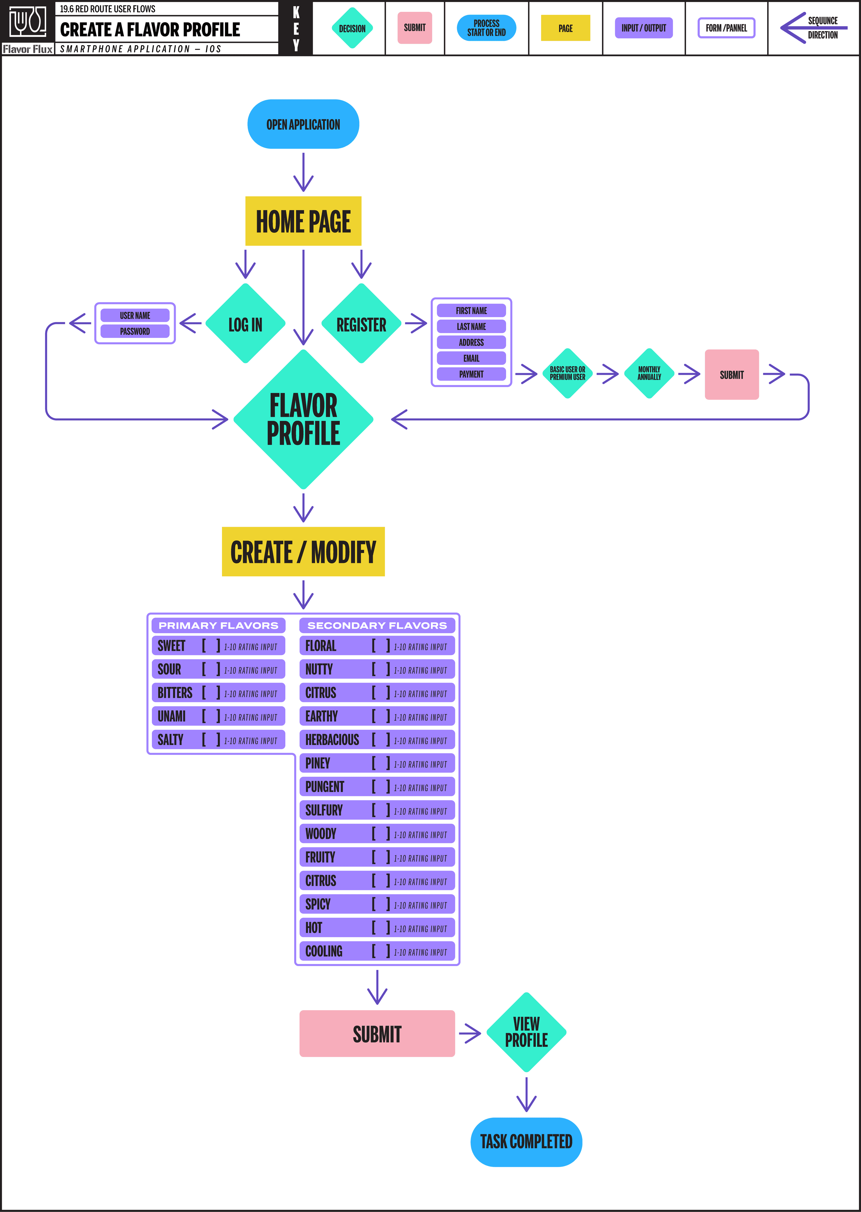
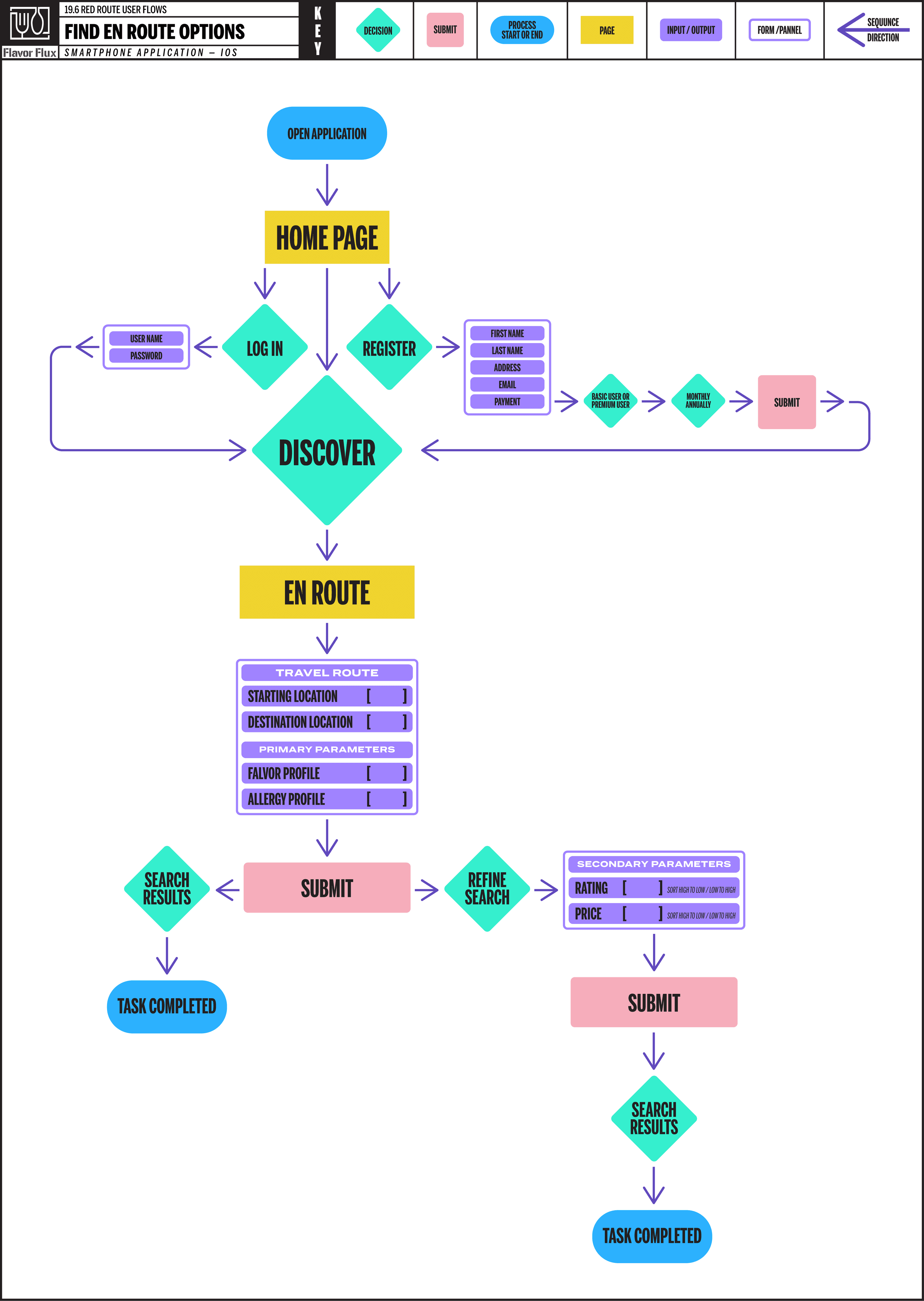
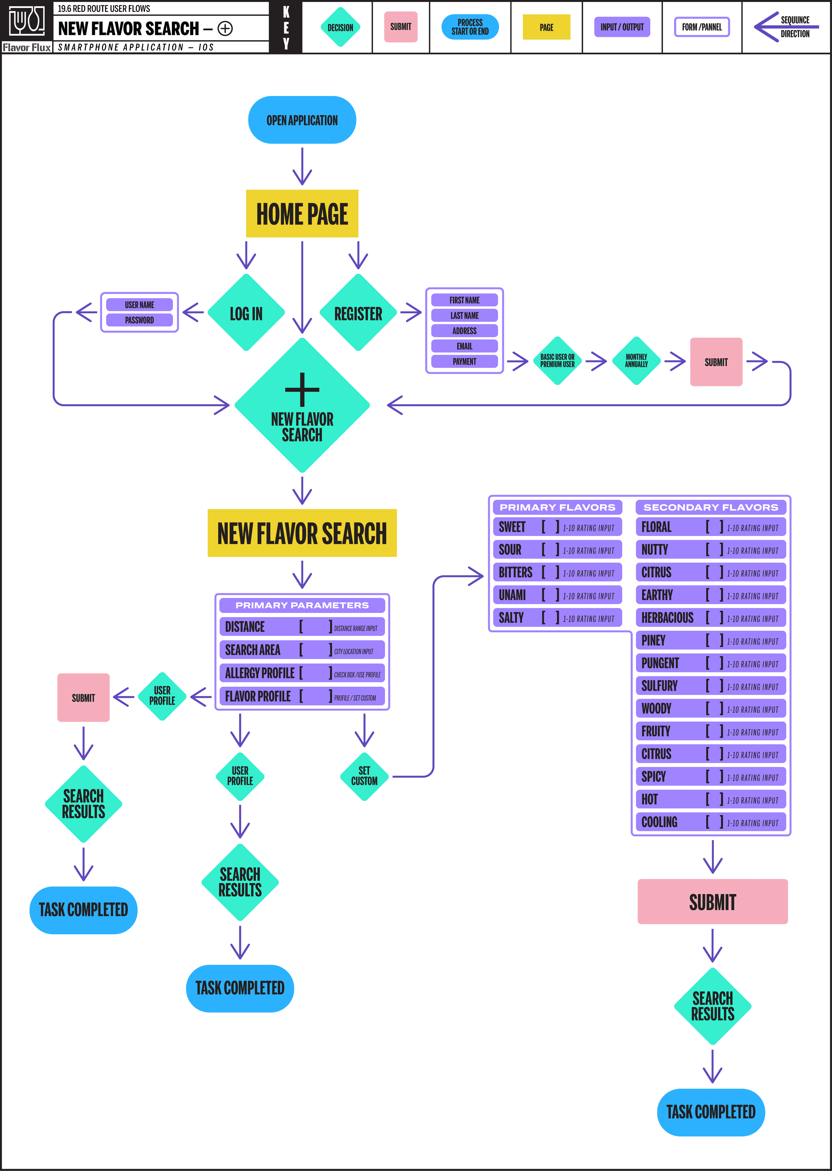
INFORMATION ARCHITECTURE —
USER FLOW RED ROUTES —
Developing user flows for red routes provide a visualization of the critical user paths for development. By mapping these flows it helped to identify friction points early in design process and to ensure a user centered design.
SITE MAP —
Creating site map established a visual representation of the apps structure and how it would be navigated by users.

LOW FIDELITY DESIGNS —
THUMBNAIL SKETCHES —
Low fidelity thumbnail sketches enabled quick exploration of potential layouts and flows, keeping the focus on structure and a user centered design and not focusing on more detailed design decisions until later.


WIREFRAMES —
Wireframes were created to establish the structural blueprint of key components and screens, while also introducing typeface selection and varying weights to begin defining the visual hierarchy within the screen designs.


WIREFLOW RED ROUTES —
Utilizing the wireframes, a more comprehensive user flow was created for each red route to visually analyze the different user journeys and identify any design pain points or production issues.


MOOD BOARD —
A mood board was created to provide design inspiration for layout, typography, color palettes, imagery and feel.

RESEARCH PLAN —
SCHEDULE —
— PHASE 1 —
DISCOVERY
PLAN RESEARCH
1. Formulate Research Plan
2. Define User Audience
CONDUCT RESEARCH
1. Secondary Research
2. User Interview Prep
• Create Screener Survey
• Create Questionnaire
3. User Interviews
RESEARCH SYNTHESIZE
1. User Personas
2. Jobs To Be Done
3. Empathy Mapping
4. User Stories
5. Thematic Analysis
5. How Might We Statements
— PHASE 2 —
DESIGN R1
DESIGN INFORMATION ARCHITECTURE
1. Create Site Map
2. User Flow Red Routes
DESIGN IN LOW FIDELITY
1. Red Route Sketches
2. Computer Wireframes
3. Edge Cases
4. Wireflow Red Routes
5. Create Flavor Infographic
6. Begin Icon Library
7. Explore Color/Type Options
DESIGN PROTOTYPE
1. Refine Design & Incorporate
Prototype Functionality
2. Begin Component Library
— PHASE 3 —
VALIDATE R1
PREPARE TO TEST
1. Create Test Script
2. Identify & Book Test Users
CONDUCT TESTING
1. Conduct Remote Moderated
Usability Tests
SYNTHESIZE RESULTS
1. Analyze Interview Videos
2. Notarize Findings
3. Create Usability Test Report
— PHASE 4 —
DESIGN R2
DESIGN IN HIGH FIDELITY
1. Finalize Color Palette/Type
2. Finalize Icon Library
3. Finalize Flavor Infographic
3. Refine Design Based On
Usability Test Findings
4. Complete Component
Library
— PHASE 5 —
VALIDATE R2
PREPARE TO TEST
1. Create Modified Test Script
2. Identify & Book Test Users
CONDUCT TESTING
1. Conduct Remote Moderated
Usability Tests
SYNTHESIZE RESULTS
1. Analyze Interview Videos
2. Notarize Findings
3. Create Usability Test Report
— PHASE 6 —
DESIGN R3
ITERATE IN HIGH FIDELITY
1. Refine Design Based On
Usability Test Findings
2. Finalize Component Library
VALIDATE R1 —
USER FEEDBACK —
Utilizing the structural design of the wireframes an MVP prototype was created for each red route and user tested.

USABILITY TEST REPORT —
Users testing provide important feedback that was implemented into the second prototype iteration.
ERROR RATING
PROBLEM
SOLUTION
CRITICAL
Option to sign up/login w/ Apple & Google in most apps.
Add option to sign up of login with Apple or Google.
CRITICAL
Need breadcrumbs for walkthrough so users
Add breadcrumb graphic for walkthrough progress.
CRITICAL
Need breadcrumbs for signup process so users no where they are in the process.
Adjust layout of signup and include a breadcrumb element at the top of screen indicating stage of process.
MINOR
Don't expect to see tab bar on first screen.
Remove tab bar on sign up screens.
MINOR
Add additional descriptions on purple screens.
Add additional description to walkthrough boxes.
MINOR
What type of subscription, monthly?
Add "Monthly" to description verbiage.
MINOR
Option needed to go back a screen.
Add "Back" button to walkthrough with "Cancel" button.
MINOR
Placement of walkthrough boxes confusing.
Keep placement of consistent from screen to screen.
MINOR
Password entry fields typically have ability to toggle from hidden to visible.
Add an "eye" UI element indicating the ability to toggle between hidden and visible to password field.
MINOR
The reversed out text in the search results prevents a clear visual hierarchy, visually noisy.
Reformat the search result boxes removing reversed out text and increase white space.
NORMAL
Need splash screen with logo and tagline first screen.
Add splash screen with logo.
DESIGN PROTOTYPE R1 —
PROTOTYPE —


• Above 21 years of age.
• Eats out at least 2-3 times a month.
• Utilizes smartphone to identify restaurants.
• Enjoys trying new restaurants/cuisines.
USER AUDIENCE
DESIGN PROTOTYPE R2 —
ICON LIBRARY —
Icons were created for the tab bar & menus along with abstracted icons for flavor profiling and allergy profiling.

FLAVOR PROFILE INFOGRAPHIC —
Designed to map each primary and secondary flavor allowing the user to view their profile at a glance on the home screen and when viewing a restaurants profile screen for a visual representation of its flavor profile.

COMPONENT LIBRARY —
During the second round of the design process the component library was completed and finalized.

COLOR PALETTE —
After finalizing the color palette, each color combination was verified for a passing minimum contrast ratio according to the Web Content Accessibility Guidelines.
COLOR COMBINATION
CONTRAST
RATIO
NORMAL TEXT
(14-18px)
LARGE TEXT
(18px or 14px+bold)
OBJECTS & UI
(Graphics, Controls)
FOREGROUND
#F05A28
BACKGROUND
#000000
6.19:1
WCAG AA: PASS
WCAG AAA: FAIL
WCAG AA: PASS
WCAG AAA: PASS
WCAG AA: PASS
N/A AAA
FOREGROUND
#551E4B
BACKGROUND
#FFFFFFF
12.54:1
WCAG AA: PASS
WCAG AAA: PASS
WCAG AA: PASS
WCAG AAA: PASS
WCAG AA: PASS
N/A AAA
FOREGROUND
#A23895
BACKGROUND
#DDE2E3
4.54:1
WCAG AA: PASS
WCAG AAA: FAIL
WCAG AA: PASS
WCAG AAA: PASS
WCAG AA: PASS
N/A AAA
FOREGROUND
#3D3D3D
BACKGROUND
#FFFFFF
10.86:1
WCAG AA: PASS
WCAG AAA: PASS
WCAG AA: PASS
WCAG AAA: PASS
WCAG AA: PASS
N/A AAA
FOREGROUND
#FFFFFF
BACKGROUND
#A23895
5.93:1
WCAG AA: PASS
WCAG AAA: FAIL
WCAG AA: PASS
WCAG AAA: PASS
WCAG AA: PASS
N/A AAA
PROTOTYPE —
Applying usability testing feedback, a second iteration was designed with a new color palette and refine structure.

DESIGN PROTOTYPE R2 —
ICON LIBRARY —
Icons were created for the tab bar & menus along with abstracted icons for flavor profiling and allergy profiling.
FLAVOR PROFILE INFOGRAPHIC —
Designed to map each primary and secondary flavor allowing the user to view their profile at a glance on the home screen and when viewing a restaurants profile screen for a visual representation of its flavor profile.
COMPONENT LIBRARY —
During the second round of the design process the component library was completed and finalized.
COLOR PALETTE —
After finalizing the color palette, each color combination was verified for a passing minimum contrast ratio according to the Web Content Accessibility Guidelines.
COLOR COMBINATION
CONTRAST
RATIO
NORMAL TEXT
(14-18px)
LARGE TEXT
(18px or 14px+bold)
OBJECTS & UI
(Graphics, Controls)
FOREGROUND
#F05A28
BACKGROUND
#000000
6.19:1
WCAG AA: PASS
WCAG AAA: FAIL
WCAG AA: PASS
WCAG AAA: PASS
WCAG AA: PASS
N/A AAA
FOREGROUND
#551E4B
BACKGROUND
#FFFFFFF
12.54:1
WCAG AA: PASS
WCAG AAA: PASS
WCAG AA: PASS
WCAG AAA: PASS
WCAG AA: PASS
N/A AAA
FOREGROUND
#A23895
BACKGROUND
#DDE2E3
4.54:1
WCAG AA: PASS
WCAG AAA: FAIL
WCAG AA: PASS
WCAG AAA: PASS
WCAG AA: PASS
N/A AAA
FOREGROUND
#3D3D3D
BACKGROUND
#FFFFFF
10.86:1
WCAG AA: PASS
WCAG AAA: PASS
WCAG AA: PASS
WCAG AAA: PASS
WCAG AA: PASS
N/A AAA
FOREGROUND
#FFFFFF
BACKGROUND
#A23895
5.93:1
WCAG AA: PASS
WCAG AAA: FAIL
WCAG AA: PASS
WCAG AAA: PASS
WCAG AA: PASS
N/A AAA
PROTOTYPE —
Applying usability testing feedback, a second iteration was designed with a new color palette and refine structure.
VALIDATE R2 —
USABILITY TEST REPORT —
A second round of moderated usability testing was conducted with another group of participants for more feedback.
ERROR RATING
PROBLEM
SOLUTION
CRITICAL
Include key flavors & allergy info within search result list.
Include key flavor and allergy ratings in results.
CRITICAL
Instructions too long, big blocks of text discouraging.
Modify design to accordion section with only 1st sent
MINOR
Location icons on search results should be numbered.
Add number to location icons.
MINOR
Some of the transitions between screens slide in wrong.
Adjust animation to correct orrientation.
MINOR
Would be nice to have operating times in search results.
Add operating times to search results.
MINOR
Need Apple & Google pay options in signup process.
Add Apple & Google pay option to payment screen.
MINOR
Background gradient during signup distracting.
Change background to more subtle gradient.
MINOR
Restaurant profile page section info not needed.
Remove page section info in restaurant profile section.
MINOR
"Profile" btn on restaurant profile not selected.
Change button state to indicate on "Profile."
MINOR
Hard to read pink text on item profiling screen.
Change input text color to standard grey.
FINAL PROTOTYPE —

PROTOTYPE —
After conducting two rounds of moderated usability testing, all critical errors identified by participants were fixed. Several other minor and normal errors brought up by more than one participant were also addressed and revisions were made based on that feedback.


THE RUNDOWN —
WHAT I LEARNED —
Over the course of the Flavor Flux project, I gained experience with a design process that was much more research-driven than a typical graphic design approach. I obtained a detailed understanding of the target audience by implementing a user screener survey to identify key users and conducting interviews to uncover their needs and emotions throughout the restaurant discovery journey. Having always gravitated toward a research-driven creative process, I recognized the value of interacting with the target audience before beginning the design phase.
Synthesizing qualitative research findings through empathy mapping, user stories, and thematic analysis helped me develop a thorough understanding of user needs and truly empathize with the users. This detailed insight provided a blueprint for the product development process, starting with user flows and a site map during the information architecture stage, then evolving into thumbnail sketches and wireframes in the low-fidelity design stage. While my experience as a graphic designer has given me extensive practice with thumbnail sketching and low-fidelity mockups, I had no prior experience developing functional prototypes. Adding this skill to my creative toolbox was incredibly exciting.
WHAT IT SOLVED —
Developing the Flavor Flux app solved the root problem of the restaurant discovery process by enabling users to identify restaurants with the flavors they craved and any potential food allergies users might have, without having to carefully analyze the menus of each dining option. By creating flavor and allergy profiling, all search queries were automatically filtered based on these preferences, providing targeted, user-centered suggestions that significantly reduced the effects of choice overload.
• Above 21 years of age.
• Eats out at least 2-3 times a month.
• Utilizes smartphone to identify restaurants.
• Enjoys trying new restaurants/cuisines.
USER AUDIENCE
• Above 21 years of age.
• Eats out at least 2-3 times a month.
• Utilizes smartphone to identify restaurants.
• Enjoys trying new restaurants/cuisines.
USER AUDIENCE
SECONDARY RESEARCH —
COMPETITIVE LANDSCAPE —
APPLICATION FEATURE
iOS App Store Rating
Cost to Use (App)
User Reviews & Ratings
Reservation Booking
Driving Route Options
Menu Viewing
Photo Uploads & Galleries
Offline Access
Search Filters
Mapping & Directions
Flavor Profiling
Allergy Profiling
FOURSQUARE
4.3 / 5
FREE
OPENTABLE
4.3 / 5
FREE
YELP
4.3 / 5
FREE
UNDERSTANDING THE DINING DECISION +
QUALITATIVE RESEARCH +
INSIGHTS INTO USER EXPERIENCES & DINING DECISIONS
Survey participants said they often had difficulty locating new restaurants and/or cuisines offering the flavors they truly craved.
Respondents stated food allergies had prevented them or their group from trying new restaurants or cuisines in the past.
Survey participants reported dificulty finding restaurants that provided flavors each group member craved when dinning out.
Subjects acknowledged experiencing choice overload when utilizing restaurant discovery apps or search engines.

"I have to go through all search results
even though it can be overwhelming
at times." — Nicole
INFORMATION ARCHITECURE —
USER FLOW RED ROUTE 1 —
Developing user flows for red routes provide a visualization of the critical user paths for development. By mapping these flows it helped to identify friction points early in design process and to ensure a user centered design.


SITE MAP —
Creating site map established a visual representation of the apps structure and how it would be navigated by users.

LOW FIDELITY DESIGNS —
THUMBNAIL SKETCHES —
Low fidelity thumbnail sketches enabled quick exploration of potential layouts and flows, keeping the focus on structure and a user centered design and not focusing on more detailed design decisions until later.
WIREFRAMES —
Wireframes were created to establish the structural blueprint of key components and screens, while also introducing typeface selection and varying weights to begin defining the visual hierarchy within the screen designs.
WIREFLOW RED ROUTES —
Utilizing the wireframes, a more comprehensive user flow was created for each red route to visually analyze the different user journeys and identify any design pain points or production issues.
MOOD BOARD —
A mood board was created to provide design inspiration for layout, typography, color palettes, imagery and feel.
RESEARCH SYNTHESIS —
USER PERSONAS —
Creating user personas helped empathize with users' challenges and prioritize what critical features to include, ensuring the product effectively solved key problems and maintain focus on the target users needs.
PARTICIPANT 1: KIM
GENDER: FEMALE
OCCUPATION: EXECUTIVE RECRUITER
LOCATION: MADSISON, WI
TIMES PER MONTH: 5-10
MARRIED: YES
CHILDREN: 4
SEARCH RESOURCES UTILIZED
GOOGLE
OTHER SEARCH ENGINE
YELP
OPEN TABLE
ROAD TRIPPERS
PRINT PUBLICATIONS
WORD OF MOUTH
SOCIAL MEDIA
FOREIGN COUNTRY APPLICATION
INFLUENCED BY
RATING
PRICE
LOCATION
CLEANLINESS
MENU VARIETY
HOLDS SMARTPHONE
LEFT HAND
BOTH HANDS
RIGHT HAND
SCROLLING / TYPING
LEFT HAND
BOTH HANDS
RIGHT HAND
"Don't want to be influenced
by the hype."EFFECTED BY CHOICE OVERLOAD
PAIN POINTS:
• FOOD ALLERGY COMPLIANCE
• CLEANLINESS / HYGIENIC
THOUGHTS:
• ALWAYS LOOKING FOR NEW PLACES
• SOMETHING WE DO FRIDAYS
SEEKING:
• WELL ROUNDED EXPERIENCE
• BLENDS OF FAVORITE FLAVORS
PARAMETERS:
• GOOD COCKTAILS & WINE LIST
• REASONABLE WAIT TIMES
CRAVING:
• GOOD CURY DISHES
• AUTHENTIC THAI FOOD
PARTICIPANT 2: JOHN
GENDER: MALE
OCCUPATION: CONTENT CREATOR
LOCATION: MADSISON, WI
TIMES PER MONTH: 2-3
MARRIED: YES
CHILDREN: NONE
SEARCH RESOURCES UTILIZED
GOOGLE
OTHER SEARCH ENGINE
YELP
OPEN TABLE
ROAD TRIPPERS
PRINT PUBLICATIONS
WORD OF MOUTH
SOCIAL MEDIA
FOREIGN COUNTRY APPLICATION
INFLUENCED BY
RATING
PRICE
LOCATION
CLEANLINESS
MENU VARIETY
HOLDS SMARTPHONE
LEFT HAND
BOTH HANDS
RIGHT HAND
SCROLLING / TYPING
LEFT HAND
BOTH HANDS
RIGHT HAND
"I'll try the burger that seems like nobody is going to buy."
EFFECTED BY CHOICE OVERLOAD
PAIN POINTS:
• EXTENDED TRAVEL DISTANCES
• OPTIONS WITH FAVORITE FLAVORS
THOUGHTS:
• REVIEWS NOT INDICATIVE OF QUALITY
• SMELL THE SMELLS
SEEKING:
• SAFE FOR FOR WIFE WITH FOOD ALLERGIES
• NEW UNIQUE CUISINES AND EXPERIENCES
PARAMETERS:
• THE LESSER KNOWN GEMS
• REASONABLE PRICE
CRAVING:
• SPICY FOODS AND FLAVORS
• PICKLED AND SOUR TASTING
PARTICIPANT 3: ALEX
GENDER: MALE
OCCUPATION: SIGNAGE INSTALLER
LOCATION: SAN JOSE, CA
TIMES PER MONTH: 8-12
MARRIED: YES
CHILDREN: 2
SEARCH RESOURCES UTILIZED
GOOGLE
OTHER SEARCH ENGINE
YELP
OPEN TABLE
ROAD TRIPPERS
PRINT PUBLICATIONS
WORD OF MOUTH
SOCIAL MEDIA
FOREIGN COUNTRY APPLICATION
INFLUENCED BY
RATING
PRICE
LOCATION
CLEANLINESS
MENU VARIETY
HOLDS SMARTPHONE
LEFT HAND
BOTH HANDS
RIGHT HAND
SCROLLING / TYPING
LEFT HAND
BOTH HANDS
RIGHT HAND
"I'm in the mood for some
greasy goodness."EFFECTED BY CHOICE OVERLOAD
PAIN POINTS:
• PRICEY JOINTS WITH SMALL PORTIONS
• LIMITED OPTIONS WITH FLAVORS CRAVED
THOUGHTS:
• USUALLY PLAY IT SAFE
• APPRECIATE BAY AREA DIVERSITY
SEEKING:
• KID FRIENDLY OPTIONS
• FOODY TYPE SPOTS
PARAMETERS:
• HIGHEST RATING THAT'S REASONABLE
• PLACES THAT OFFERS FAVORITES
CRAVING:
• GOOD MEXICAN FOOD
• FAVORITE FLAVORS IN NEW DISHES
PARTICIPANT 4: NICOLE
GENDER: FEMALE
OCCUPATION: DEDICATED MOTHER
LOCATION: APPLETON, WI
TIMES PER MONTH: 1-4
MARRIED: YES
CHILDREN: 2
SEARCH RESOURCES UTILIZED
GOOGLE
OTHER SEARCH ENGINE
YELP
OPEN TABLE
ROAD TRIPPERS
PRINT PUBLICATIONS
WORD OF MOUTH
SOCIAL MEDIA
FOREIGN COUNTRY APPLICATION
INFLUENCED BY
RATING
PRICE
LOCATION
CLEANLINESS
MENU VARIETY
HOLDS SMARTPHONE
LEFT HAND
BOTH HANDS
RIGHT HAND
SCROLLING / TYPING
LEFT HAND
BOTH HANDS
RIGHT HAND
"I have to go through all search results
even though it can be overwhelming."EFFECTED BY CHOICE OVERLOAD
PAIN POINTS:
• OVER PRICED OFFERINGS
• LACK OF FAVORITE FLAVORS IN DISHES
THOUGHTS:
• ALWAYS ORDER THE SAME THING
• TRY TO ADHERE TO DIET
SEEKING:
• CATCH ALL RESTAURANT
• WHAT'S ON THE WAY
PARAMETERS:
• CHILDREN COMPATIBLE
• REASONABLE PRICE
CRAVING:
• SPICY FOOD ON OCCASION
• GOOD TACOS
PARTICIPANT 5: EMILY
GENDER: FEMALE
OCCUPATION: ADMIN ASSISTANT
LOCATION: SAN FRANCISCO, CA
TIMES PER MONTH: 10-15
MARRIED: YES
CHILDREN: NONE / TWO DOGS
SEARCH RESOURCES UTILIZED
GOOGLE
OTHER SEARCH ENGINE
YELP
OPEN TABLE
ROAD TRIPPERS
PRINT PUBLICATIONS
WORD OF MOUTH
SOCIAL MEDIA
FOREIGN COUNTRY APPLICATION
INFLUENCED BY
RATING
PRICE
LOCATION
CLEANLINESS
MENU VARIETY
HOLDS SMARTPHONE
LEFT HAND
BOTH HANDS
RIGHT HAND
SCROLLING / TYPING
LEFT HAND
BOTH HANDS
RIGHT HAND
"One of the perks of my job is I get to dine out frequently."
EFFECTED BY CHOICE OVERLOAD
PAIN POINTS:
• IDENTIFYING OPTIONS WITH MY FLAVORS
• FOOD ALLERGY SAFE OPTIONS
THOUGHTS:
• PREFER MANAGEABLE NUMBER OPTIONS
• WORD OF MOUTH SUGGESTIONS
SEEKING:
• HIGH RATING / REVIEWS
• GOOD WHITE TABLE CLOTH RESTAURANT
PARAMETERS:
• ALIGN WITH CLIENTS PREFERENCES
• GREAT SERVICE
CRAVING:
• UNAMI AND GARLIC FLAVORS
• GOOD COCKTAILS
JOBS TO BE DONE —
Writing Jobs to Be Done statements helped clarify user needs, prioritizing feature development around meaningful goals and reduced choice overload by directing attention to what truly matters.

JTBD statements were key to understanding customer needs and driving product innovation.
MAIN JOB: IDENTIFY NEW RESTAURANTS
RELATED JOBS: 1) DISCOVER NEW FOODS. 2) FIND FAVORITE FLAVORS.
NEED STATEMENTS: DIRECTION OF CHANGE + UNIT OF MEASURE + OBJECT + CLARIFIER
1) REDUCE + THE NUMBER + OF UNDESIRABLE RESTAURANTS + FROM SEARCH.
2) INCREASE + THE SELECTION + OF DESIRED RESTAURANTS + PRESENTED.
3) EXPLORE + FAVORITE FLAVORS + AT NEW RESTAURANTS + DISCOVERED.
4) DISCOVER + NEW DISHES + WITH FAVORITE FLAVORS + AT NEW RESTAURANTS.
5) EXPOSURE TO + NEW CUISINES + WITH FAVORITE FLAVORS + NEW EXPERIENCES.
JOBS (WHAT):
HUNGRY PERSON
MAIN JOB:
IDENTIFY NEW RESTAURANTS.
RELATED JOBS:
1) DISCOVER NEW FOOD.
2) FIND FAVORITE FLAVORS.
EMOTIONAL JOBS:
POSTIVLEY STIMULATE FLAVOR PALETE.
SOCIAL JOBS:
IDENTIFY OTHER PEOPLE WITH SIMILAR TASTES.
CIRCUMSTANCES
(WHEN / WHERE):
1) FINDING A RESTARAUNT COMPATIBLE WITH
EACH GROUP MEMBER.
2) IDENTIFYING RESTARAUNT COMPATIBLE
WITH PERSONS FOOD ALLERIES.
EMPATHY MAPS —
Developing empathy maps uncovered unmet user needs while highlighting pain points in the restaurant discovery process and helped reduce assumptions, resulting in more user centered design solutions.
SAY & DO
• "…had an opportunity to eat out a lot, go to real nice
establishments, and is where I think I became a little bit
of a foody."• "Want a well-rounded experience. "
• "Don't want to be influenced by the hype.
• Analyze menu prior to visit to verify food allergy
compliance.HEAR
• Local papers, Social (Facebook) local tapas restaurant
promoting itself via social media• Very particular about reviews referencing hygiene of
restaurant (result of parents working in the industry)• Not influenced by hype
SEE
• Look for good cocktail and wine menu
• Always looking for curry reminiscent of home
• Look at menu prior to visit
THINK & FEEL
• Lots of Chicago natives in area, a lot great
restaurants as result• Love blends of flavors fusion cuisine, unexpected
combinations• Sometimes overwhelmed by choices
• Wait time a big factor
GAIN
• Good cocktail menu & wine list
• Well rounded experience
PAIN
• Food allergy compliance
• Sometimes overwhelmed by number choices
• Hype / Wait time
SAY & DO
• Don't really go by reviews, feel they're not really
indicative of the quality that restaurant• "I'll try the burger that seems like nobody is going to
buy."• "Walk around the mall to see what we like"
• "Smell the smells"
HEAR
• Chinese app talks about best local places and what to
avoid and what's "super pricy."• Gravitate towards suggestions from other that are
lesser know• Only listen to reviews by natives of cuisine
SEE
• Look for a place unique to area when with group of
people who have different mindset• Use Google to search to see what's good near me
• Look for restaurants by walking around
THINK & FEEL
• Due to different palette of westerners won't rely on
Google reviews
• Don't want to drive to far and have to leave city
• Certain parts of the city don't really want to go to
• To many options can be a demotivating factor"
• Really into spicy foodGAIN
• New unique establishments
• Lesser know dishes
• Spicy and Sour (pickled) flavors
PAIN
• Extended travel distances
• Too many options
• High price point
SAY & DO
• When using the smartphone to search (web or app
search) hold phone in left hand. Use both hands only
when typing or zooming in.• Frequent places that have favorites they usually order.
•"In the mood for some greasy goodness."
• "Highest rating with reasonable pricing."
HEAR
• Decision second guessed
• Kids input
SEE
• Web search using Google, Yelp app sometimes.
• Look for restaurants that appease the kids taste
• Casual restaurants/spots primarily
THINK & FEEL
• Really no common flavors among diverse group
of favorites• Small restaurants, food trucks and takeout spots
• No food allergies or anything try to avoid.
• Usually able to find solutions to cravings
• Lucky to live in a diverse area where there is an
abundance of all type of foods.GAIN
• Greasy comfort food
• Places that offer favorites
• Diverse options available in Bay Area - able to satisfy cravings
PAIN
• Wife second guessing decision
• Kid compatible option
• Pricey restaurants
SAY & DO
• "I have to go through them all, even though can
be overwhelming"• "When don't want to spend a million dollars today.'
• "Number one would be Google"
• "Once in a while crave spicy food"
• "Crave tacos all the time"
HEAR
• Good Ratings
• Kids needs
• Husbands opinion
SEE
• DoorDash for foods images
• Whats on the way in Roadtrippers app
• Google listings with top ratings & images
THINK & FEEL
• Rating primarily drives the decision along with
image of food• With kids in hard to stay for prolonged periods of time
• Prefer less options with filters, 30 to 5 options
• Always order the same thing
• Winter crave meat comfort food
• Currently dieting
GAIN
• Offer good selection of Salads and/or bowls
• Options that are close within route
• "Catchall" restaurants
PAIN
• Don't want to take chance ordering something will not like
• Has to be on the route when traveling by car
• Finding kid compatible option
SAY & DO
• "Sometimes will go somewhere for cocktails
before eating.• "White tablecloth restaurant for an evening out"
• Hold phone in right hand, thumb to navigate
• "Get to dine out frequently for business.
• "Somehow stumbled across"
HEAR
• Local papers, Social (Facebook) local tapas restaurant
promoting itself via social media• Very particular about reviews referencing hygiene of
restaurant (as result of parents working in the industry)• Not influenced by hype
SEE
• Google reviews with good ratings
• Occasionally discover new place by accident
• Open Table and Yelp reviews when out
THINK & FEEL
• Prefer manageable number of options
• Decisions for work are influenced solely by rating
• Dinning out with husband nothing to expensive
• Love garlic and unami flavors
• Chinese, Thai, and Seafood are favorites
GAIN
• Eating out frequently free for work
• Nice cocktails before eating
• Satisfy flavor cravings
PAIN
• Restaurants that please clients preferences
• Not too expensive
• Not finding flavor or food being craved
USER STORIES —
By creating user stories, I was able to translate broad problems into specific user challenges, which clarified priorities and informed product development decisions.
DISCOVER NEW
RESTAURANTS
CREATE A FOOD ALLERGY PROFILE
CREATE A
FLAVOR PROFILE
VIEW IMAGES
OF FOOD &
BEVERAGES
IDENTIFY "CATCHALL"
RESTAURANTS
OPTIONS THAT
ARE CLEAN & HYGIENIC
WELL ROUND DINNING OPTIONS
RESTAURANT WITH GOOD PORTION SIZES
SOME PLACE THAT
HAS OPTIONS TO ADHEAR TO DIET
ON THE ROUTE
WE ARE
TRAVELLING
RESTAURANTS
WITH LOW WAIT TIMES
EXAMINE THE
MENU
OPTIONS THAT
ARE CHILDREN COMPATIBLE
SOMETHING
NEAR BY
A REASONABLE PRICED OPTION, WON'T BREAK
THE BANK
RESTAURANT THAT GIVES YOU YOUR
MONEYS WORTH
SOME PLACE THAT
OFFERS QUICK SERVICE
SOME PLACE WITH AN OUTDOOR SEATING OPTION
A GOOD WHITE TABLECLOTH
OPTION
CREATE A USER PROFILE
FIND FOOD
ALLERGY
COMPLIANT
OPTIONS
TO SAFELY
EXPLORE NEW FLAVORS
REDUCE OPTIONS AND MAKE MORE MANAGEABLE
FIND AUTHENTIC
CUISINE
DISCOVER NEW FOODS WITH MY FAVORITE FLAVORS
FIND THE BEST
SPICY FOOD NEAR
ME
FIND UNAMI
RICH FOODS
GOOD MEXICAN
FOOD
GOOD THAI
FOOD
FOODY TYPE
SPOTS
GOOD TACOS
CREATE A GROUP FOOD ALLERGY PROFILE
FIND COMPATIBLE DNNING OPTIONS
CREATE A GROUP FLAVOR PROFILE
FIND DINNING OPTION WITH SOMETHING FOR EVERYONE
VIEW LOCAL USER
SUGGESTIONS
TO SEE WHAT'S TRENDING
TO SEE
WHAT'S NEW
FIND OPTIONS
NEAR ME
THEMATIC ANALYSIS —
Through thematic analysis, I identified common themes across participants, which helped me empathize with their pain points in the restaurant discovery process.
AMOUNT OF OPTIONS
SECONDARY
STEPS
TYPICAL FIRST STEPS
PREFFERENCES
SEEKING
DRIVING FACTORS
SPECIAL PARAMETERS
HOLDING
PHONE
START WITH
GOOGLE
SEARCH FOR NEAR
ME AND GO FROM
THERE
GOOGLE & THEN
VERIFY WITH
YELP
"NUMBER ONE
WOULD BE
GOOGLE"
GOOGLE BECAUSE
EASIER TO
BROWSE
COMBINATION OF
PLATFORMS AND RESOURCES
USE ROADTRIPPER
WHEN TRAVELING
BY CAR
LIKE STREAMLINED
PROCESS OF OPENTABLE
DECISION DRIVEN
BY RATINGS AND IMAGES
ANALYZE MENU
OVERWHELMED
BY CHOICES
TOO MANY
OPTIONS CAN BE
DEMOTIVATING
OVER A COUPLE DOZEN RARELY REVIEW ALL
OPTIONS
CHOICE OVERLOAD
CAN AFFECT THE
PROCESS
"HAVE TO REVIEW ALL OPTIONS,
EVEN IF IT'S OVERWHELMING."
"CATCHALL RESTAURANT OFFERING SEVERAL
CUISINES."
"DON'T WANT TO BE INFLUENCED BY THE HYPE."
TRY WHAT NO ONE ELESE WILL TRY
"GREASY
GOODNESS"
"WANT A WELL ROUNDED EXPERIENCE"
FIRST AVAILABLE OPTION THAT
LOOKS GOOD
WHAT'S NEAR
BY ME
I'M IN THE
MOOD FOR…
"GRAVITATE TOWARDS THE LESSER KNOWN"
ALWAYS LOOKING
FOR PLACES
"SOMEHOW STUMBLED
ACROSS"
"USUALLY PLAY IT SAFE"
"SMELL THE
SMELLS"
IMAGES AND
VIDEOS CREATE CRAVINGS
"EATING OUT IS
A SPECIAL
EVENT FOR US"
NO FOOD
ALLERGIES OR
ANYTHING WE
AVOID
FOOD ALLERGY
COMPATIBILTY
CURRENTLY
DIETING
DOORDASH
IMAGES, TO SEE
WHAT I'M IN THE MOOD FOR
ALWAYS ORDER
THE SAME THING
"SMALL RESTAURANTS,
FOOD TRUCKS, OR TAKEOUT SPOTS
HOLD AND TYPE
IN ONE HAND
HOLD IN ONE HAND
& USE THUMB
TO SCROLL
USUALLY HOLD
PHONE IN
ONE HAND
HOLD IN ONE HAND
BROWSING, TWO
WHEN TYPING
HOW MIGHT WE STATEMENTS —
Writing How Might We Statements allowed me to reframe user problems into meaningful opportunities for design.
HOW MIGHT WE (HMW) - FINDING THE RIGHT RESTAURANT
1) HOW MIGHT WE MAKE THE RESTAURANT DISCOVERY PROCESS MORE ACCESSIBLE.
2) HOW MIGHT WE INCREASE PEOPLE'S ABILITY TO IDENTIFY COMPATIBLE DINING OPTIONS.
3) HOW MIGHT WE ASSIST PEOPLE IN DISCOVERING NEW CUISINES.
4) HOW MIGHT WE MAKE DINERS IDENTIFY THEIR FAVORITE FLAVORS.
5) HOW MIGHT WE ENABLE EASIER IDENTIFICATION OF ALLERGY RESTRICTIONS AT DINING OPTIONS.
INFORMATION ARCHITECTURE —
USER FLOW RED ROUTES —
Developing user flows for red routes provide a visualization of the critical user paths for development. By mapping these flows it helped to identify friction points early in design process and to ensure a user centered design.


SITE MAP —
Creating site map established a visual representation of the apps structure and how it would be navigated by users.
LOW FIDELTY DESIGNS —
THUMBNAIL SKETCHES —
Low fidelity thumbnail sketches enabled quick exploration of potential layouts and flows, keeping the focus on structure and a user centered design and not focusing on more detailed design decisions until later.
WIREFRAMES —
Wireframes were created to establish the structural blueprint of key components and screens, while also introducing typeface selection and varying weights to begin defining the visual hierarchy within the screen designs.
WIREFLOW RED ROUTES —
Utilizing the wireframes, a more comprehensive user flow was created for each red route to visually analyze the different user journeys and identify any design pain points or production issues.
MOOD BOARD —
A mood board was created to provide design inspiration for layout, typography, color palettes, imagery and feel.

Usability testing kept the design
process focused on user needs and highlighted the importance of adhering to Jakob's Heuristics.
Usability testing kept the design
process focused on user needs and highlighted the importance of adhering to Jakob's Heuristics.

Usability testing kept the design
process focused on user needs and highlighted the importance of adhering to Jakob's Heuristics.
DESIGN PROTOTYPE R1 —
PROTOTYPE —

VALIDATE R1 —
USER FEEDBACK —
Utilizing the structural design of the wireframes an MVP prototype was created for each red route and user tested.
USABILITY TEST REPORT —
Users testing provide important feedback that was implemented into the second prototype iteration.
ERROR RATING
PROBLEM
SOLUTION
CRITICAL
Need option to sign up/login w/ Apple & Google.
Add option to sign up of login with Apple or Google.
CRITICAL
Need breadcrumbs for walkthrough so users.
Add breadcrumb graphic for walkthrough progress.
CRITICAL
Need breadcrumbs for signup process so users no where they are in the process.
Adjust layout of signup and include a breadcrumb element at the top of screen indicating stage of process.
MINOR
Don't expect to see tab bar on first screen.
Remove tab bar on sign up screens.
MINOR
Add additional descriptions on purple screens.
Add additional description to walkthrough boxes.
MINOR
What type of subscription, monthly?
Add "Monthly" to description verbiage.
MINOR
Option needed to go back a screen.
Add "Back" button to walkthrough with "Cancel" button.
MINOR
Placement of walkthrough boxes confusing.
Keep placement of consistent from screen to screen.
MINOR
Password entry fields typically have ability to toggle from hidden to visible.
Add an "eye" UI element indicating the ability to toggle between hidden and visible to password field.
MINOR
The reversed out text in the search results prevents a clear visual hierarchy, visually noisy.
Reformat the search result boxes removing reversed out text and increase white space.
NORMAL
Need splash screen with logo and tagline first screen.
Add splash screen with logo.
DESIGN PROTOTYPE R2 —
ICON LIBRARY —
Icons were created for the tab bar & menus along with abstracted icons for flavor profiling and allergy profiling.

FLAVOR PROFILE INFOGRAPHIC —
Designed to map each primary and secondary flavor allowing the user to view their profile at a glance on the home screen and when viewing a restaurants profile screen for a visual representation of its flavor profile.
COMPONENT LIBRARY +
During the second round of the design process the component library was completed and finalized.
COLOR PALETTE —
After finalizing the color palette, each color combination was verified for a passing minimum contrast ratio according to the Web Content Accessibility Guidelines.
COLOR
COMBINATION
CONTRAST
RATIO
NORMAL
TEXT
(14-18px)
LARGE TEXT
(18px or 14px+bold)
OBJECTS & UI
(18px or 14px+bold)
FOREGROUND
#F05A28
FOREGROUND
#000000
6.19:1
WCAG AA: PASS
WCAG AAA: FAIL
WCAG AA: PASS
WCAG AAA: PASS
WCAG AA: PASS
N/A AAA
FOREGROUND
#551E4B
FOREGROUND
#FFFFFF
12.54:1
WCAG AA: PASS
WCAG AAA: PASS
WCAG AA: PASS
WCAG AAA: PASS
WCAG AA: PASS
N/A AAA
FOREGROUND
#A23895
FOREGROUND
#DDE2E3
4.54:1
WCAG AA: PASS
WCAG AAA: FAIL
WCAG AA: PASS
WCAG AAA: PASS
WCAG AA: PASS
N/A AAA
FOREGROUND
#3D3D3D
FOREGROUND
#FFFFFF
10.86:1
WCAG AA: PASS
WCAG AAA: PASS
WCAG AA: PASS
WCAG AAA: PASS
WCAG AA: PASS
N/A AAA
FOREGROUND
#FFFFFF
FOREGROUND
#A23895
5.93:1
WCAG AA: PASS
WCAG AAA: FAIL
WCAG AA: PASS
WCAG AAA: PASS
WCAG AA: PASS
N/A AAA
PROTOTYPE —
Applying usability testing feedback, a second iteration was designed with a new color palette and refine structure.
DESIGN PROTOTYPE R2 —
ICON LIBRARY —
Icons were created for the tab bar & menus along with abstracted icons for flavor profiling and allergy profiling.
FLAVOR PROFILE INFOGRAPHIC —
Designed to map each primary and secondary flavor allowing the user to view their profile at a glance on the home screen and when viewing a restaurants profile screen for a visual representation of its flavor profile.
COMPONENT LIBRARY +
During the second round of the design process the component library was completed and finalized.
COLOR PALETTE —
After finalizing the color palette, each color combination was verified for a passing minimum contrast ratio according to the Web Content Accessibility Guidelines.
COLOR
COMBINATION
CONTRAST
RATIO
NORMAL
TEXT
(14-18px)
LARGE TEXT
(18px or 14px+bold)
OBJECTS & UI
(18px or 14px+bold)
FOREGROUND
#F05A28
FOREGROUND
#000000
6.19:1
WCAG AA: PASS
WCAG AAA: FAIL
WCAG AA: PASS
WCAG AAA: PASS
WCAG AA: PASS
N/A AAA
FOREGROUND
#551E4B
FOREGROUND
#FFFFFF
12.54:1
WCAG AA: PASS
WCAG AAA: PASS
WCAG AA: PASS
WCAG AAA: PASS
WCAG AA: PASS
N/A AAA
FOREGROUND
#A23895
FOREGROUND
#DDE2E3
4.54:1
WCAG AA: PASS
WCAG AAA: FAIL
WCAG AA: PASS
WCAG AAA: PASS
WCAG AA: PASS
N/A AAA
FOREGROUND
#3D3D3D
FOREGROUND
#FFFFFF
10.86:1
WCAG AA: PASS
WCAG AAA: PASS
WCAG AA: PASS
WCAG AAA: PASS
WCAG AA: PASS
N/A AAA
FOREGROUND
#FFFFFF
FOREGROUND
#A23895
5.93:1
WCAG AA: PASS
WCAG AAA: FAIL
WCAG AA: PASS
WCAG AAA: PASS
WCAG AA: PASS
N/A AAA
PROTOTYPE —
Applying usability testing feedback, a second iteration was designed with a new color palette and refine structure.
VALIDATE R2 —
USABILITY TEST REPORT —
A second round of moderated usability testing was conducted with another group of participants for more feedback.
ERROR RATING
PROBLEM
SOLUTION
CRITICAL
Include key flavors & allergy info in search result list.
Include key flavor and allergy ratings in results.
CRITICAL
Instructions too long, big blocks of text discouraging.
Modify design to accordion section with only 1st sent
MINOR
Location icons on search results should be numbered.
Add number to location icons.
MINOR
Some of the transitions between screens slide in wrong.
Adjust animation to correct orientation.
MINOR
Would be nice to have operating times in search results.
Add operating times to search results.
MINOR
Would be nice to see Apple & Google pay option.
Add Apple & Google pay option to payment screen.
MINOR
Background gradient during signup distracting.
Change background to more subtle gradient.
MINOR
Restaurant profile page section info not needed.
Remove page section info in restaurant profile section.
MINOR
"Profile" btn on restaurant profile not selected.
Change button state to indicate on "Profile."
MINOR
Hard to read pink text on item profiling screen.
Change input text color to standard grey.
FINAL PROTOTYPE —

PROTOTYPE —
After conducting two rounds of moderated usability testing, all critical errors identified by participants were fixed. Several other minor and normal errors brought up by more than one participant were also addressed, revisions were made based on that feedback.
THE RUNDOWN —
WHAT I LEARNED —
Over the course of the Flavor Flux project, I gained experience with a design process that was much more research-driven than a typical graphic design approach. I obtained a detailed understanding of the target audience by implementing a user screener survey to identify key users and conducting interviews to uncover their needs and emotions throughout the restaurant discovery journey. Having always gravitated toward a research-driven creative process, I recognized the value of interacting with the target audience before beginning the design phase.
Synthesizing qualitative research findings through empathy mapping, user stories, and thematic analysis helped me develop a thorough understanding of user needs and truly empathize with the users. This detailed insight provided a blueprint for the product development process, starting with user flows and a site map during the information architecture stage, then evolving into thumbnail sketches and wireframes in the low-fidelity design stage. While my experience as a graphic designer has given me extensive practice with thumbnail sketching and low-fidelity mockups, I had no prior experience developing functional prototypes. Adding this skill to my creative toolbox was incredibly exciting.
WHAT IT SOLVED —
Developing the Flavor Flux app solved the root problem of the restaurant discovery process by enabling users to identify restaurants with the flavors they craved and any potential food allergies users might have, without having to carefully analyze the menus of each dining option. By creating flavor and allergy profiling, all search queries were automatically filtered based on these preferences, providing targeted, user-centered suggestions that significantly reduced the effects of choice overload.
DESIGN PROTOTYPE R1 –
PROTOTYPE —
VALIDATE R1 —
USER FEEDBACK —
Utilizing the structural design of the wireframes an MVP prototype was created for each red route and user tested.
USABILITY TEST REPORT —
Users testing provide important feedback that was implemented into the second prototype iteration.
ERROR RATING
PROBLEM
SOLUTION
CRITICAL
Option to sign up/login w/ Apple & Google in most apps.
Add option to sign up of login with Apple or Google.
CRITICAL
Need breadcrumbs for walkthrough so users
Add breadcrumb graphic for walkthrough progress.
CRITICAL
Need breadcrumbs for signup process so users no where they are in the process.
Adjust layout of signup and include a breadcrumb element at the top of screen indicating stage of process.
MINOR
Don't expect to see tab bar on first screen.
Remove tab bar on sign up screens.
MINOR
Add additional descriptions on purple screens.
Add additional description to walkthrough boxes.
MINOR
What type of subscription, monthly?
Add "Monthly" to description verbiage.
MINOR
Option needed to go back a screen.
Add "Back" button to walkthrough with "Cancel" button.
MINOR
Placement of walkthrough boxes confusing.
Keep placement of consistent from screen to screen.
MINOR
Password entry fields typically have ability to toggle from hidden to visible.
Add an "eye" UI element indicating the ability to toggle between hidden and visible to password field.
MINOR
The reversed out text in the search results prevents a clear visual hierarchy, visually noisy.
Reformat the search result boxes removing reversed out text and increase white space.
NORMAL
Need splash screen with logo and tagline first screen.
Add splash screen with logo.
DESIGN PROTOTYPE R2 —
ICON LIBRARY —
Icons were created for the tab bar & menus along with abstracted icons for flavor profiling and allergy profiling.
FLAVOR PROFILE INFOGRAPHIC —
Designed to map each primary and secondary flavor allowing the user to view their profile at a glance on the home screen and when viewing a restaurants profile screen for a visual representation of its flavor profile.
COMPONENT LIBRARY —
During the second round of the design process the component library was completed and finalized.

COLOR PALETTE —
After finalizing the color palette, each color combination was verified for a passing minimum contrast ratio according to the Web Content Accessibility Guidelines.
COLOR COMBINATION
CONTRAST
RATIO
NORMAL TEXT
(14-18px)
LARGE TEXT
(18px or 14px+bold)
OBJECTS & UI
(Graphics, Controls)
FOREGROUND
#F05A28
BACKGROUND
#000000
6.19:1
WCAG AA: PASS
WCAG AAA: FAIL
WCAG AA: PASS
WCAG AAA: PASS
WCAG AA: PASS
N/A AAA
FOREGROUND
#551E4B
BACKGROUND
#FFFFFF
12.54:1
WCAG AA: PASS
WCAG AAA: PASS
WCAG AA: PASS
WCAG AAA: PASS
WCAG AA: PASS
N/A AAA
FOREGROUND
#A23895
BACKGROUND
#DDE2E3
4.54:1
WCAG AA: PASS
WCAG AAA: FAIL
WCAG AA: PASS
WCAG AAA: PASS
WCAG AA: PASS
N/A AAA
FOREGROUND
#3D3D3D
BACKGROUND
#FFFFFF
10.86:1
WCAG AA: PASS
WCAG AAA: PASS
WCAG AA: PASS
WCAG AAA: PASS
WCAG AA: PASS
N/A AAA
FOREGROUND
#FFFFFF
BACKGROUND
#A23895
5.93:1
WCAG AA: PASS
WCAG AAA: FAIL
WCAG AA: PASS
WCAG AAA: PASS
WCAG AA: PASS
N/A AAA
PROTOTYPE —
Applying usability testing feedback, a second iteration was designed with a new color palette and refine structure.
VALIDATE R2 —
USABILITY TEST REPORT —
A second round of moderated usability testing was conducted with another group of participants for more feedback.
ERROR RATING
PROBLEM
SOLUTION
CRITICAL
Include key flavors & allergy info within search result list.
Include key flavor and allergy ratings in results.
CRITICAL
Instructions too long, big blocks of text discouraging.
Modify design to accordion fold section with only 1st sent
MINOR
Location icons on search results should be numbered.
Add number to location icons.
MINOR
Some of the transitions between screens slide in wrong.
Adjust animation to correct orrientation.
MINOR
Would be nice to have operating times in search results.
Add operating times to search results.
MINOR
Would be nice to see Apple & Google pay option.
Add Apple & Google pay option to payment screen.
MINOR
Background gradient during signup distracting.
Change background to more subtle gradient.
MINOR
Restaurant profile page section info not needed.
Remove page section info in restaurant profile section.
MINOR
"Profile" btn on restaurant profile not selected.
Change button state to indicate on "Profile."
MINOR
Hard to read pink text on item profiling screen.
Change input text color to standard grey.
FINAL PROTOTYPE —
PROTOTYPE —
After conducting two rounds of moderated usability testing, all critical errors identified by participants were fixed. Several other minor and normal errors brought up by more than one participant were also addressed and revisions were made based on that feedback.
THE RUNDOWN —
WHAT I LEARNED —
Over the course of the Flavor Flux project, I gained experience with a design process that was much more research-driven than a typical graphic design approach. I obtained a detailed understanding of the target audience by implementing a user screener survey to identify key users and conducting interviews to uncover their needs and emotions throughout the restaurant discovery journey. Having always gravitated toward a research-driven creative process, I recognized the value of interacting with the target audience before beginning the design phase.
Synthesizing qualitative research findings through empathy mapping, user stories, and thematic analysis helped me develop a thorough understanding of user needs and truly empathize with the users. This detailed insight provided a blueprint for the product development process, starting with user flows and a site map during the information architecture stage, then evolving into thumbnail sketches and wireframes in the low-fidelity design stage. While my experience as a graphic designer has given me extensive practice with thumbnail sketching and low-fidelity mockups, I had no prior experience developing functional prototypes. Adding this skill to my creative toolbox was incredibly exciting.
WHAT IT SOLVED —
Developing the Flavor Flux app solved the root problem of the restaurant discovery process by enabling users to identify restaurants with the flavors they craved and any potential food allergies users might have, without having to carefully analyze the menus of each dining option. By creating flavor and allergy profiling, all search queries were automatically filtered based on these preferences, providing targeted, user-centered suggestions that significantly reduced the effects of choice overload.
RESEARCH SYNTHESIS —
USER PERSONAS —
Creating user personas helped empathize with users' challenges and prioritize what critical features to include, ensuring the product effectively solved key problems and maintain focus on the target users needs.
PARTICIPANT 1: KIM
GENDER: FEMALE
OCCUPATION: EXECUTIVE RECRUITER
LOCATION: MADSISON, WI
TIMES PER MONTH: 5-10
MARRIED: YES
CHILDREN: 4
SEARCH RESOURCES UTILIZED
GOOGLE
OTHER SEARCH ENGINE
YELP
OPEN TABLE
ROAD TRIPPERS
PRINT PUBLICATIONS
WORD OF MOUTH
SOCIAL MEDIA
FOREIGN COUNTRY APPLICATION
INFLUENCED BY
RATING
PRICE
LOCATION
CLEANLINESS
MENU VARIETY
HOLDS SMARTPHONE
LEFT HAND
BOTH HANDS
RIGHT HAND
SCROLLING / TYPING
LEFT HAND
BOTH HANDS
RIGHT HAND
"Don't want to be influenced
by the hype."EFFECTED BY CHOICE OVERLOAD
PAIN POINTS:
• FOOD ALLERGY COMPLIANCE
• CLEANLINESS / HYGIENIC
THOUGHTS:
• ALWAYS LOOKING FOR NEW PLACES
• SOMETHING WE DO FRIDAYS
SEEKING:
• WELL ROUNDED EXPERIENCE
• BLENDS OF FAVORITE FLAVORS
PARAMETERS:
• GOOD COCKTAILS & WINE LIST
• REASONABLE WAIT TIMES
CRAVING:
• GOOD CURY DISHES
• AUTHENTIC THAI FOOD
PARTICIPANT 2: JOHN
GENDER: MALE
OCCUPATION: CONTENT CREATOR
LOCATION: MADSISON, WI
TIMES PER MONTH: 2-3
MARRIED: YES
CHILDREN: NONE
SEARCH RESOURCES UTILIZED
GOOGLE
OTHER SEARCH ENGINE
YELP
OPEN TABLE
ROAD TRIPPERS
PRINT PUBLICATIONS
WORD OF MOUTH
SOCIAL MEDIA
FOREIGN COUNTRY APPLICATION
INFLUENCED BY
RATING
PRICE
LOCATION
CLEANLINESS
MENU VARIETY
HOLDS SMARTPHONE
LEFT HAND
BOTH HANDS
RIGHT HAND
SCROLLING / TYPING
LEFT HAND
BOTH HANDS
RIGHT HAND
"I'll try the burger that seems like nobody is going to buy."
EFFECTED BY CHOICE OVERLOAD
PAIN POINTS:
• EXTENDED TRAVEL DISTANCES
• OPTIONS WITH FAVORITE FLAVORS
THOUGHTS:
• REVIEWS NOT INDICATIVE OF QUALITY
• SMELL THE SMELLS
SEEKING:
• SAFE FOR FOR WIFE WITH FOOD ALLERGIES
• NEW UNIQUE CUISINES AND EXPERIENCES
PARAMETERS:
• THE LESSER KNOWN GEMS
• REASONABLE PRICE
CRAVING:
• SPICY FOODS AND FLAVORS
• PICKLED AND SOUR TASTING
PARTICIPANT 3: ALEX
GENDER: MALE
OCCUPATION: SIGNAGE INSTALLER
LOCATION: SAN JOSE, CA
TIMES PER MONTH: 8-12
MARRIED: YES
CHILDREN: 2
SEARCH RESOURCES UTILIZED
GOOGLE
OTHER SEARCH ENGINE
YELP
OPEN TABLE
ROAD TRIPPERS
PRINT PUBLICATIONS
WORD OF MOUTH
SOCIAL MEDIA
FOREIGN COUNTRY APPLICATION
INFLUENCED BY
RATING
PRICE
LOCATION
CLEANLINESS
MENU VARIETY
HOLDS SMARTPHONE
LEFT HAND
BOTH HANDS
RIGHT HAND
SCROLLING / TYPING
LEFT HAND
BOTH HANDS
RIGHT HAND
"I'm in the mood for some
greasy goodness."EFFECTED BY CHOICE OVERLOAD
PAIN POINTS:
• PRICEY JOINTS WITH SMALL PORTIONS
• LIMITED OPTIONS WITH FLAVORS CRAVED
THOUGHTS:
• USUALLY PLAY IT SAFE
• APPRECIATE BAY AREA DIVERSITY
SEEKING:
• KID FRIENDLY OPTIONS
• FOODY TYPE SPOTS
PARAMETERS:
• HIGHEST RATING THAT'S REASONABLE
• PLACES THAT OFFERS FAVORITES
CRAVING:
• GOOD MEXICAN FOOD
• FAVORITE FLAVORS IN NEW DISHES
PARTICIPANT 4: NICOLE
GENDER: FEMALE
OCCUPATION: DEDICATED MOTHER
LOCATION: APPLETON, WI
TIMES PER MONTH: 1-4
MARRIED: YES
CHILDREN: 2
SEARCH RESOURCES UTILIZED
GOOGLE
OTHER SEARCH ENGINE
YELP
OPEN TABLE
ROAD TRIPPERS
PRINT PUBLICATIONS
WORD OF MOUTH
SOCIAL MEDIA
FOREIGN COUNTRY APPLICATION
INFLUENCED BY
RATING
PRICE
LOCATION
CLEANLINESS
MENU VARIETY
HOLDS SMARTPHONE
LEFT HAND
BOTH HANDS
RIGHT HAND
SCROLLING / TYPING
LEFT HAND
BOTH HANDS
RIGHT HAND
"I have to go through all search results
even though it can be overwhelming."EFFECTED BY CHOICE OVERLOAD
PAIN POINTS:
• OVER PRICED OFFERINGS
• LACK OF FAVORITE FLAVORS IN DISHES
THOUGHTS:
• ALWAYS ORDER THE SAME THING
• TRY TO ADHERE TO DIET
SEEKING:
• CATCH ALL RESTAURANT
• WHAT'S ON THE WAY
PARAMETERS:
• CHILDREN COMPATIBLE
• REASONABLE PRICE
CRAVING:
• SPICY FOOD ON OCCASION
• GOOD TACOS
PARTICIPANT 5: EMILY
GENDER: FEMALE
OCCUPATION: ADMIN ASSISTANT
LOCATION: SAN FRANCISCO, CA
TIMES PER MONTH: 10-15
MARRIED: YES
CHILDREN: NONE / TWO DOGS
SEARCH RESOURCES UTILIZED
GOOGLE
OTHER SEARCH ENGINE
YELP
OPEN TABLE
ROAD TRIPPERS
PRINT PUBLICATIONS
WORD OF MOUTH
SOCIAL MEDIA
FOREIGN COUNTRY APPLICATION
INFLUENCED BY
RATING
PRICE
LOCATION
CLEANLINESS
MENU VARIETY
HOLDS SMARTPHONE
LEFT HAND
BOTH HANDS
RIGHT HAND
SCROLLING / TYPING
LEFT HAND
BOTH HANDS
RIGHT HAND
"One of the perks of my job is I get to dine out frequently."
EFFECTED BY CHOICE OVERLOAD
PAIN POINTS:
• IDENTIFYING OPTIONS WITH MY FLAVORS
• FOOD ALLERGY SAFE OPTIONS
THOUGHTS:
• PREFER MANAGEABLE NUMBER OPTIONS
• WORD OF MOUTH SUGGESTIONS
SEEKING:
• HIGH RATING / REVIEWS
• GOOD WHITE TABLE CLOTH RESTAURANT
PARAMETERS:
• ALIGN WITH CLIENTS PREFERENCES
• GREAT SERVICE
CRAVING:
• UNAMI AND GARLIC FLAVORS
• GOOD COCKTAILS
JOBS TO BE DONE —
Writing Jobs to Be Done statements helped clarify user needs, prioritizing feature development around meaningful goals and reduced choice overload by directing attention to what truly matters.
JTBD statements were key to understanding customer needs and driving product innovation.
MAIN JOB: IDENTIFY NEW RESTAURANTS
RELATED JOBS: 1) DISCOVER NEW FOODS. 2) FIND FAVORITE FLAVORS.
NEED STATEMENTS: DIRECTION OF CHANGE + UNIT OF MEASURE + OBJECT + CLARIFIER
1) REDUCE + THE NUMBER + OF UNDESIRABLE RESTAURANTS + FROM SEARCH.
2) INCREASE + THE SELECTION + OF DESIRED RESTAURANTS + PRESENTED.
3) EXPLORE + FAVORITE FLAVORS + AT NEW RESTAURANTS + DISCOVERED.
4) DISCOVER + NEW DISHES + WITH FAVORITE FLAVORS + AT NEW RESTAURANTS.
5) EXPOSURE TO + NEW CUISINES + W/ FAVORITE FLAVORS + NEW EXPERIENCES.
JOBS (WHAT):
HUNGRY PERSON
MAIN JOB:
IDENTIFY NEW RESTAURANTS.
RELATED JOBS:
1) DISCOVER NEW FOOD.
2) FIND FAVORITE FLAVORS.
EMOTIONAL JOBS:
POSTIVLEY STIMULATE FLAVOR PALETE.
SOCIAL JOBS:
IDENTIFY OTHER PEOPLE W/ SIMILAR TASTES.
JOBS (WHAT):
1) FINDING A RESTARAUNT COMPATIBLE WITH
EACH GROUP MEMBER.
2) IDENTIFYING RESTARAUNT COMPATIBLE
WITH PERSONS FOOD ALLERIES.
EMPATHY MAPPING —
This process clearly mapped interview subjects' thoughts, feelings, and behaviors to guide the design
THINK AND FEEL
• "…had an opportunity to eat out a lot, go to real nice
establishments, and is where I think I became a little bit
of a foody."• "Want a well-rounded experience. "
• "Don't want to be influenced by the hype.
• Analyze menu prior to visit to verify food allergy
compliance.HEAR
• Local papers, Social (Facebook) local tapas restaurant
promoting itself via social media• Very particular about reviews referencing hygiene of
restaurant (result of parents working in the industry)• Not influenced by hype
SEE
• Look for good cocktail and wine menu
• Always looking for curry reminiscent of home
• Look at menu prior to visit
THINK AND FEEL
• Lots of Chicago natives in area, a lot great
restaurants as result• Love blends of flavors fusion cuisine, unexpected
combinations• Sometimes overwhelmed by choices
• Wait time a big factor
GAIN
• Good cocktail menu & wine list
• Well rounded experience
PAIN
• Food allergy compliance
• Sometimes overwhelmed by number choices
• Hype / Wait time
THINK AND FEEL
• Don't really go by reviews, feel they're not really
indicative of the quality that restaurant• "I'll try the burger that seems like nobody is going to
buy."• "Walk around the mall to see what we like"
• "Smell the smells"
HEAR
• Chinese app talks about best local places and what to
avoid and what's "super pricy."• Gravitate towards suggestions from other that are
lesser know• Only listen to reviews by natives of cuisine
SEE
• Look for a place unique to area when with group of
people who have different mindset• Use Google to search to see what's good near me
• Look for restaurants by walking around
THINK AND FEEL
• Due to different palette of westerners won't rely on
Google reviews
• Don't want to drive to far and have to leave city
• Certain parts of the city don't really want to go to
• To many options can be a demotivating factor"
• Really into spicy foodGAIN
• New unique establishments
• Lesser know dishes
• Spicy and Sour (pickled) flavors
PAIN
• Extended travel distances
• Too many options
• High price point
THINK AND FEEL
• When using the smartphone to search (web or app
search) hold phone in left hand. Use both hands only
when typing or zooming in.• Frequent places that have favorites they usually order.
•"In the mood for some greasy goodness."
• "Highest rating with reasonable pricing."
HEAR
• Decision second guessed
• Kids input
SEE
• Web search using Google, Yelp app sometimes.
• Look for restaurants that appease the kids taste
• Casual restaurants/spots primarily
THINK AND FEEL
• Really no common flavors among diverse group
of favorites• Small restaurants, food trucks and takeout spots
• No food allergies or anything try to avoid.
• Usually able to find solutions to cravings
• Lucky to live in a diverse area where there is an
abundance of all type of foods.GAIN
• Greasy comfort food
• Places that offer favorites
• Diverse options available in Bay Area - able to satisfy cravings
PAIN
• Wife second guessing decision
• Kid compatible option
• Pricey restaurants
THINK AND FEEL
• "I have to go through them all, even though can
be overwhelming"• "When don't want to spend a million dollars today.'
• "Number one would be Google"
• "Once in a while crave spicy food"
• "Crave tacos all the time"
HEAR
• Good Ratings
• Kids needs
• Husbands opinion
SEE
• DoorDash for foods images
• Whats on the way in Roadtrippers app
• Google listings with top ratings & images
THINK AND FEEL
• Rating primarily drives the decision along with
image of food• With kids in hard to stay for prolonged periods of time
• Prefer less options with filters, 30 to 5 options
• Always order the same thing
• Winter crave meat comfort food
• Currently dieting
GAIN
• Offer good selection of Salads and/or bowls
• Options that are close within route
• "Catchall" restaurants
PAIN
• Don't want to take chance ordering something will not like
• Has to be on the route when traveling by car
• Finding kid compatible option
THINK AND FEEL
• "Sometimes will go somewhere for cocktails
before eating.• "White tablecloth restaurant for an evening out"
• Hold phone in right hand, thumb to navigate
• "Get to dine out frequently for business.
• "Somehow stumbled across"
HEAR
• Local papers, Social (Facebook) local tapas restaurant
promoting itself via social media• Very particular about reviews referencing hygiene of
restaurant (as result of parents working in the industry)• Not influenced by hype
SEE
• Google reviews with good ratings
• Occasionally discover new place by accident
• Open Table and Yelp reviews when out
THINK AND FEEL
• Prefer manageable number of options
• Decisions for work are influenced solely by rating
• Dinning out with husband nothing to expensive
• Love garlic and unami flavors
• Chinese, Thai, and Seafood are favorites
GAIN
• Eating out frequently free for work
• Nice cocktails before eating
• Satisfy flavor cravings
PAIN
• Restaurants that please clients preferences
• Not too expensive
• Not finding flavor or food being craved
USER STORIES —
By creating user stories, I was able to translate broad problems into specific user challenges, which clarified priorities and informed product development decisions.
DISCOVER NEW
RESTAURANTS
CREATE A FOOD ALLERGY PROFILE
CREATE A
FLAVOR PROFILE
VIEW IMAGES
OF FOOD &
BEVERAGES
IDENTIFY "CATCHALL"
RESTAURANTS
OPTIONS THAT
ARE CLEAN & HYGIENIC
WELL ROUND DINNING OPTIONS
RESTAURANT WITH GOOD PORTION SIZES
SOME PLACE THAT
HAS OPTIONS TO ADHEAR TO DIET
ON THE ROUTE
WE ARE
TRAVELLING
RESTAURANTS
WITH LOW WAIT TIMES
EXAMINE THE
MENU
OPTIONS THAT
ARE CHILDREN COMPATIBLE
SOMETHING
NEAR BY
A REASONABLE PRICED OPTION, WON'T BREAK
THE BANK
RESTAURANT THAT GIVES YOU YOUR
MONEYS WORTH
SOME PLACE THAT
OFFERS QUICK SERVICE
SOME PLACE WITH AN OUTDOOR SEATING OPTION
A GOOD WHITE TABLECLOTH
OPTION
CREATE A USER PROFILE
FIND FOOD
ALLERGY
COMPLIANT
OPTIONS
TO SAFELY
EXPLORE NEW FLAVORS
REDUCE OPTIONS AND MAKE MORE MANAGEABLE
FIND AUTHENTIC
CUISINE
DISCOVER NEW FOODS WITH MY FAVORITE FLAVORS
FIND THE BEST
SPICY FOOD NEAR
ME
FIND UNAMI
RICH FOODS
GOOD MEXICAN
FOOD
GOOD THAI
FOOD
FOODY TYPE
SPOTS
GOOD TACOS
CREATE A GROUP FOOD ALLERGY PROFILE
FIND COMPATIBLE DNNING OPTIONS
CREATE A GROUP FLAVOR PROFILE
FIND DINNING OPTION WITH SOMETHING FOR EVERYONE
VIEW LOCAL USER
SUGGESTIONS
TO SEE WHAT'S TRENDING
TO SEE
WHAT'S NEW
FIND OPTIONS
NEAR ME
THEMATIC ANALYSIS —
Through thematic analysis, I identified common themes across participants, which helped me empathize with their pain points in the restaurant discovery process.
AMOUNT OF OPTIONS
SECONDARY
STEPS
TYPICAL FIRST STEPS
PREFFERENCES
SEEKING
DRIVING FACTORS
SPECIAL PARAMETERS
HOLDING
PHONE
START WITH
GOOGLE
SEARCH FOR NEAR
ME AND GO FROM
THERE
GOOGLE & THEN
VERIFY WITH
YELP
"NUMBER ONE
WOULD BE
GOOGLE"
GOOGLE BECAUSE
EASIER TO
BROWSE
COMBINATION OF
PLATFORMS AND RESOURCES
USE ROADTRIPPER
WHEN TRAVELING
BY CAR
LIKE STREAMLINED
PROCESS OF OPENTABLE
DECISION DRIVEN
BY RATINGS AND IMAGES
ANALYZE MENU
OVERWHELMED
BY CHOICES
TOO MANY
OPTIONS CAN BE
DEMOTIVATING
OVER A COUPLE DOZEN RARELY REVIEW ALL
OPTIONS
CHOICE OVERLOAD
CAN AFFECT THE
PROCESS
"HAVE TO REVIEW ALL OPTIONS,
EVEN IF IT'S OVERWHELMING."
"CATCHALL RESTAURANT OFFERING SEVERAL
CUISINES."
"DON'T WANT TO BE INFLUENCED BY THE HYPE."
TRY WHAT NO ONE ELESE WILL TRY
"GREASY
GOODNESS"
"WANT A WELL ROUNDED EXPERIENCE"
FIRST AVAILABLE OPTION THAT
LOOKS GOOD
WHAT'S NEAR
BY ME
I'M IN THE
MOOD FOR…
"GRAVITATE TOWARDS THE LESSER KNOWN"
ALWAYS LOOKING
FOR PLACES
"SOMEHOW STUMBLED
ACROSS"
"USUALLY PLAY IT SAFE"
"SMELL THE
SMELLS"
IMAGES AND
VIDEOS CREATE CRAVINGS
"EATING OUT IS
A SPECIAL
EVENT FOR US"
NO FOOD
ALLERGIES OR
ANYTHING WE
AVOID
FOOD ALLERGY
COMPATIBILTY
CURRENTLY
DIETING
DOORDASH
IMAGES, TO SEE
WHAT I'M IN THE MOOD FOR
ALWAYS ORDER
THE SAME THING
"SMALL RESTAURANTS,
FOOD TRUCKS, OR TAKEOUT SPOTS
HOLD AND TYPE
IN ONE HAND
HOLD IN ONE HAND
& USE THUMB
TO SCROLL
USUALLY HOLD
PHONE IN
ONE HAND
HOLD IN ONE HAND
BROWSING, TWO
WHEN TYPING
HOW MIGHT WE STATEMENTS —
Reframed user problems into meaningful opportunities for design, helping to identify a range of creative solutions.
HOW MIGHT WE (HMW) - FINDING THE RIGHT RESTAURANT
1) HOW MIGHT WE MAKE THE RESTAURANT DISCOVERY PROCESS MORE ACCESSIBLE.
2) HOW MIGHT WE INCREASE PEOPLE'S ABILITY TO IDENTIFY COMPATIBLE DINING OPTIONS.
3) HOW MIGHT WE ASSIST PEOPLE IN DISCOVERING NEW CUISINES.
4) HOW MIGHT WE MAKE DINERS IDENTIFY THEIR FAVORITE FLAVORS.
5) HOW MIGHT WE ENABLE EASIER IDENTIFICATION OF ALLERGY RESTRICTIONS AT DINING OPTIONS.


Interested in connecting?
Let’s talk projects, collaborations, or anything design!
Interested in connecting?
Let’s talk projects, collaborations, or anything design!

Interested in connecting?
Let’s talk projects, collaborations, or anything design!
Interested in connecting?
Let’s talk projects, collaborations, or anything design!